library(tidyverse)
library(HistData)
library(readxl)
library(unvotes)
library(janitor)

dta_dop_affordable_housing<-read_csv("./Data/Affordable_Housing_by_Town.csv")

dta_playfair<-Wheat

tmp_dta_titanic_passengers_bio<-read_csv("./Data/titanic bio data.csv")
tmp_dta_titanic_passengers_ticket<-read_excel("./Data/titanic ticket data.xlsx")

dta_titanic_passengers<-left_join(tmp_dta_titanic_passengers_ticket,tmp_dta_titanic_passengers_bio)

#from: https://ilostat.ilo.org/methods/concepts-and-definitions/classification-occupation/
dta_isco08_definitions<-read_excel("./Data/ISCO-08 EN Structure and definitions.xlsx") |>
  clean_names()

#General Social Survey (GSS) data from NORC, the University of Chicago (gss_cat from the forcats package)
dta_norc_gss<-read_csv("./Data/NORC - General Social Survey (GSS).csv")

dta_un_roll_calls<-un_roll_calls
dta_un_roll_call_issues<- un_roll_call_issues
dta_un_votes<- un_votesBackground
About this guide
This guide is designed to provide an accessible introduction to the R programming language for policy analysis. While it is designed to complement the course An Introduction to R for Policy Analysis, it is meant as a standalone guide for newcomers to the R programming language.
Reflecting the realities of real-world policy analysis, and that the best way to learn R is by doing R, this book is designed to be a practice manual for using R. The topics have therefore been introduced using real-world data sets and just enough theory to get you started working with data.
Unlike many technical manuals, this guide acknowledges the messiness of real-world data and the iterative nature of policy analysis. Rather than presenting idealized “best practice principles” in isolation, we focus on equipping you with practical strategies for tackling the common challenge faced in policy analysts and research: fielding ambiguous questions with limited access to data under tight deadlines.
Throughout this guide, you’ll find practical examples drawn from policy-relevant domains such as economics, public health, education, and environmental analysis. With each chapter introducing slightly more sophisticated techniques for working with data and answering policy questions.
The guide begins by providing an introduction to the R language and how it relates to applied policy analysis. We then move to learning how to import, clean and explore data before moving to producing visualizations, statistical modelling and tools for automating your workflow. This guide also covers a topic I wish I was introduced to as a newcomer, such as building a legible and reproducible analysis workflow, troubleshooting errors and deciding whether you need to use R for an analysis task.
This book is a work in progress and will be updated over time, but comments, corrections and suggestions are welcome.
How AI was used: The first draft of this guide was written by me (a human) based on the course An introduction to R for Policy Analysis. AI tools were used to help better communicate ideas and organize content, but the final guide (and any mistakes) are my own.
Focus Datasets
A selection of datasets will be used to illustrate the concepts covered in this book. Where possible, datasets have been selected that are both policy relevant and in a format similar to what might be found in real-world policy analysis. In other cases, datasets have been selected because they’re interesting (or fun) to work with.
Titanic passenger survival data sourced from Frank Harrell Jr’s “R Workflow for Reproducible Data Analysis and Reporting” (link).
Playfair’s data on wages and the price of wheat sourced from the HistData package.
Affordable housing by town 2011-2023, published by the Department of Planning, Connecticut, United States (link).
United Nations General Assembly voting data from the unvotes package based on Erik Voeten “Data and Analyses of Voting in the UN General Assembly” Routledge Handbook of International Organization, edited by Bob Reinalda (published May 27, 2013)
Additional Resources
Swirl: Learning R in R
Another great resource for learning R is the “swirl” package. which provides a set of interactive lessons that introduce the basics of base R within the R console.
Installing swirl: You can install and run the swirl package by following these steps:
Install swirl: Execute the command
install.packages("swirl")in the R consoleLoad the swirl package:
library(swirl)Run Swirl:
swirl()Select a course, and lesson to complete: once you’ve run the swirl package it will guide you through the process.
Note: swirl lessons can be really helpful for learning base R, but some of the lessons are no longer actively maintained. You can find out more about the swirl package here and errors that might arise via the github repository.
Programming for Public Policy Analysis
Learning Public Policy Analysis
Applied policy analysis operates under real-world constraints—limited budgets, tight deadlines, and imperfect information. Successful policy analysis is therefore the art of the possible as we do our best to balance analytical rigor with the data, resources and time available to us:
“…Decision makers usually operate within a tight time frame with inadequate resources and information. They are buffeted by special-interest pleading, bureaucratic imperatives, and political forces whose vision extends no further than the next election cycle (Dye, 1984). In such an atmosphere, greater technical expertise can play a role, but a significantly constrained one, at best…”
Source: Barkenbus, J., 1998. Expertise and the policy cycle. Tennessee: Energy, Environment, and Resources Centre: University of Tennessee. Retrieved March, 21, p.2016.
As a practitioner, I’m not blind to this reality. I’m also familiar with the elegant theories and neat approaches presented in textbooks having little to do with the realities faced by public policy professionals.
The conceptual frameworks and models presented in this book are therefore not designed to reflect reality, but help us think about an idea or problem. In the words of George Box, “All models are wrong, but some are useful”. This book uses models and frameworks for their utility, not because they’re right.
A large part of learning public policy is about doing it
Based on: Ayres, R., Head, B., Mercer, T. and Wanna, J., 2021. Learning policy, doing policy: Interactions between public policy theory, practice and teaching (p. 352). ANU Press.
Although what this looks like in practice varies from job to job, my personal experience as an applied economist suggested this to be common. Yet, when writing this course I came across few resources from academia that provided an accurate (or useful) picture of what applied policy analysis looked like in practice. Most textbooks cover similar statistical techniques designed to answer narrow and well-defined questions using well-formatted datasets.
Policy analysis, it seemed, was a dark art that a person must be indoctrinated into and couldn’t be taught. In the words of one practitioner:
“…there is almost a wish to keep the policy process secret, the notion that it cannot be taught. This is something that you have to be anointed into; it is a different kind of knowledge”
Source: Mercer, T., 2021. What can policy theory offer busy practitioners? Investigating the Australian experience. LEARNING POLICY, DOING POLICY, p.51.
Although it’s not the intention of this book (or the associated course) to fill this gap, both have been designed with this in mind. With the focus questions, analysis techniques and datasets all being selected to better mirror the types of problems faced in real-world policy analysis.
The course is also structured around the application of simple principles and guiding questions that have been drawn from the experiences of real world practitioners from government, the private sector and academia.
Data and the Public Policy Cycle
- The ‘Policy Cycle’ describes how public policies and interventions typically move from conception to implementation. The table below shows each stage of this cycle and how data analysis can contribute strengthen policy-making at each stage:
| Policy Cycle Stage | Description | How Data Analysis Can Contribute |
|---|---|---|
| Emergence | Public policy issue(s) emerge | Identifying and quantifying the scope and scale of emerging public policy issue(s). |
| Agenda Setting | Identifying and prioritizing issues that warrant action by government | Using evidence to quantify issues, identify trends and prioritize potential public policy issues that require attention. |
| Policy Formulation | Developing possible solutions and specific plans | Modeling potential outcomes, comparing intervention options and estimating the cost of alternative policy interventions. |
| Implementation and Monitoring | Putting the policy into action and tracking progress | Using data to monitor progress, detect implementation challenges and/or monitoring uptake. |
| Evaluation | Assessing outcomes and determining if the policy achieved its goals | Evaluating what worked (or didn’t) once a policy has been fully implemented. |
From Spreadsheets to Scripts
Most of us start working with data using a point-and-click tool like Microsoft Excel. Although point-and-click tools have their own learning curve, they are designed to work like most other consumer analysis software: you open some data, manually rearrange it to a format that makes sense and to conduct analysis by clicking on the tools presented to you.
Want to organize age, dates and names in a single column?
Go for it!
Interested in jazzing up your data by making it different shades of pink?
No problem!
Notice errors in your data?
Easy: Directly correct them and your boss will be none the wiser.
R is a stickler by comparison. While Excel lets you click, drag, and directly edit cells, R requires you to write commands for every action. R also expects your data is organized in a specific way, with columns of the right type and using the same boring color as every other variable. In R, you can’t just click a cell and change it, you need to make changes to your data using code, which can feel cumbersome for newcomers to programming.
When you’re first learning R, this can feel limiting, but each restriction serves a purpose:
Every action is visible: Your code shows exactly what you’re doing. Instead of hidden formulas and errors, code transparently documents each step you taken.
Consistency by design: Applying analysis to vectors, instead of cells, encourages analysis to be applied identically across a variable. This can make it easier to spot errors (as they will be repeated across the entire variable) and encourages us to development a consistent methodology.
Structure allows automation: Requiring that data is organized in a consistent way makes it easier to automate and streamline repetitive analysis, and
stealre-purpose old code for new projects.Reproducibility: Code creates a permanent record of each step in your analysis. Thereby making it easier to reliably reproduce and share your analysis with stakeholders, such as your colleagues and/or the public.
Why Should you R?
A key motivation for this guide comes from the myriad of opportunities for applying modern data science tools and technique to policy analysis. Whether you’re policy adviser working for government, a think tank, a consulting firm or a charity, being able to program in R holds a number of distinct advantages.
Key Advantages:
Automation: Although learning to program can present a challenge, by utilizing R in your work it’s often possible to automate and streamline repetitive data management and analysis tasks – saving time, money and allowing public policy professionals to spend more of their time making better public policies.
Reproducible Research and Transparency: Programming languages promote transparency and reproducibility in policy analysis by design. Helping to ensure your work can be validated, replicated and shared with others if the need arises (such as when you need to respond to information requests made by the public).
Data Visualization and Communication: R is famous for its ability to produce high-quality and visually compelling data visualizations. Making it easier to effectively communicate policy analysis and research to a diverse variety of audiences.
Advanced Statistical Analysis and Data Acquisition: In addition to R opening up opportunities for conducting advanced statistical analysis and modelling, its ability to work with a wide variety of data formats can open up new possibilities for sourcing data. Expanding what’s technically possible at each stage of the policy cycle.
Community Support: R has a large and active community. Meaning that there a large variety of packages, tools, frameworks and support groups readily available.
Cost: Commercial software often requires purchasing licenses, which can come at a significant cost. However, R is free – with the cost associated with learning how to use R easily outweighed by its power and flexibility.
When Should You R?
When we acquire a new skill, it’s common to see opportunities to use it everywhere — even when it’s not the best tool for the job. This is sometimes termed the law of the instrument and can result in an over-reliance on a new, fun and/or familiar tool.
R’s versatility makes it particularly susceptible to this bias. Maybe you’ve been asked to split the lunch bill and your first instinct is to calculate this via the R console. Or perhaps you need to send a set of transactions to your accountant, but you end up developing a regression model to forecast your monthly spending.
Whatever the problem, once you know how to program it can be tempting to over-engineer solutions to simple problems. Although this can be fun and a great way to get comfortable with programming, it can also waste a lot of time. All of a sudden a task that would take 2 minutes in a spreadsheet might consume an hour of our time and come with a variety of unanticipated costs, such as needing to produce documentation for colleagues and continually update the analysis over time.
Before tackling an analysis problem it can therefore be a good idea to spend a couple of minutes thinking through the problem and whether a programming language, like R, is the best tool for the job:
Should I Use a Programming Language?
| Theme | Questions to Ask |
|---|---|
| Data Format | Is the data large or complex enough to benefit from using more advanced tools? Is the data stored in multiple formats and/or locations? Would manual processing be error-prone or time-consuming? |
| Task | Is this analysis repetitive and likely to be performed again in the future? Can the process be broken into a set of logical, programmable steps?< Would automation save significant time in the long run? |
| Collaboration | Will collaborators still be able to contribute effectively? Would the reproducibility of code be an advantage? |
| Technical Requirements | Does the analysis require specialized statistical methods? Are advanced visualizations needed? Would the built-in documentation capabilities of a programming language improve clarity? |
In short, programming languages tend to be good for repetitive tasks that can be defined using a set of logical rules and formulas. However, sometimes simpler tools like spreadsheets can provide faster solutions for straightforward analyses that can be more easily understood and maintained by analysts that lack programming expertise
way, learning how to know when R is well-suited for a task rather than being computational overkill is a valuable skill in itself.
Core Tools
An Introduction to R
R and RStudio
R is a programming language and software environment specifically designed for statistical computing, data analysis and graphics.
RStudio is an integrated development environment (IDE) for R. In essence, RStudio provides a user-friendly workspace that makes working with data in R easier.
R is the engine that does the work we ask of it, while RStudio provides an accessible interface from which we can control it. Together, R and RStudio provide an analysis toolkit to make working with data easier and more efficient.
R
R can be installed on Windows, Mac or Linux by following the “Download and Install” links at https://cran.r-project.org/.
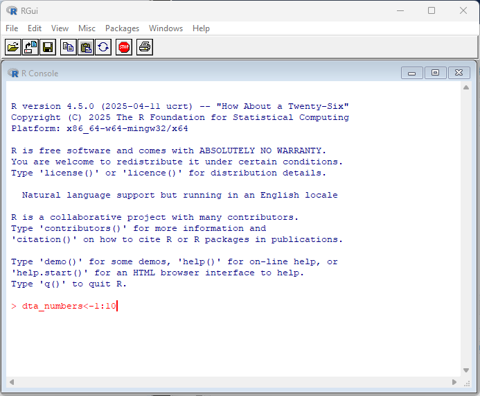
By default, R comes with a simple user interface called ‘RGui’ that provides a way to execute commands. For newcomers to the language it’s worth experimenting with simple commands and calculations. In the example below, dta_numbers<-1:10 creates an object called dta_numbers that includes the numbers from 1:10. You can try simple calculations like you would a calculator.
RStudio
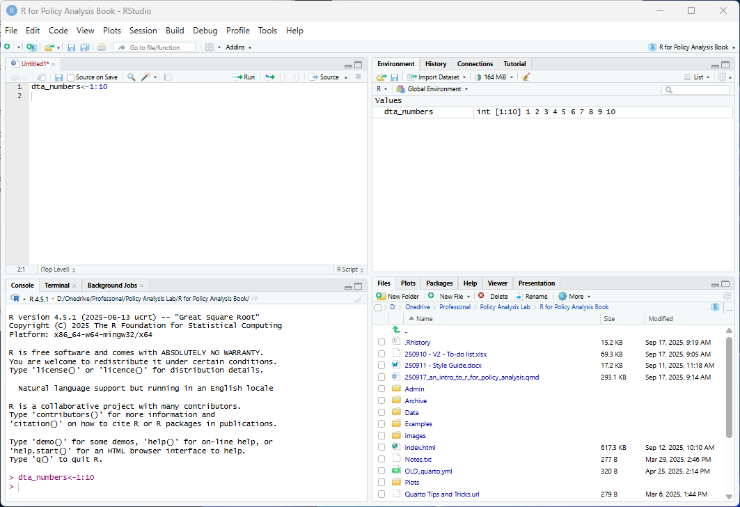
R Studio is a more feature-rich IDE for interacting with R. RStudio can be freely installed on Windows, Mac or Linux via https://posit.co/download/rstudio-desktop/
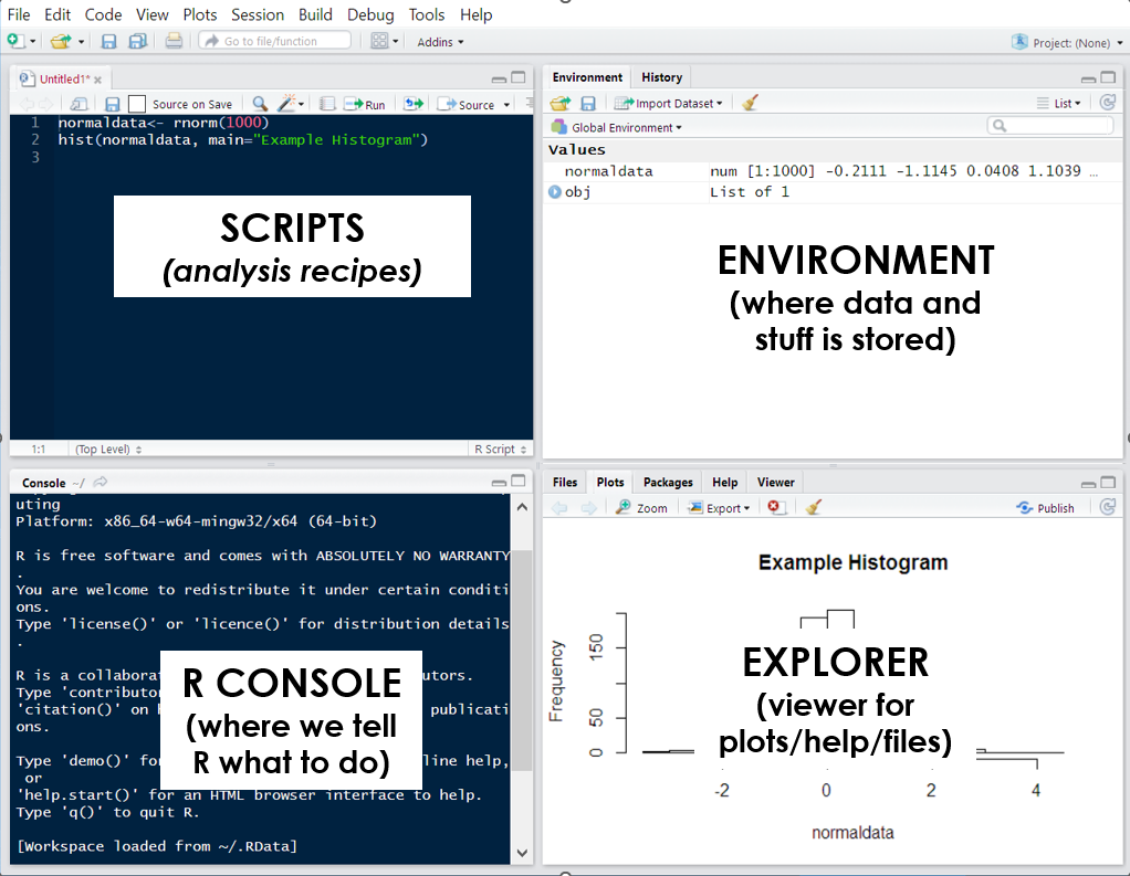
Like the RGui, RStudio is centered around executing commands through the R console. However, it also comes with a set of additional tools for working with R that are organized across four tabs (or panes), including the environment pane that presents objects you’ve created (such as dta_numbers), a pane with a preview of files in your working directory and a pane with a script where you can write code to have R execute.
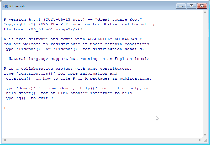
The R Console
You might have noticed that both RStudio and RGui have a similar window that displays the current version of R you’re working with and some commands to get you started. This is called the R Console and serves as a command-line interface for interacting with R.
By interacting with R, I mean this in a practical sense as we’llfollow the same basic workflow when using the language:
R lets us know that it’s ready to be told what to do (with the
>symbol);We tell R what to do (by executing a set of commands); and
R follows our instructions and responds based on the result.
How R responds will depend on the command(s) we provide to it, but usually it will either return the results we’ve asked for or display an error message to signify that something went wrong. Sometimes R won’t provide a response when executing a command to avoid presenting too much unnecessary information. You can override this behavior by enclosing the command in print():. print(dta_numbers<-1:10)
When R displays the + symbol it means it’s waiting for more information, such as when it’s only provided half of a command.
If you’re new to programming, working with the R console can feel intimidating since it provides minimal guidance on what it is, or how to get started. My advice for newcomers is to spend some time experimenting in the console by executing commands in the console.
By ‘executing’ I just mean entering the code into the console and pressing enter.
If you’re using RStudio you can also execute commands via the scripts pane. Scripts are essentially text files made up of commands and notes that simplify the process for creating analysis recipes. You can run commands in a script by selecting the code you’d like to run in the script pane and selecting ‘Run’. Alternatively, you can place your cursor at the end of a line code in the script and press Ctrl+Enter (command + return for MacOS).
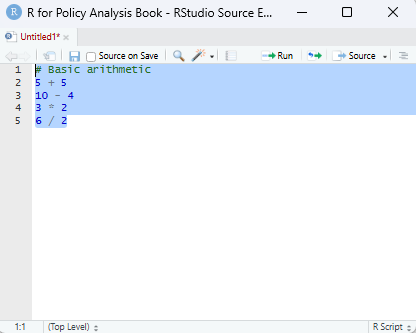
Whether you execute commands directly or via a script the results will be presented in the console. As a start, try copying the commands (or expressions) below and executing them in the R console:
# Basic arithmetic
5 + 5
[1] 1010 - 4 [1] 63 * 2 [1] 66 / 2[1] 3When executing the above commands you’ll notice that R will return a result, just like a calculator. However, we can also use functions and operators to have output more useful information, such as a summary statistic based on data we give provide it:
#generate some numbers
1:10
[1] 1 2 3 4 5 6 7 8 9 10# calculate the mean of the numbers 1 to 10
mean(1:10) [1] 5.5In all of the examples above, R automatically executes the instructions provided and prints the results in the console without saving them. But, if we wanted to store them for later use we could so using the ‘object assignment’ operator ‘<-’:
# Object assignment
x <- 1:10
y <- c(1, 2, 3, 4, 5)

# Storing text strings
names<- c("Chris","Mary","Shazza")
If you run the code above you’ll see that R doesn’t return a result. Instead, it silently creates named objects. Notice that in the first line of code the assignment operator <- assigns the numbers one to ten to an object named x.
The code below provides a simple demonstration of how to can be useful in practice. Notice that now that x and y exists, we can refer to them directly in our commands.
# Return the contents of an object names # Object manipulation
x + y
[1] 2 4 6 8 10 7 9 11 13 15Once you’ve run the code, observe how R adds the vectors element by element. The first value of x and the first value of y are added together to produce 2, the second values combine to make 4, and so on through each position in the two vectors. This behavior reflects the fact that R is vector-based, which means operations are peformed across an entire vector number-by-number (or element-by-element).
Note: When vectors of unequal length are combined in an operation, R ‘recycles’ the shorter vector by repeating its elements to match the length of the longer vector. In the example above, elements from y are recycled when adding it to x.
Note: If the length of x was not a multiple of y, R will usually not complete and and present a warning.
# Using a function to calculate the mean
mean(y)
[1] 3Finally, in the code below we’ve taken the numbers in the object ‘y’ and provided them to the mean() function. You can read what the mean function does by typing ?mean in the console, but as you might of guessed it has taken the contents of y and calculated the arithmetic average.
Notice that the basic workflow is that we give R some information, such as a set of instructions on what to do and R tries to execute what we’ve asked. Ask R to subtract 4 from 10 and it will give us the number 6. Tell it to assign the numbers 1 to 5 to an object called ‘y’ and it will silently store those numbers as an object. In short, R takes a set of inputs, processes them and returns a series of results that are (hopefully) useful to us.
RStudio
RStudio is an integrated development environment (IDE) designed to help us use R effectively. By default, RStudio is divided into four separate windows (or ‘panes’) that provide a set of tools and functions to help us work with R:
Script Editor: At a basic level, the script window is just a fancy text editor where you can write your code. When you click the ‘Run’ button at the top of the pane, RStudio will send selected code to the R console to be executed.
The R Console: This is where we interact with R: either by directly typing our commands in the console or having RStudio do it for us. When running code from our analysis script, this is where the code is sent to be executed. This is also where information is displayed by, such as results of our code, status messages and error messages.
Environment and History:
Environment: presents what ‘objects’ (such as data) have been loaded into the R environment. For instance, after executing dta_rnorm<-rnorm(100) the object ‘dta_rnorm’ will appear here.
History: provides a history of commands sent to the R console.
Files, Plots, Packages, and Help:
File: A simple file explorer.
Plots: where plots and other outputs will be presented by RStudio.
Packages: a list of installed packaged (note loaded packages are ticked)
Help: An interface for searching and viewing help files.
Useful options
Dark mode: you might notice that a lot of my screenshots from RStudio are in dark mode. I use the Cobalt theme. You can change the theme of RStudio via ‘Global Options’ > Appearance’ > ‘Editor theme’.
Base pipes: Most of the time I’ll use base pipes (|>) rather than magrittr pipes (%>%) in my code. You can enable this as the default in RStudio via ‘Global Options’ > ‘Code’ > ‘Editing’ > ‘Use native pipe operator’.
Code wrapping: you can enable the soft-wrapping of source files to make it easier to view long lines of code. This option is available via ‘Global Options’ > ‘Code’ > ‘Editing’ > ‘Soft-wrap source files’.
Start from a clean slate
When you first exit R, you’re likely to be asked whether you’d like to save a copy of your workspace, which contains a copy of objects you were working with.
Don’t.
In fact, one of the first settings I recommend new users implement is to disable restoring and saving your workspace in RStudio via Tools > Global Options > General: Workspace
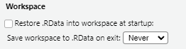
The idea behind this is to encourage us to outline every step of an analysis recipe in our scripts. Encouraging you to create logical and well-documented scripts that provide a reproducible record of the data used, how it was cleaned and how results were produced. In addition, to encouraging reproducibility in our work it also reduces the risk of carrying forward errors from previous sessions, such as actions that we forgot to save in our script. Ensuring not only that our recipe works the same way each time its run, but that fatal errors are spotted and dealt with more quickly.
Foundations
Thinking Like A Programmer
Using point-and-click tools for data analysis follows a similar pattern: you have a question to answer, some data to answer it with, and a collection of tools presented to you that you can interact with. Just like how we interact with the world around us, you’re presented with a series of visual queues about the consequences of each action you take. Analyzing a dataset then becomes a matter of clicking the right tools in the right order and observing the results.
Programming languages like R work a little differently. Instead of having a collection of tools presented to you, you’re provided with an empty text box where you can tell the computer what to do. There’s no icons to click, menus to navigate or documentation presented to you. Instead, you’re expected to enter the right commands in the right order and ask for visual queues when you need them.
Analyzing data using point-and-click software is like ordering from a menu — the options and their ingredients are chosen for you. Whereas programming is like cooking for yourself — you choose the ingredients and how to cook them.This difference presents a fundamental trade-off: point-and-click software sacrifices flexibility and control for ease of use: programming sacrifices ease of use for flexibility and control.
For those that regularly work with data, R provides invaluable power and flexibility: offering an almost unlimited array of tools that can be applied in whatever way makes sense for your data. Need to import and clean data stored in hundreds of excel files? R can help with this. Interested in transforming your statistical modelling into an interactive dashboard? R has you covered there too. But, there’s a trade-off: learning to program requires that getting comfortable writing your own recipes rather than ordering from the menu.
The Iron Chef: Teaching Robots to Cook
To take the metaphor further than I probably should: think of writing code as creating a recipe for a robot chef. Robots are great at math and following instructions, but they can’t taste or interpret ambiguous instructions. Provide a vague cake recipe to a human and they’ll likely figure it out. Provide it to a robot chef and they might set the kitchen on fire.

This is because computers are incredibly fast, but purely literal, machines. They excel at processing vast amounts of data and performing calculations at speeds far beyond human capability. However, they lack the human ability to read between the lines and intelligently respond to ambiguity. Tell a computer to do the wrong thing and it will just do it really quickly.
Writing code therefore means leaving nothing to chance. We need to provide the computer with the right ingredients, in the correct format and provide it with a precise set of instructions in the in the correct order.
This can feel daunting as you’re not only learning a new language, but the logic that dictates how it functions.
The good news is this that you’ve done this before. None of us are born knowing how to talk in our native tongue. Instead, we learn by watching and mimicking those around us. Learning to code is similar. We spend time mimicking others, troubleshooting errors and practicing the basics until we’re armed with a large enough vocabulary to write the recipes we need.
The journey from confusion to competence follows a predictable arc and is worth scaling. Start with the basics: import some data, apply a simple function and create a terrible graph. Encounter an error? Figure out its source, why it occurred and how to avoid it next time. Step by step, experiment, make mistakes, and celebrate each victory on your journey to master R.
Some Basic Architecture
Although working with R is the best way to learn it. There are some basic concepts that it’s worth becoming familiar with before you start. We’ll cover each of these in greater detail throughout the book, but I describe the basic building blocks as being divided into three themes:
Language: How you talk to R (e.g. operators, commands and functions).
Objects: How R organizes data and information (e.g. dataframes, variables and lists).
Software: How you interact with R (e.g. RStudio, the console and scripts).
Language
Think of R as a language for talking to computers about data. Like any language, R has its own symbols, words and grammar that need to be applied to communicate correctly:
Operators are R’s most basic vocabulary: a set of single symbols that perform actions:
Math operators are used for basic arithmetic ,such as
2 + 3,10 - 5,4 * 2and8 / 2Assignment operators store values.
dta_my_data <- 100saves the value 100 to an object called dta_my_data.Comparison such as
5 > 3which tests whether 5 greater than 3.
Expressions (or commands) are a set of complete instructions for R to follow. When you type 2 + 3 into the console and hit Enter, R will return 5.
Objects
Objects are containers that R uses to hold information. When we execute dta_my_data <- 100 R creates an object with the name dta_my_data. Functions, such as mean() are also objects, except they contain a set of instructions that R can follow:
Functions are a collection of commands that handle more complex tasks. Instead of writing 50 lines of code to calculate an average, you use the mean(), or plot(x, y) can be used to create a graph.
Packages expand the functionality of R. Each package includes a collection of objects, such as functions and data, designed to make analysis and visualization easier. At the time of writing there were more than 22,000 packages available on CRAN. Packages can be installed using install.packages("package_name") and loaded using library(package_name).
Data Structures are containers that organize your information in R:
Vectors store multiple values of the same type e.g.
ages <- c(25, 30, 22, 45)creates a vector of ages.Dataframes organize data across rows and columns (like a spreadsheet). Each column has its own name and can be thought of as a single vector (or variable).
Software
We’ll be using specific software to interact with the R language, such as RStudio. Think of these as ‘helpers’ to work with R separate to the language itself:
RStudio provides a user-friendly workspace with panels for writing code, viewing results, and managing analysis.
Scripts are text files for writing code. RStudio has a script pane for authoring scripts.
Base R
By default R comes with a set of tools and functionality to let you immediately work with data, such as simple data structures, and functions to manipulate data, calculate summary statistics and produce plots. This default functionality is referred to as base R.
I don’t think anyone actually believes that R is designed to make everyone happy. For me, R does about 99% of the things I need to do, but sadly, when I need to order a pizza, I still have to pick up the telephone.
Roger D. Peng
Base R provides the foundation for everything you’ll do in R. While you’ll often add specialized packages to help with specific tasks, these additions always build on base R’s core capabilities. When somebody describes their analysis as being written in base R they mean it solely relies on the functionality that comes with R when it’s first installed.
You can read more about the design of base R here.
Note: While base R remains mostly stable across versions, code written for R 4.4 may not work in R 2.1 due to some changes in default behaviors and functionality over time. This is why it’s important to document the version of R (and R packages) you’re using when writing analysis.
Installing and Loading Packages
Packages can extend the capability of R by providing access to additional commands and functions to base R. Although you can install packages from a variety of sources, like GitHub, by default R installs packages from CRAN (the Comprehensive R Archive Network), which is a central repository of R packages. You can search for packages by name or topic at r-packages.io and r-universe.dev.
Use the install.packages("Package_Name") command to install a new package in R. Once a package is installed you can load it using library(Package_Name). It’s also possible to explcitely utilize a function without loading the package using package_name::function_name().
Packages can also be installed, loaded and updated in the Packages tab in the explorer window of RStudio. Packages with a tick next to their name have been loaded. Click  to check for package updates.
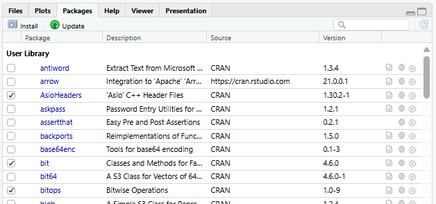
Most packages will come with documentation that explains its purpose and how to use individual functions. To access a package’s documentation you can execute help(package= "package_name") in the console. For instance, help(package = "base") will display the documentation for the base package.
The tidyverse: a Modern Analysis Toolkit
The tidyverse is a collection of R packages designed to make working with data simpler. Aside from including a collection of tools to make data science easier, packages in the tidyverse are also designed around a common set of principles and grammar to make it easier to use. For these reasons, we’ll primarily be using packages from the tidyverse in this guide, including:
- dplyr: Provides a set of tools for filtering, selecting, mutating, and summarizing data (link).
- forcats: Helps with the creation, manipulation and analysis and of factors, which are useful for categorical variables (link).
- ggplot2: Implements a consistent ‘grammar’ for producing high quality statistical visualizations (link).
- lubridate: Makes managing dates and times easier (link).
- purrr: Provides a set of tool that simplify functional programming, such as completing the same operation across multiple datasets without re-writing the same code (link).
- readr: Facilitates efficient importation of rectangular data formats (link).
- stringr: Includes a set of functions to help with managing and manipulating string, such as text data or information stored as text (link).
- tidyr: Includes data reshaping tools to assist with data wrangling tasks, such as reshaping (link).
To install the tidyverse in R you can execute install.packages('tidyverse') in the R console. Once the tidyverse is installed you’ll need to load the package to work with them using library(tidyverse).
Other Packages
Although the tidyverse will do a lot of the heavy lifting in this guide, we’ll also be drawing on other packages available on CRAN, including:
HistData: which provides a set of interesting datasets (link).
janitor: To help us examine and clean data (link).
readxl: Designed to help with reading data from Excel files (link). Although this package is part of the tidyverse, it will need to be installed and loaded separately to be used.
skimr: provides a set of simple summary functions for exploring data (link).
wbstats: For downloading data from the World Bank (link).
Why Learn Base R?
If the Tidyverse is So Great, Why Bother with Base R?
Although this guide will mainly focus on using tools available in packages from the ‘Tidyverse’, becoming familiar with base R holds a number of advantages:
Conceptual understanding: Base R provides much of the logic and/or functionality used by the 20,000+ R packages currently available (including the tidyverse!) so should form a backbone of learning how to use R.
Collaboration and communication: Base R is frequently used by others in the R community. Meaning that understanding base R will make it easier to find help and practical examples when trying to conduct analysis and troubleshoot problems. -
Flexibility and interdisciplinary: As base R provides the basis for a large number of packages, being comfortable with base R will make it easier to draw on tools offered by packages outside the tidyverse. Providing access to specialized functionality like geo-spatial mapping, building machine learning models and producing interactive web-based dashboards.
Speed and convenience: In some cases base R can be be easier, faster and more efficient than the tidyverse alternative.
Objects
Objects serve as containers that hold information and data. Each object type has its own format and set of attributes that can make it well-adapted to some tasks, but not others. Some common object types include:
Vectors ~ an ordered collection of values of the same type
Matrices ~ multiple columns of values of the same type
Data Frames (or Tibbles) ~ one or more columns of any element class
Lists ~ Collection of objects, such as more than one dataframe
Functions ~ R code providing a set of instructions to fulfill when called
To create an object, we can use ‘<-’. To delete an object you can use rm(object_name). In the example below we’ve created three vectors, a dataframe and a simple function. These objects are then deleted using rm().
#create vectors
dta_age <- c(34,42,19)
dta_names<-c("Mary","Kelvin","Susan")
dta_female<-c(TRUE, FALSE, TRUE)

#create a dataframe
dta_class<-data.frame(dta_names,dta_age,dta_female)

#create a function
fnc_count<-function(from=1, to=10) {from:to}

# delete the objects
rm(dta_age,dta_names,dta_female,dta_class,fnc_count)
Note: While = can be used for assignment, <- is preferred. This is because ‘=’ has a lot of other uses, such as specifying the value of arguments in functions, creating variables and testing logical conditions.
Functions
Functions are reusable pieces of code that complete a bundle of task based on the ingredients provided to it. A function will normally have a name which allows us to all upon it in R, like max(), summary() and table() and a set of parameters that can be used to customize its behavior. For instance, in the code below plot() uses the data called EuStockMarkets to produce a plot. The parameter main is then used to let plot() know what the title should be.
#take a look at our ingredients (the data):
head(EuStockMarkets)
Time Series:
Start = c(1991, 130)
End = c(1991, 135)
Frequency = 260
DAX SMI CAC FTSE
1991.496 1628.75 1678.1 1772.8 2443.6
1991.500 1613.63 1688.5 1750.5 2460.2
1991.504 1606.51 1678.6 1718.0 2448.2
1991.508 1621.04 1684.1 1708.1 2470.4
1991.512 1618.16 1686.6 1723.1 2484.7
1991.515 1610.61 1671.6 1714.3 2466.8#produce a plot with the data:
plot(EuStockMarkets)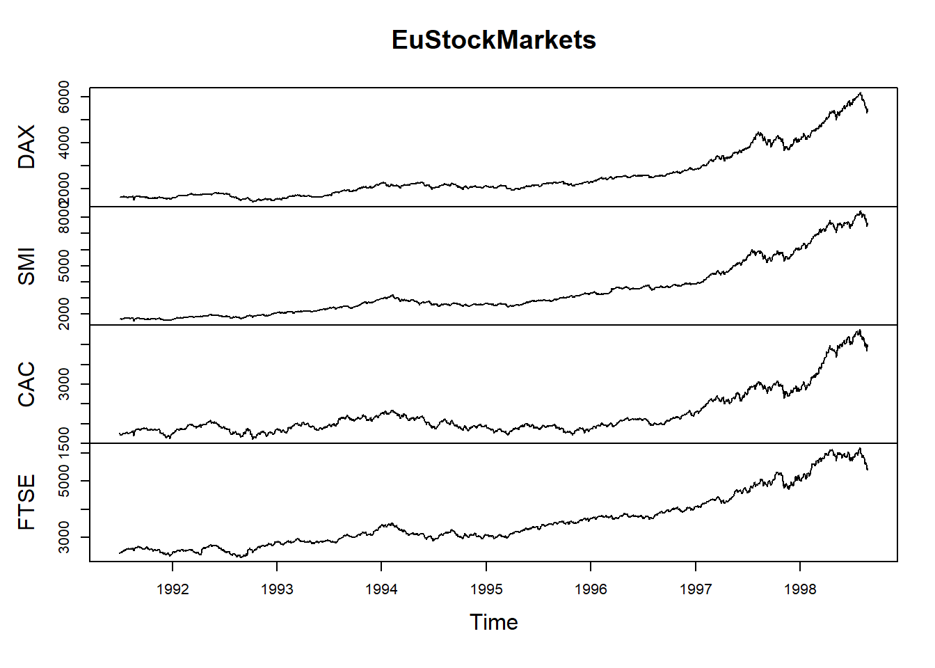
#produce a plot with the data while specifying the title to use:
plot(EuStockMarkets, main="Price of European Stocks")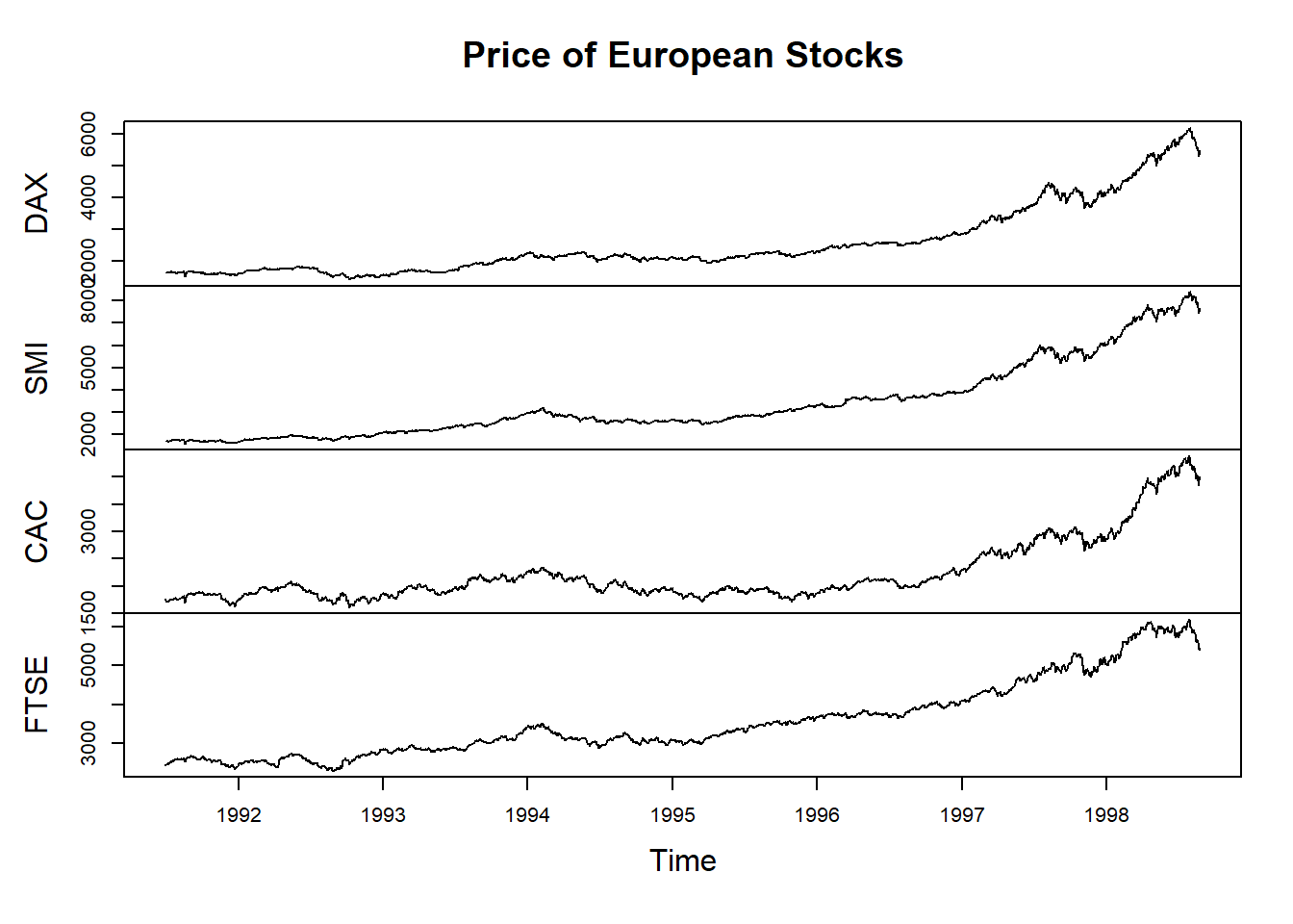
Functions are the essential tools for working with data. Much of programming involves figuring out which functions to use, in what order and with which ingredients. Sometimes a function expects that we provide it with a collection of numbers, sometimes it expects a data table or maybe it is designed to adapt based on the ingredients provided to it.
Documentation
Almost all functions come with in-built help that explains what a function does and how to use it. To access a function’s help you can execute the function name with a ? at the front in the console. For instance, executing the command ?summary() will display the help file for the summary() function.
Don’t worry if the in-built help seems confusing. It will become more and more useful as you become comfortable with R.
Parameters and Arguments
We’ll sometimes use the terms parameters and arguments when talking about functions:
- Parameters are named options that define how a function behaves. For instance, the
mainparameter inplot()can be used to specify a custom title for a plot. - Arguments are the values provided to a parameter. In example above,
"Price of European Stocks"is the argument specified for the parametermain.
Data Structures
Vectors
Vectors are collections of elements of the same data type, such as numeric values, character strings, or logical values. When working with dataframes, each column (or variable) is essentially a vector that stores a specific type of information, such as a collection of names, ages, or whether or not members of the public are eligible for a grant.
In the example below we’ve created a numeric, character and logical vector.
#create vectors
dta_age <- c(34,42,19)

dta_names<-c("Mary","Kelvin","Susan")

dta_female<-c(TRUE, FALSE, TRUE)
Common vector classes include:
Character (chr):
c("Ben", "Sheryl", "Bazza")Numeric (num):
c(1.2, 45.0, 21.6)Integer (int):
c(11, 47, 62)Dates (Date):
"21-12-03 UTC"Logical (logi):
c(TRUE, FALSE)Factors (Factor):
factor(x=c(1,1,0), c("Manual"=0,"Automatic"=1))
Because vectors store information in a single class, R will try to ‘coerce’ elements into a single class that avoids losing information about the value. In the example below, the source values are coerced to the character class to avoid losing information.
dta_pizza<-c(TRUE, "Maybe", 4)Matrices
Matrices a two-dimensional collection of elements of the same type (e.g. numeric, character, logical etc).
# Create a matrix
dta_m <- matrix(1:9, nrow = 3, ncol = 3)

dta_m
Dataframes
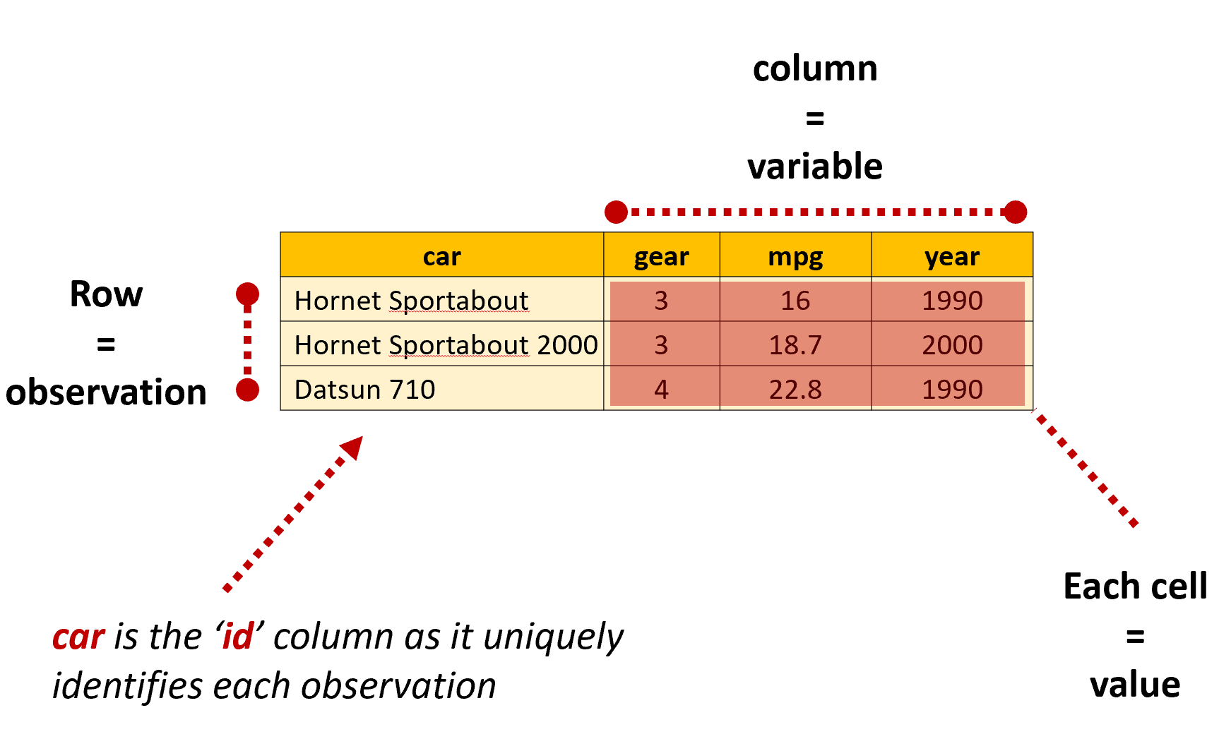
In R, dataframes are data tables that organize data in rows and columns, similar to a spreadsheet. When a dataframe is in a ‘tidy’ format, each row will present information about a single observation for each variable included in the dataframe. At the intersection of each row and column is a value, which is sometimes referred to as a single ‘cell’ or ‘element’.
Dataframes can be thought of as a collection of vectors with the same length that are stuck together. They are the most common data structured used when working with data in R:
#create vectors
dta_age <- c(34,42,19)

dta_names<-c("Mary","Kelvin","Susan")

dta_female<-c(TRUE, FALSE, TRUE)

#create a dataframe

dta_class<-data.frame(dta_names,dta_age,dta_female)
Tibbles
You’ll also come across something called ‘tibbles’ throughout your R journey. Tibbles are a modern reimagining of the data.frame from the tidyverse that tries to keep what works and drop what doesn’t. In most instances when working with tidyverse packages tibbles are the preferred choice.
Tidy Data
We’ll talk more about different data shapes later in the book, but the key thing to remember is that R generally works best when our data is organized in a tidy format: where each row is an observation, each column is a variable and each cell a single value.
Classes
The ‘class’ of an element, vector or object refers to the characteristics and structure of information stored in an object. Classes are useful as they define how information should be stored, displayed and manipulated.
Although the objects were created in a similar way, they each have a distinct class based on the information they store. To see the class of an object you can use class(). Notice in the example below that the class of dta_female is ‘logical’ as the object is a vector containing logical values.
#create vectors
dta_age <- c(34,42,19)

dta_names<-c("Mary","Kelvin","Susan")

dta_female<-c(TRUE, FALSE, TRUE)

#create a dataframe
dta_class<-data.frame(dta_names,dta_age,dta_female)

#check the class of an object

class(dta_names)
[1] "character"class(dta_female)[1] "logical"Sequences
The colon operator ‘:’ can be used to create sequences using the format from:to
For instance, ‘1:10’ when executed will return the numbers from one to ten, whereas 10:1 will return the same numbers in the opposite order.
# Output a sequence of numbers from 1 to 10
1:10
[1] 1 2 3 4 5 6 7 8 9 10# now from 20 to 3
20:3 [1] 20 19 18 17 16 15 14 13 12 11 10 9 8 7 6 5 4 3#and we can combine it with other values
pi:10[1] 3.141593 4.141593 5.141593 6.141593 7.141593 8.141593 9.141593It’s also possible to have R return more complicated sequences using seq() and rep(). For instance, if we wanted to return every second number between 0 and 20 we could use:
# Using seq() function
seq(from=0, to=20, by=2)
[1] 0 2 4 6 8 10 12 14 16 18 20Or to repeat the number 3 twenty times we could use:
rep(3, times=20) [1] 3 3 3 3 3 3 3 3 3 3 3 3 3 3 3 3 3 3 3 3Aside from this being useful for creating simple vectors to play with, sequences are frequently used for performing more advanced tasks, such as individually importing individual files in a list.
Combining Elements
Concatenate
When you first come across R code in the wild you’re likely to come across the c(), which combines or concatenates values into a vector or list. For instance, dta_vector <- c(1,2,3,4) would combine the numbers 1 to 4 together to create the vector dta_vector.
We’ll often need to use c() when specifying multiple parameters. In the example below, notice how it has been used to specify which values should be considered as missing (NA) when importing an excel file:
# Specifies both blank cells and "99" as missing values

read_excel("my_data.xlsx", na = c("", "99"))
paste()
paste() and paste0 also combine elements into a vector, but unlike c() they do this on an element-by-element basis. For instance, c(1:3,3:1) will combine the numbers in the order they are provided, whereas paste(1:3,3:1) will combine the numbers element-by-element, resulting in “1 3” “2 2” “3 1”.
Notice that paste() has also added a space between each number, which is the function’s default behavior unless we specify a different value for the sep argument. paste0() works in the same way as paste(), but does not add a deliminator between elements i.e. sep=““.
#create a simple string of numbers based on their ranking

ref_rank <- c(5,1,7)

#create a vector of names

ref_names<- c("James","Sarah","Emil")

#combine rank and names into combined text strings #set the seperator as a space using the sep argument

paste("Name:", ref_names,"Rank:",ref_rank, sep=" ")
[1] "Name: James Rank: 5" "Name: Sarah Rank: 1" "Name: Emil Rank: 7" #Demonstrate difference from c()
c("Name:", ref_names,"Rank:",ref_rank)[1] "Name:" "James" "Sarah" "Emil" "Rank:" "5" "1" "7" Logical Operators
Logical operators allow us to test particular conditions are met, such as whether a survey respondent’s age is greater than 25. Whenever testing a logical condition (or set of conditions) R will either return TRUE, FALSE or NA based on the result of the test. For instance 11>=3 will return TRUE, 6>2 will return FALSE and 4>NA will return NA. When applied to a vector a result will be returned for each element, for instance 2:4>=3 will return FALSE TRUE TRUE
It’s also possible to test whether multiple conditions are met using & and |. The and operator (& ) tests whether all specifed conditions are met and the or operator (|) tests whether at least one condition is met. For instance 1:5>=3 & 1:5 <5 returns FALSE TRUE FALSE as a number must be greater or equal to three and less than five, where 2:4>=3 | 2:4 <1 returns FALSE TRUE TRUE as a number can meet either of the conditions.
| Operator | Description | Example | Result |
|---|---|---|---|
== |
Equal to | 5 == 5 |
TRUE |
!= |
Not equal to | 5 != 3 |
TRUE |
> |
Greater than | 5 > 3 |
TRUE |
< |
Less than | 5 < 3 |
FALSE |
>= |
Greater than or equal to | 5 >= 5 |
TRUE |
<= |
Less than or equal to | 5 <= 3 |
FALSE |
& |
AND | (5 > 3) & (5 < 7) |
TRUE |
| |
OR | (5 > 7) | (5 < 7) |
TRUE |
Logical operators will become increasingly handy for working with data and controlling how your code runs as you progress. When cleaning data this might mean dropping all values equal to NA or identifying unusual values that warrant further investigation. You might also want to test which tax thresholds apply to individuals in a modelling exercise. Or maybe you’d like to have your code behave differently based on whether a condition is met, such as by applying a different function depending on the sample size you’re working with.
Errors, Warnings and Messages
The more you experiment working with R, the more seemingly inscrutable messages you’re likely to encounter. Maybe you’ve tried to assign some data to an object, but have entered < instead f <-. Perhaps you’d like to import some data from an excel file, but have pointed R to the wrong place on your hard drive. Or you might have tried to apply the mean() function on a vector stored as characters, not numbers.
Whatever the case, R will usually let you know when something goes wrong with a set of obnoxious and sometimes inscrubtable errors, warnings or messages:
Errors: occur when R cannot execute the code you sent it. This usually means the code failed and no output was generated.
Warning: indicates that something in your code might not have worked as expected, so you should check its work.
Messages: are notes from a function reminding you of something important, such as its default behavior, missing values that have been introduced and/or how to interpret the results.
List adapted from: Travis Loux, 2024, R for the Uninitiated
Deciphering Errors
Newcomers are right to be confused by R’s seemingly indecipherable collection of errors, warnings and messages. Learning a programming language requires that we learn how to intepret strange symbols governed by a set of rules and logic designed for computers. If you were learning wizardry, mispronouncing a syllable might mean you accidentally conjure a toad. When you’re learning to program, using the wrong symbol or function might crash your computer.

Although I don’t want to take this magical analogy (sorry) too far, I find it to be an an apt way to describe what I found particularly frustrating when learning to program: having no idea what an error meant gave me no path for fixing it or knowing where to look for help.
The good news is that when you first start to program you’re likely to make the same mistakes and see the same types of messages. In fact, Noam Ross found this outwhen analyzing Stack Overflow questions, finding that a small number of errors account for the majority of messages you’re likely to get:
- “Could not find function” - Usually from typing the function name incorrectly or failing to load the package it comes from, such typing
Read.csv()instead ofread.csv()or referencing theggplot()function before loading the package vialibrary(ggplot2). - “Error in if” - Caused by non-logical data or missing values being provided when a condition is tested. A simple example of this is
if (NA > 5) print("Success!")asNAis returned by the test. - “Error in eval” - Results when a function tries to use an object it can’t find, such as a data object that hasn’t been loaded.
subset(iris, Species == nonexistent)produces this message. - “Cannot open” - Attempts to read inaccessible or non-existent files. An obvious example of this is
read.csv("A path that doesn't exist"), but you’re likely to encounter this when you’ve specified the wrong location for a file or if the file is open by another program. - “No applicable method” - Using a function on an unsupported data types. This is rarer, but usually occurs when a function is provided the wrong type of object, such as a list instead of a dataframe.
- “Subscript out of bounds” - Trying to access elements or dimensions that don’t exist, such as
pi[[2]]aspiis a single vector. - Object of type closure is not subsettable - such as when you try to use subsetting operators (like
[,[[, or$) on a function instead of a data structure. A simple example of this ismean[](which is trying to subset a function).
Adapted from: David Smith, 30/3/2015, The most common R error messages, Revolution Analytics
Importing Data
If you’re new to programming, even importing data can be a challenge. Unlike more traditional ‘point and click’ statistical software, you can’t simply click a data file to import it into R. Instead, you’ll need to provide the location of the file to a function that can read the data and save it as an object using <-.
While this can feel finicky at first, once you’ve found the function that you need importing data follows the same basic steps:
Load the library with the function you need to read the data;
Letting the function know where the file is stored on your computer; and
Executing the function while assigning the results to a named object.
The code below provides a simple example of this. Notice that the package haven is loaded so read_spss() can be used to read the SPSS file. The location of the file on the hard drive is then provided to read_spss() to import it and save it as an object called dta_affordable_housing.
library(haven)

dta_affordable_housing<-read_spss("C:/Working Directory/Data/Affordable_Housing_by_Town.sav")
Note: the . symbol can also be used to refer to locations within the working directory, which can be specified separately. For instance, if the location of the working directory is set to C:/Working Directory/ the file path “./Data/Affordable_Housing_by_Town.sav" could be used. This just tells R that the affordable housing data file is located in a folder called ‘Data’ within the working directory.
Exploratory and Explanatory Analysis
Throughout this guide we’ll sometimes describe analysis as exploratory or explanatory.
Exploratory analysis describes the steps we take to understand a dataset and figure out how to answer our focus question(s). This might include understanding how data is organized, which variables are available and exploring relationships between variables. Outputs produced at the exploratory analysis stage are mainly meant for us, and others in our team, so don’t need to be in a format that an outside audience can understand.
Explanatory analysis entails the steps taken to answer our focus question(s) and share our results with an outside audience. This will often mean producing outputs that are suitable for an outside audience, such as by using high-quality plots, well-formatted statistical tables and/or interactive dashboards.
File Systems and Paths
A computer’s file system functions like a filing cabinet. Just as you might organize papers, documents and other files into a folder in your filing cabinet files on your computer are organized in a series of folders (or directories) on your hard drive.
Although their format will vary slightly depending on your operating system, their essential structure remains the same. For instance, if I have a file called “Analysis.R” in my “Project” folder its file path might be C:/Project/Analysis.R. This provides an address for the file and lets the computer know it’s located on the C drive in a folder called “Project”. We can also specify the location of a folder by excluding the name of a file. For example the file path C:/Stuff/Project 1/ specifies that the ‘Project 1’ folder is stored in another folder called ‘Stuff’ (or sub-directory).
Note: Windows typically shows file paths with backslashes (\), while R uses forward slashes (/). Don’t worry, they mean the same thing. Just make sure you use forward slashes when referring to the location of files and folders in R.
RStudio Projects
The folder R works from is called the working directory and usually needs to be correctly specified for your code to run. Although it’s a good idea to be familiar with how working directories work (more on that below), it’s generally easier to use RStudio Projects as this automatically sets the location of your working directory when you open it to wherever the RProject file is saved.
To create a new project select ‘File’ > ‘New Project’ via the RStudio file menu. A .Rproj file will then be saved in the directory you specify. Now, each time you open the project your working directory will automatically be set to the location of the .Rproj file.
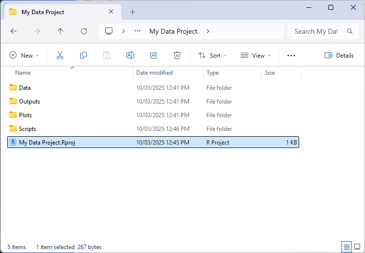
Aside from being more convenient to have the working directory automatically set in this way, R projects allow us to specify relative file and directory paths when working with R (using ‘.’ in the file path). This feature is particularly handy when when collaborating with others on the same project or when working on the project across multiple machines (such as a home computer). As instead of reference absolute paths like “C:/My Files/Project 1/Data/my_data.csv”, you can simply make references relative to where the .Rproj file is stored e.g. “./Data/my_data.csv”. This makes code easier to read and also means it will work without needing to modify file paths or manually set working directories based on where the project folder resides on each system.
Working Directories
The working directory tells R where to open and save files on your hard drive. When starting R from a project its location will be set to the project folder. Otherwise, your working directory will be set to the default location (such as the ‘My Documents’ folder for Windows).
To return the current location of your working directory, use the command getwd(). To set the location of your working directory in R, use setwd("file_path"), where ‘file_path’ denotes the location of the folder you’re working from. You can also change the default location of your working directory using RStudio via: ‘Session’ > ‘Set Working Directory’.
Files can be loaded and saved files relative to the working directory. For instance, if we’ve set our working directory to ‘C:/My Data Project/’, we could import the data file using dta_data<-read.csv('./data.csv'), with R substituting ‘.’ with the location of the working directory.
Organizing Your Working Directory
Although you’re free to organize your analysis projects in a way that works for you, a good place to start is to organize your a working directory around a standardized structure, such as:
- ./Data/: For storing the original input data and processed versions of the data.
- ./Outputs/: Where results of analysis are stored, such as statistical summaries.
- ./Plots/: Which is used for saving any plots generated.
- ./Scripts/: For storing individual R scripts.
Applying a standardized structure like this will help keep your analysis project organized and make it easier to understand how everything fits together (both for your colleagues and you when you return to your analysis in the future).
Reading and Saving Data
Importing and saving files requires picking the right function for the job and specifying where to load or save the file. The code below provides a demonstration of this using the titanic data, with . letting R know the files should be loaded and saved within the working directory:
#load the titanic bio data
dta_titanic_passengers_bio<-read.csv("./Data/titanic bio data.csv")

#save the titanic data as an RDS file
saveRDS(dta_titanic_passengers_bio, "./Data/titanic bio data.rds")
Also notice that we’ve provided saveRDS() with dta_titanic_passengers_bio so it knows what we’re asking it to save. saveRDS() has guessed dta_titanic_passengers_bio is the file we’d like it to save, but we can also specify this explicitly using saveRDS(object=dta_titanic_passengers_bio, "./Data/titanic bio data.rds")
Customizing Parameters
The behaviour of functions can often be customized by tweaking their parameters.
The options available for a function are listed in their documentation, which can be viewed by placing ? in front of the function in the console e.g. ?read_excel(). Take a look at Usage and Arguments in the help to get a sense of the parameters available for a function. Values specified after = represent the default value used when their value isn’t directly specified. As an example, skip = 0 indicates that read_excel() won’t skip any rows in an excel sheet unless we ask it to do so.
The code below presents a simple example of customizing parameters for read_excel(). By specifying sheet=1 read_excel() knows to read the data from the first sheet. Whereas na=c("","NA) tells read_excel() to consider cells that are empty or contain the value “NA” as missing:
#load the readxl package
library(readxl)

#view help for read_excel()
?read_excel()

#import data while customizing parameters
dta_titanic_ticket_data<-read_excel("./Data/titanic ticket data.xlsx",
                                    sheet=1,
                                    na=c("","NA"))
Working With Common Data Formats
One of R’s many strengths is its ability to work with data stored in a variety of formats used by commercial software, such as Excel, SPSS, SAS and Stata files. The table below provides a summary of functions and packages that can be used to work with common data formats.
| Data Format | File Extension | Importing | Exporting | Required Package |
|---|---|---|---|---|
| CSV | .csv |
read.csv() or read_csv() |
write.csv() or write_csv() |
Base R or readr |
| Tab-delimited | .txt, .tsv | read_tsv() or read.delim() |
write_tsv() or write.table() |
readr or Base R |
| Excel | .xlsx, .xls |
read_excel() |
write_xlsx() |
readxl (import), writexl or openxlsx (export) |
| Stata | .dta |
read_dta() or read_stata |
write_dta() |
haven |
| SPSS | .sav, .por |
read_sav() or read_spss() |
write_sav() |
haven or foreign |
| SAS | .sas7bdat, .xpt |
read_sas() |
write_xpt() |
haven |
| R Data | .RData, .rda, .rds |
readRDS() |
save() or saveRDS() |
Base R |
Note: The functions listed below that use . for spaces, like read.csv() are available in Base R.
Looking at Your Data
The first step once you’ve imported your data you’ll need to get a sense of what you’re working with. At the outset this involves answering three questions: what is the structure and size of the data; what information does it contain; and are there any issues that need to be addressed prior to analysis?
Answering these questions when you first import the data into R will help you understand what steps need to be taken to get it read for analysis.
What is the Structure and Size of Your Data?
The str() function is a good place to start to understand how data is organized. In the example below str() indicates that dta_titanic_passengers_bio is a dataframe made up of 1,309 observations across 11 variables. The function also gives a hint about what the structure and class of each variable. For instance, int indicates that the survived variable is an integermade up of 1s and 0s.
#|output: true

#load the titanic bio data
dta_titanic_passengers_bio<-read.csv("./Data/titanic bio data.csv")

#take a look at the structure of the dataframe
str(dta_titanic_passengers_bio)
'data.frame': 1309 obs. of 11 variables:
$ survived : int 1 1 0 0 0 1 1 0 1 0 ...
$ name : chr "Allen, Miss. Elisabeth Walton" "Allison, Master. Hudson Trevor" "Allison, Miss. Helen Loraine" "Allison, Mr. Hudson Joshua Creighton" ...
$ sex : chr "female" "male" "female" "male" ...
$ age : num 29 0.917 2 30 25 ...
$ sibsp : int 0 1 1 1 1 0 1 0 2 0 ...
$ parch : int 0 2 2 2 2 0 0 0 0 0 ...
$ ticket : chr "24160" "113781" "113781" "113781" ...
$ embarked : chr "S" "S" "S" "S" ...
$ boat : chr "2" "11" NA NA ...
$ body : int NA NA NA 135 NA NA NA NA NA 22 ...
$ home.dest: chr "St Louis, MO" "Montreal, PQ / Chesterville, ON" "Montreal, PQ / Chesterville, ON" "Montreal, PQ / Chesterville, ON" ...What Information Does Your Data Contain?
Before importing a dataset, understand how it was collected and how each variable is defined. This information is usually provided in a data dictionary, which explains what each variable means and what values it contains. If no data dictionary exists, it’s a good idea to contact the person and/or organization that created the data before analyzing it.
Although str() provides a good hint what information is available, it’s not designed to provide us a holistic picture of the structure and distribution of each variable. The skimr package’s skim() function and table() can provide a more holistic picture of your data.
The code below demonstrates this for the titanic data. Notice that the skim() function provides a set of information relevant to the class of each variable. For instance, we can see that the sex variable contains two unique values, which is what we might expect if passengers had been assigned as Male or Female. It also appears there is a lot of missing values for the boat variable, with missing values recorded for 823 of the 1,309 observations. The number of missing values has also been provided fro numeric variables alongside summary statistics that give us a sense of the range and distribution of values recorded.
#|output: true

#load the skimr package
library(skimr)

#Have R provide summary information for each variable
skim(dta_titanic_passengers_bio)| Name | dta_titanic_passengers_bi… |
| Number of rows | 1309 |
| Number of columns | 11 |
| _______________________ | |
| Column type frequency: | |
| character | 6 |
| numeric | 5 |
| ________________________ | |
| Group variables | None |
Variable type: character
| skim_variable | n_missing | complete_rate | min | max | empty | n_unique | whitespace |
|---|---|---|---|---|---|---|---|
| name | 0 | 1.00 | 12 | 82 | 0 | 1307 | 0 |
| sex | 0 | 1.00 | 4 | 6 | 0 | 2 | 0 |
| ticket | 0 | 1.00 | 3 | 18 | 0 | 929 | 0 |
| embarked | 2 | 1.00 | 1 | 1 | 0 | 3 | 0 |
| boat | 823 | 0.37 | 1 | 7 | 0 | 27 | 0 |
| home.dest | 564 | 0.57 | 5 | 50 | 0 | 369 | 0 |
Variable type: numeric
| skim_variable | n_missing | complete_rate | mean | sd | p0 | p25 | p50 | p75 | p100 | hist |
|---|---|---|---|---|---|---|---|---|---|---|
| survived | 0 | 1.00 | 0.38 | 0.49 | 0.00 | 0 | 0 | 1 | 1 | ▇▁▁▁▅ |
| age | 263 | 0.80 | 29.88 | 14.41 | 0.17 | 21 | 28 | 39 | 80 | ▂▇▅▂▁ |
| sibsp | 0 | 1.00 | 0.50 | 1.04 | 0.00 | 0 | 0 | 1 | 8 | ▇▁▁▁▁ |
| parch | 0 | 1.00 | 0.39 | 0.87 | 0.00 | 0 | 0 | 0 | 9 | ▇▁▁▁▁ |
| body | 1188 | 0.09 | 160.81 | 97.70 | 1.00 | 72 | 155 | 256 | 328 | ▇▇▇▅▇ |
The table() function can be helpful for getting a sense of how values are distributed for categorical data. In the case of the sex variable, skim() indicated that it contained two unique values, but not what these values were. table() can be used to produce frequency tables to explore this:
Note: $ is used for accessing a particular variable within the dataframe by name.
#|output: true

#Count the number of observations for each unique value of the sex variable
table(dta_titanic_passengers_bio$sex)
female   male
   466    843
#Count the number of observations for each unique value of the survived variable
table(dta_titanic_passengers_bio$survived)
  0   1
809 500
#Count the sex of passengers vs whether they survived
table(dta_titanic_passengers_bio$sex,
dta_titanic_passengers_bio$survived)
           0   1
  female 127 339
  male   682 161
Are There Any Issues That Need to be Addressed Prior to Analysis?
The reality of working with real world data is that data cleaning and wrangling is an iterative process that occurs throughout your analysis as you discover new issues and refine your questions. However, based on our brief exploration of the data I can already see some issues that might need to be addressed:
The survived variable uses 1 or 0 to indicate whether a passenger survived. Converting these to logical values (
TRUEandFALSE) would make this variable easier to interpret.The sex of passengers could be capitalized for better presentation in tables and plots.
Editing Data
Data is edited in R by running commands that change the values stored in an object. The basic pattern is simple: old_data<- new_data
Replace Values By Location
The code below shows how to replace one entry based on where it sits in your dataset. Here, dta_titanic_passengers_bio$sex[3] tells R to find row 3 in the sex column. The <- "Female" part tells R what to put there instead.
#load the titanic bio data
dta_titanic_passengers_bio<-read.csv("./Data/titanic bio data.csv")

#replace the third value of the sex variable with "Female" (instead of "female")
dta_titanic_passengers_bio$sex[3]<-"Female"
Replace Values By Logical Test
More often, you’ll want to change many values at once across an entire column. The code below capitalizes all entries in the sex column using the toTitleCase() function:
library(tools)

dta_titanic_passengers_bio$sex<-toTitleCase(dta_titanic_passengers_bio$sex)
Having to edit data in this way has an important advantage: it encourages reproducibility, so each time you (or someone else) runs your code they can get identical results. Creating reproducible analysis is an important pre-requisite for good policy analysis. But, it also protects you: as you’ll have a permanent record in your code of any adustments you made to a dataset and why it was necessary.
Getting Help
You can learn more about how a function works by adding ? to the front of the function name and executing the command in R. For example, to see the in-built documentation for the rbind() function you can execute ?rbind in the R console. When asking for documentation on operators make sure to enclose it in apostrophes or quotes e.g. ?"+", ?'%in%', ?'|>' etc. You can also search using the search function on the ‘Help’ tab of the explorer pane.
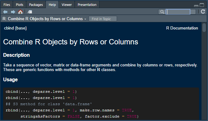
Each help file generally has the same basic format, with the purpose, logic and options available for a function being organized across the following sections:
Description: Provides a brief summary of what a function does.
Usage: Shows you how a function is structured and the defaults for arguments (specified next to ‘=’).
Arguments: Lists all the parameters and arguments the function accepts and explains what each one does. For rbind ‘…’ just means the function can take multiple dataframes, matrices or vectors.
Details: Provides a deeper explanation of how the function works.
Value: Explains what the function returns (outputs). Essential for understanding what you’ll get back when you use the function.
Examples: Shows practical examples of how to use the function with example code. Examples will typically also include any dataframes relevant for reproducing the provided examples.
See Also: Lists related functions.
References: Points to technical literature or sources relevant to the function.
My recommendation is to read R’s help like you might a recipe: focus on the most important sections first and dig into the details as needed. In practice, my suggestion is to start with the Description, Usage and Arguments to get a feel for what the function does, how it’s structured and the options available.
From there, my advice is to go straight to Examples to see how it works. From here you can also copy the code and adjust it to suit your needs.
Vignettes
Some packages also come with their own ‘vignettes’, which provide a general explanation of what the package and its functions do. To view a vignette for a package you can use vignette(‘package_name’). You can also see a list of vignettes available by executing vignette() without mentioning a package.
If you’d like to see how base R and tidyverse approaches compare, you can view a helpful comparison by typing vignette('base') in R.
Handling Errors
Whether you’re a novice or experienced programmer, knowing how to track down, correct and avoid making errors is an important skill: both when designing a methodology and when creating the analysis recipe that executes your plan.
Code errors: in some cases a piece of code might not work, resulting in an error message, such as :
When we’ve forgotten to include a closing bracket at the end of a function.
If we’ve forgot to include ” at the start and end of a string we’re defining.
When we’ve used the wrong capitalization when referencing an object, function or package.
Approach errors: sometimes our code might run perfectly, but it still includes an error.
Maybe we’re interested in calculating the average age of people in our data, but have told R to calculate the median.
Perhaps we want to produce a graph showing the relationship between a person’s height and weight, but have accidentally selected the shoe-size variable.
Data errors: even if our code runs perfectly and our analysis recipe is correct, bad data can mean our results are wrong. This is commonly referred to as the ‘garbage in, garbage out’ (GIGO) problem. For instance:
Maybe missing values are recorded as ‘-9’ in our source data, rather than ‘NA’.
Perhaps the data includes redundant values, such as reporting total population at the national and state level, resulting in us counting people twice in our analysis.
Perhaps there are values that make little sense: such as somebody with a recorded age of 241.
Note: although fatal errors that produce an error message may be discouraging, explicit failures have the advantage of being easier to spot, rectify, and learn from, because R immediately brings the issue to our attention. On the other hand, methodological and data quality errors can be much more dangerous as R will happily (and silently) produce incorrect results if your approach is flawed or your data contains undetected problems.
For this reason, developing good data cleaning and verification practices is essential. Including by checking and visually examining your results at each stages of analysis, implementing sanity checks and seeking peers to review and validate your work.
Strategies for avoiding and troubleshooting errors
Start from the begining: Since R executes code sequentially from top to bottom, adopt a methodical debugging process by trying to run the first ten percent of your code and only moving to the next section once it works (and so on).
Setting Your Working Directory: R needs to know where to look when loading and saving files. You can do this manually be executing the setwd() function, but it recommended you crearte a new R Projects in the directory you’re working from.
Control flow and logic: Remember that to reference an object it needs to exist in R. For instance, before we can produce a plot from a dataset we need to import it into R and assign it an object name using ‘<-’ first.
Spelling and case sensitivity: packages, functions and objects are case sensitive in R, which means it considers max() and MAX() to be completely different functions.
Object Assignment: Use‘<-‘ when assigning values to an object. A good way to think of this is ’<-‘ sends values from the right to whatever object the arrow is pointing to.
Finishing what you started: When starting a function, make sure to end it with ’)“. Similarly, when including a text string in code, make sure to finish and end it with” or ’.
Pause between arguments: remember to separate each argument withing a function with a comma so R knows they’re seperate e.g. mean(dta_vector, rm.na=TRUE).
Referencing variables: Some functions are fussy with how you reference variables and will return an error if you do it in a way they don’t like. For instance, even though dta_example$var_1 and dta_example[, “var_1”] reference the same column, certain functions will only accept one format or the other.
Try to apply logic checks to your analysis: a good approach for identifying potential issues with your analysis is to identify conditions that should be met if the data, code and analysis is correct, for instance:
If we’re estimating the cost of building more schools, the cost should probably be somewhere between zero and the budget available for education (and likely close to what has been spent for similar programs in the past)
If we are calculating a state or region’s population, when we add them together they should be close to the national population
If we are interested in examining how outcomes differ across different sexes we might want to make sure a person’s sex has been consistently recorded across the dataset e.g. not “Male”, “M” and “Man”.
Data Cleaning and Wrangling
Data cleaning and wrangling is about transforming a raw dataset into a format and structure that’s suitable for analysis, modeling and visualization. Although both terms are used interchangeably and describe similar steps, for the sake of clarity:
Data wrangling is about acuiring raw data and making it suitable for analysis by changing its shape, format and contents. This might involve importing multiple datasets, getting them in the right shape and combining information from both into a single dataframe.
Data cleaningis about improving the quality and reliability of data by identifying and correcting errors and inconsistencies, and removing unnecessary data. In practice this might mean dropping observations that are inaccurate, transforming variables into the right format or relabeling variables so they consistent.
One of the reasons for the terms being used interchangeably is that data wrangling and cleaning can’t be easily separated in practice. You might discover merged columns while reshaping data, or find structural issues during cleaning.
Data Cleaning and Policy Analysis
In the context of applied policy analysis, effective data wrangling is about ensuring that the quality, accuracy and usefulness of a dataset is optimized for the task at hand. Data preparation can also directly influence policy outcomes as inadequately wrangled data not only complicates analysis but can also result in misleading, inaccurate or harmful policy advice. As no matter how sophisticated the analytical technique, they cannot compensate for poor quality data.1
This matters because data preparation dominates analytical work:
“Data scientists, according to interviews and expert estimates, spend 50 percent to 80 percent of their time mired in the mundane labor of collecting and preparing unruly digital data, before it can be explored for useful nuggets.”
Lucky for us, many of the packages available in the tidyverse have been specifically designed to make data wrangling less cumbersome, with packages like readr, dplyr, tidyr, and stringr providing a variety of functions for importing, cleaning and reshaping data so it’s ready to be analyzed and visualized.
Data Quality
Data cleaning is the process of identifying and correcting corrupt, inaccurate, or irrelevant data from a dataset in the interest of making it easier to work with and improving its quality.
| Property | Description | Example |
|---|---|---|
| Accurate | Data should reflect true values and be free from errors or duplication. | Correcting spelling errors in the names of cities used in regional analysis. |
| Complete | Necessary values are present. | Using date of birth values to populate missing age values. |
| Consistent | Data should be uniform and adhere to the same format and standards throughout the dataset. | Using the same date format (e.g., YYYY-MM-DD) across all records / the same definition for assigning observations to categories. |
| Format | Each object and/or variable should be stored in the correct format. | Storing dates as actual date values rather than text strings to properly analyze treatment timelines and wait times. |
| Relevant | Data should be pertinent to the analysis, with irrelevant data potentially removed. | Excluding personally identifiable information that is irrelevant to the analysis and/or is unethical to retain. |
| Scale | Variables should be appropriately transformed if needed for analysis. | Transforming GDP to GDP per-capita to allow better comparisons across different economic regions. |
| Shape | Data should be organized in a shape and format suitable for analysis. | Organizing emissions data in a ‘tidy’ format to allow comparison of policy interventions across different jurisdictions. |
| Valid | Data, and relationships between data, should conform to relevant rules or constraints. | Ensuring budget subtotals align with budget totals when added together. |
Some Rules of Thumb
One way to judge the quality of our data and results is to identify validation checks by considering what would the data and/or results look like if they’re right?:
Do variables and/or our results fall within plausible boundaries?
- Is our estimated cost for a budget program plausible (e.g. >$0)?
- Are unemployment rates between zero and 100 percent?
Do the relationships between variables make sense?
- Do subtotals add to totals?
- Is employment ≤ the total labour force?
Do unexpected breaks or patterns emerge in our results?
- Do regular seasonal patterns continue consistently over time?
- Does the scale of a variable unexpectedly change over time?
Are findings sensitive to minor changes in our approach, assumptions and/or input data?
- Does the impact of a policy intervention change dramatically with relatively minor changes to our assumptions?
- Are conclusions affected by outlier removal or different treatments of missing data?
Do estimated effects align with theoretical expectations and relevant literature?
- Are estimates within ranges reported in similar studies?
- Are relationships consistent with established economic and/or behavioral principles?
Note: When working with data it’s a good idea to document all data cleaning procedures using R scripts, rather than directly making modifications to the data file that can’t be traced. Well-documented code creates a reproducible audit trail which can be helpful if you to retrace your steps or explain your methodology later. This can also make your findings more credible by making the entire data preparation and analysis pipeline transparent and reproducible.
Getting to Know Your Data
R works best with tidy data: each row an observation, each column a variable, each cell a single value. But data preparation goes beyond looking at the structure and shape of a dataset to understanding its quality and suitability for analysis.
When starting with a new dataset, it’s helpful to run through a series of diagnostic questions to understand what you’re working with and identify potential issues. These questions help you assess the current state of your data and determine what cleaning and wrangling steps might be needed.
The table below provides a brief summary of the types of questions each function can help us answer:
| Question | Purpose | Useful Functions |
|---|---|---|
| What shape is the data? | Determine if (and how) the data needs to be transformed to a tidy format | dim(), str() |
| How many observations and variables does the dataset contain? | Understand the scope and complexity of dataset | nrow(), ncol(), dim() |
| Are variables well-labeled and in the proper format? | Ensure variables are correctly classified e.g. numeric, factor, character, etc. | str(), class(), summary() |
| What type of data do variables contain? | Understand what values look like for each variable and what they imply about what’s being measured | str(), head(), tail() |
| Are values consistently formatted? | Check for standardization in how values have been coded e.g. consistently using ‘Male’ or ‘Female’ for gender | unique(), table() |
| Do the values look accurate? | Identify implausible values or outliers, such as subtotals exceeding relevant totals, extreme / erroneous values etc. | summary(), boxplot(), hist(), plot() |
| Are there missing values and properly recognized? | Assess data completeness and R’s handling of NA values | is.na(), sum(is.na()), summary() |
Class Conversion
The R language is designed around a set of structures that make statistical analysis, modelling and visualization possible, such as objects (like dataframes) and vectors (or variables). The class() function can be used to view the class of a structure, such as an object or set of values. RStudio will also present the class of structures in the Environment pane.
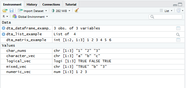
Each structure has its own set of properties that define the type of information it can hold, its format and compatibility with certain types of analysis. Matrices and dataframes provide a simple example of this, with matrices requiring that all columns store information of the same type unlike dataframes that can have columns with different data types. Some functions only work with specific object and vector types; for example, it’s not possible to use mean() on text data.
Because classes change the utility of objects and vectors it’s sometimes necessary that we convert its class to suit our analysis. In R, this is referred to as conversion or coercion and comes in two main flavors:
Implicit: implicit conversion occurs when R automatically makes the conversion for us. This is usually done silently in a way that avoids losing information. Notice in the code below that
mixed_vecis implicitly coerced into the character class by R, despite it being comprised of logical, text and numeric values, to avoid losing information.Explicit: explicit conversion occurs when we directly converts a structure from one class to another, such as from a matrix to a dataframe or a text vector to numeric. Because R will normally try to pick a suitable class by default, explicit coercion will sometimes result in us losing information. R will normally warn us when this occurs by displaying
NAs introduced by coercion. You can see an example of this in the code below.
# Mixed vector (converts to character)
mixed_vec <- c(TRUE, "b", 3)

#(Notice that it's implicitly coerced to character)
class(mixed_vec)
[1] "character"#(and that attempting to explicitely convert its class introduces NAs)
as.numeric(mixed_vec)[1] NA NA 3Whether to convert the class of a variable or object will depend on whether it will be useful for your analysis. For example, you might leave a ‘date’ variable as a character type if you won’t perform date-based operations. Similarly, numeric variables like customer IDs that don’t convey meaningful order or scale might be just as useful as a character as an integer.
Converting Objects
The code below provides a number of simple examples of converting between different vector and object classes. Notice that in base R conversion is usually performed by providing the vector or object to a function with the format as.new_class() such as as.character(), as.factor(), as.data.frame() etc. Some packages in the tidyverse have their own functions for coercing objects and vectors into a specific type, such as as_factor (forcats), as_tibble() (tibble) and as_data() (lubridate).
# Create different vector types
numeric_vec <- c(1, 2, 3)

# logical
logical_vec <- c(TRUE, FALSE, TRUE)

# Character
character_vec <- c("a", "b", "c")

# Numbers stored as strings
char_nums <- c("1", "2", "3")

# Create matrix
dta_matrix_example <- matrix(1:6, nrow = 2)

# Create data frame
dta_dataframe_example <- data.frame(
    numbers = numeric_vec,
    text = character_vec,
    logical= logical_vec)

#create a list
dta_list_example <- list(
    numbers = numeric_vec,
    text = character_vec,
    matrix = dta_matrix_example,
    dataframe = dta_dataframe_example)
The code below demonstrates converting an object from one class to another. Notices that when the matrix is converted to a dataframe its contents remain numeric, but when we convert the dataframe to a matrix every element is converted to a string. This reflects the fact that a matrix object can only store elements of one class, but each column of a dataframe can be a different class. As a rule, R will generally coerce values to text strings if there is a risk of losing information.
Finally, notice that we’ve excluded the matrix object when converting the list to a dataframe. This is done using the subset syntax dta_list_example[-3], with [-3] telling R to exclude the third object in the list (the matrix). If we don’t do this and just execute as.data.frame(dta_list_example) R will return an error message to let us know something went wrong. In this case, this is because the matrix object has a different number of rows to other items stored in the list:
# Matrix to Data Frame
as.data.frame(dta_matrix_example)
V1 V2 V3
1 1 3 5
2 2 4 6# Dataframe ot matrix
as.matrix(dta_dataframe_example) numbers text logical
[1,] "1" "a" "TRUE"
[2,] "2" "b" "FALSE"
[3,] "3" "c" "TRUE" # List to Data Frame
as.data.frame(dta_list_example[-3]) numbers text dataframe.numbers dataframe.text dataframe.logical
1 1 a 1 a TRUE
2 2 b 2 b FALSE
3 3 c 3 c TRUEA summary of useful object coercion functions is provided below:
| Use Case(s) | Notes | |
|---|---|---|
as.data.frame() |
Converting a matrix of survey responses into a data frame to allow columns to have different classes and variable labels. | All elements provided to the function must have equal length. If a list is supplied, each element will be converted to a column in the data frame. When a matrix is provided to the function each column is converted separately. |
as.matrix() |
Converting a dataframe into a matrix to perform matrix operations and/or applying linear algebra transformations | All elements will be coerced to a single type, with mixed numeric and character data defaulting to character to prevent information loss. |
as.list() |
Creating a list structure to compactly store different datasets and outputs in a single object. | This conversion works with most R objects and preserves the internal structure of complex objects like data frames and models. |
Converting Vectors
The code below demonstrates the conversion of each of the vectors to a new class. In this case we haven’t saved the results, but could do so using the ‘<-’ operator:
# Character to Numeric
as.numeric(char_nums)
[1] 1 2 3# Numeric to Character
as.character(numeric_vec) [1] "1" "2" "3"# Factor Conversions
as.factor(character_vec) [1] a b c
Levels: a b c# Converting when classes are mixed
as.numeric(mixed_vec)[1] NA NA 3Some of the most useful functions for coercing vectors has been outlined in the table below:
| Function | Example Use Case | Notes |
|---|---|---|
as.numeric() |
Converting data stored as character strings (such as “19.99”) into numeric values. This is sometimes required to allow mathematical operations like calculating summary statistics. | R will attempt to coerce elements into numbers. Where it isn’t able to do so for a value, it will return NA values. |
as.character() |
Converting values to character strings. | This conversion always succeeds and avoids losing information from the source data. |
as.factor() |
Converting character labels into categorical groupings. Factors are a more efficient way to store labels and are designed to be easier to work with in R for modelling, statistical analysis and data visualization. | Factor levels are created alphabetically by default unless explicitly ordered. forcats’ as_factor() is a useful alternative. |
as.logical() |
Converting numeric indicators coded as 0 and 1 into logical TRUE/FALSE values. | Zero values become FALSE while all non-zero values become TRUE. The function should correctly coerce the character strings “TRUE” and “FALSE” into their logical equivalent. |
as.integer() |
Converting continuous numeric data into integers. | Decimal portions are truncated rather than rounded, making 4.9 become 4. |
as.Date() |
Converting character date strings into values with a Date class. This enables chronological sorting, time series analysis and date/time arithmetic. | Non-standard date formats require explicit format specification to be coerced. lubridate’s as_date() function is a useful alternative that’s often easier to work with. |
Binding and Joining Data
Binding and joining dataframes describes the process of adding additional observations or variables from one dataframe to another. Maybe new data has come in and we want to add new observations (rows) to our existing dataframe. Or perhaps we have two dataframes with different variables (columns) that we would like to combine into one. In most cases a common key is needed across the dataframes so R knows where values from one dataframe should be added to the other.
R provides two functions for combining dataframes: cbind() combines separate dataframes side by side (adding columns), while rbind() stacks them on top of each other (adding rows). Both functions will attempt to join the dataframes in a way that places values in the correct place. For instance, rbind(dta_data_1,dta_data_2) will join the two dataframes together by matching up their variable names. Whereas cbind(dta_data_1,dta_data_2) will add columns from the first dataframe to the second based on its row number.
Binding (stacking) dataframes:
Binding adds observations from one dataset to another. In most cases this is done by stacking the two dataframes on top of one another based on the column names.
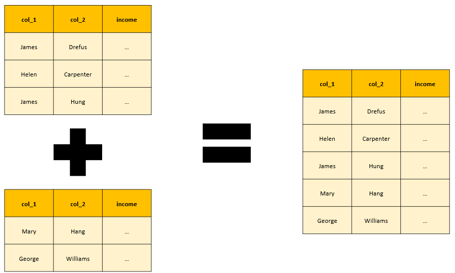
# Example of binding
dta_df1 <- data.frame(
    name = c("Alice", "Bob"),
    age = c(25, 30)
)

dta_df2 <- data.frame(
    name = c("Charlie", "David"),
    age = c(35, 40)
)
# Bind rows (base)
dta_df1_and_df2 <- rbind(dta_df1, dta_df2)

# Bind rows (dplyr)
library(dplyr)
dta_df1_and_df2 <- bind_rows(dta_df1, dta_df2)
Merging dataframes:
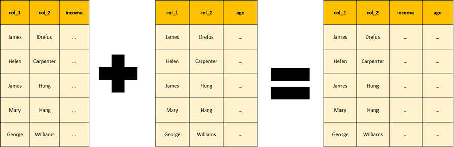
joining or ‘merging’ datframes describes the process of adding variables from one dataframe to another. To ensure values are placed in the correct location a common ‘key’ is used across dataframes. In the example below the location of values is based on matching the names recorded in col_1 and col_2.
| Join Type | Description |
|---|---|
left_join() |
Keep all observations from the left dataframe i.e. the first dataframe specified in the function |
right_join() |
Keep all observations from the right dataframe i.e the second dataframe specified in the function. |
inner_join() |
Keep only matching observations from both dataframes |
full_join() |
Keep all observations from both dataframes |
Note: the left_join() function automatically looks for common variable names across the data frames being merged, but these case also be specified explicitly using the ‘by’ argument.
# Example of merging
dta_df1 <- data.frame(
    name = c("Alice", "Bob"),
    age = c(25, 30)
)

dta_df2 <- data.frame(
    name = c("Alice", "Bob"),
    income = c(50000, 60000)
)
# Merge by common name (base)
dta_joined_df1_and_df2 <- merge(dta_df1, dta_df2, by = "name")

library(dplyr)
# Merge by common name (dplyr)
dta_joined_df1_and_df2 <- left_join(dta_df1, dta_df2, by = "name")
Selecting, Filtering and Subsetting Data
Usually when we work with data we’ll be interested in examining a specific set of observations or variables rather than the entire dataset. Perhaps we want to drop missing values, identify unusual values or focus our analysis on specific observations in a dataset. We’ll generally use the following terms to describe selecting (or subsetting) specific parts of a dataset:
Selecting: refers to the process of selecting specific variables within a dataset, such as the variables we’re interested to analyze.
Filtering: relates to selecting specific observations from a dataset based on the value of one or more variable. For instance, we might want to focus on larger regions by filtering observations based on the population variable.
Subsetting: Is a general term used to describe selecting specific variables and/or filtering observations.
Selecting Variables
Base R
The $ operator can be used to select a variable from a dataframe. In the code below notice that $ is used to select the Wages variable in the dataframe dta_wheat_prices_and_wages.
library(HistData)

#get data from the HistData package
dta_wheat_prices_and_wages<-Wheat

#return values from the Wages variable:
dta_wheat_prices_and_wages$Wages
[1] 5.00 5.05 5.08 5.12 5.15 5.25 5.54 5.61 5.69 5.78 5.94 6.01
[13] 6.12 6.22 6.30 6.37 6.45 6.50 6.60 6.75 6.80 6.90 7.00 7.30
[25] 7.60 8.00 8.50 9.00 10.00 11.00 11.75 12.50 13.00 13.30 13.60 14.00
[37] 14.50 15.00 15.70 16.50 17.60 18.50 19.50 21.00 23.00 25.50 27.50 28.50
[49] 29.50 30.00 NA NA NA[] can also be used to select variables by specifying the name(s) we’re interested in. Notice in the code below that the expression takes the format object_name[rows, columns]:
#return values from the Wages variable:
dta_wheat_prices_and_wages[,"Wages"]
[1] 5.00 5.05 5.08 5.12 5.15 5.25 5.54 5.61 5.69 5.78 5.94 6.01
[13] 6.12 6.22 6.30 6.37 6.45 6.50 6.60 6.75 6.80 6.90 7.00 7.30
[25] 7.60 8.00 8.50 9.00 10.00 11.00 11.75 12.50 13.00 13.30 13.60 14.00
[37] 14.50 15.00 15.70 16.50 17.60 18.50 19.50 21.00 23.00 25.50 27.50 28.50
[49] 29.50 30.00 NA NA NA#return values from the year and Wages variable:
dta_wheat_prices_and_wages[,c("Year", "Wages")] Year Wages
1 1565 5.00
2 1570 5.05
3 1575 5.08
4 1580 5.12
5 1585 5.15
6 1590 5.25
7 1595 5.54
8 1600 5.61
9 1605 5.69
10 1610 5.78
11 1615 5.94
12 1620 6.01
13 1625 6.12
14 1630 6.22
15 1635 6.30
16 1640 6.37
17 1645 6.45
18 1650 6.50
19 1655 6.60
20 1660 6.75
21 1665 6.80
22 1670 6.90
23 1675 7.00
24 1680 7.30
25 1685 7.60
26 1690 8.00
27 1695 8.50
28 1700 9.00
29 1705 10.00
30 1710 11.00
31 1715 11.75
32 1720 12.50
33 1725 13.00
34 1730 13.30
35 1735 13.60
36 1740 14.00
37 1745 14.50
38 1750 15.00
39 1755 15.70
40 1760 16.50
41 1765 17.60
42 1770 18.50
43 1775 19.50
44 1780 21.00
45 1785 23.00
46 1790 25.50
47 1795 27.50
48 1800 28.50
49 1805 29.50
50 1810 30.00
51 1815 NA
52 1820 NA
53 1821 NAdplyr
select() from the dplyr package can also be used to to select specific variables from a dataframe. Aside from being easier to read than $, select() has an intuitive grammer for specifying which variables to include (or exclude):
#load the dplyr package for the select() function
library(dplyr)

#return values from the Wages variable:
select(dta_wheat_prices_and_wages,Wages)
Wages
1 5.00
2 5.05
3 5.08
4 5.12
5 5.15
6 5.25
7 5.54
8 5.61
9 5.69
10 5.78
11 5.94
12 6.01
13 6.12
14 6.22
15 6.30
16 6.37
17 6.45
18 6.50
19 6.60
20 6.75
21 6.80
22 6.90
23 7.00
24 7.30
25 7.60
26 8.00
27 8.50
28 9.00
29 10.00
30 11.00
31 11.75
32 12.50
33 13.00
34 13.30
35 13.60
36 14.00
37 14.50
38 15.00
39 15.70
40 16.50
41 17.60
42 18.50
43 19.50
44 21.00
45 23.00
46 25.50
47 27.50
48 28.50
49 29.50
50 30.00
51 NA
52 NA
53 NA#return values from Year and the Wages variable:
select(dta_wheat_prices_and_wages,Year, Wages) Year Wages
1 1565 5.00
2 1570 5.05
3 1575 5.08
4 1580 5.12
5 1585 5.15
6 1590 5.25
7 1595 5.54
8 1600 5.61
9 1605 5.69
10 1610 5.78
11 1615 5.94
12 1620 6.01
13 1625 6.12
14 1630 6.22
15 1635 6.30
16 1640 6.37
17 1645 6.45
18 1650 6.50
19 1655 6.60
20 1660 6.75
21 1665 6.80
22 1670 6.90
23 1675 7.00
24 1680 7.30
25 1685 7.60
26 1690 8.00
27 1695 8.50
28 1700 9.00
29 1705 10.00
30 1710 11.00
31 1715 11.75
32 1720 12.50
33 1725 13.00
34 1730 13.30
35 1735 13.60
36 1740 14.00
37 1745 14.50
38 1750 15.00
39 1755 15.70
40 1760 16.50
41 1765 17.60
42 1770 18.50
43 1775 19.50
44 1780 21.00
45 1785 23.00
46 1790 25.50
47 1795 27.50
48 1800 28.50
49 1805 29.50
50 1810 30.00
51 1815 NA
52 1820 NA
53 1821 NA#return values from Year and the Wages variable by excluding Wheat variable:
select(dta_wheat_prices_and_wages,-Wheat) Year Wages
1 1565 5.00
2 1570 5.05
3 1575 5.08
4 1580 5.12
5 1585 5.15
6 1590 5.25
7 1595 5.54
8 1600 5.61
9 1605 5.69
10 1610 5.78
11 1615 5.94
12 1620 6.01
13 1625 6.12
14 1630 6.22
15 1635 6.30
16 1640 6.37
17 1645 6.45
18 1650 6.50
19 1655 6.60
20 1660 6.75
21 1665 6.80
22 1670 6.90
23 1675 7.00
24 1680 7.30
25 1685 7.60
26 1690 8.00
27 1695 8.50
28 1700 9.00
29 1705 10.00
30 1710 11.00
31 1715 11.75
32 1720 12.50
33 1725 13.00
34 1730 13.30
35 1735 13.60
36 1740 14.00
37 1745 14.50
38 1750 15.00
39 1755 15.70
40 1760 16.50
41 1765 17.60
42 1770 18.50
43 1775 19.50
44 1780 21.00
45 1785 23.00
46 1790 25.50
47 1795 27.50
48 1800 28.50
49 1805 29.50
50 1810 30.00
51 1815 NA
52 1820 NA
53 1821 NASelection Helpers
Variables can also be selected in select() using a series of selection helpers that look for patterns in variable names, such as:
starts_with(): Select variables that start with a prefix.ends_with(): Select variables that end with a suffix.contains(): Select variables that contiain a particular string.
Examples of how to apply these selection helpers is provided in the code below. Additional selection helpers are available in select()’s help file.
#starts_with()
select(dta_wheat_prices_and_wages,-starts_with("Wh"))
Year Wages
1 1565 5.00
2 1570 5.05
3 1575 5.08
4 1580 5.12
5 1585 5.15
6 1590 5.25
7 1595 5.54
8 1600 5.61
9 1605 5.69
10 1610 5.78
11 1615 5.94
12 1620 6.01
13 1625 6.12
14 1630 6.22
15 1635 6.30
16 1640 6.37
17 1645 6.45
18 1650 6.50
19 1655 6.60
20 1660 6.75
21 1665 6.80
22 1670 6.90
23 1675 7.00
24 1680 7.30
25 1685 7.60
26 1690 8.00
27 1695 8.50
28 1700 9.00
29 1705 10.00
30 1710 11.00
31 1715 11.75
32 1720 12.50
33 1725 13.00
34 1730 13.30
35 1735 13.60
36 1740 14.00
37 1745 14.50
38 1750 15.00
39 1755 15.70
40 1760 16.50
41 1765 17.60
42 1770 18.50
43 1775 19.50
44 1780 21.00
45 1785 23.00
46 1790 25.50
47 1795 27.50
48 1800 28.50
49 1805 29.50
50 1810 30.00
51 1815 NA
52 1820 NA
53 1821 NA#ends_with()
select(dta_wheat_prices_and_wages,ends_with("eat")) Wheat
1 41.0
2 45.0
3 42.0
4 49.0
5 41.5
6 47.0
7 64.0
8 27.0
9 33.0
10 32.0
11 33.0
12 35.0
13 33.0
14 45.0
15 33.0
16 39.0
17 53.0
18 42.0
19 40.5
20 46.5
21 32.0
22 37.0
23 43.0
24 35.0
25 27.0
26 40.0
27 50.0
28 30.0
29 32.0
30 44.0
31 33.0
32 29.0
33 39.0
34 26.0
35 32.0
36 27.0
37 27.5
38 31.0
39 35.5
40 31.0
41 43.0
42 47.0
43 44.0
44 46.0
45 42.0
46 47.5
47 76.0
48 79.0
49 81.0
50 99.0
51 78.0
52 54.0
53 54.0#contains():
select(dta_wheat_prices_and_wages,contains("age")) Wages
1 5.00
2 5.05
3 5.08
4 5.12
5 5.15
6 5.25
7 5.54
8 5.61
9 5.69
10 5.78
11 5.94
12 6.01
13 6.12
14 6.22
15 6.30
16 6.37
17 6.45
18 6.50
19 6.60
20 6.75
21 6.80
22 6.90
23 7.00
24 7.30
25 7.60
26 8.00
27 8.50
28 9.00
29 10.00
30 11.00
31 11.75
32 12.50
33 13.00
34 13.30
35 13.60
36 14.00
37 14.50
38 15.00
39 15.70
40 16.50
41 17.60
42 18.50
43 19.50
44 21.00
45 23.00
46 25.50
47 27.50
48 28.50
49 29.50
50 30.00
51 NA
52 NA
53 NABecause R directly outputs the results it’s possible to directly provide them to other functions, provided they’re in a format the function expects. For example, to calculate the median value for Year we could use median(dta_wheat_prices_and_wages$Year). However, because select() returns a dataframe to we’d need to first extract the values using pull() before providing it to median().
#Base R
median(dta_wheat_prices_and_wages$Year)
[1] 1695#dplyr (with pipes):
select(dta_wheat_prices_and_wages,Year) |>
pull() |>
median()[1] 1695#dplyr (without pipes)
median(pull(select(dta_wheat_prices_and_wages,Year)))[1] 1695Filtering Observations
Base R:
[] can be used to select specific observations by selecting the rows we’re interested in the format object_name[rows, columns] for a dataframe or vector_name[rows] for a variable (or vector). For instance:
Filtering by observation number: To return the 22nd observation for all variables in a dataframe you can execute
dta_wheat_prices_and_wages[22,]. The-operator can also be used to return everything but the 22nd row:dta_wheat_prices_and_wages[-22,]Filtering by observation range: The same notation can be used to return a series of rows, for instance
dta_wheat_prices_and_wages[5:22,]will return observations from row 5 to 22.Filtering by condition: To filter by condition
[] can be adapted to take the form[logical condition(s) to test,]Although this can be confusing for newcomers, the key thing to understand is that the logical test (s) provided to[] need to be a series ofTRUEandFALSE, such as returned bydta_wheat_prices_and_wages$Year>1700. This can then be directly specified in the[]notation to return observations in the dataframe that meet this condition:dta_wheat_prices_and_wages[dta_wheat_prices_and_wages$Year>1700,]
The code below provides another demonstration of how [] can be applied in practice. Notice in the example below either row numbers or logical values can be used to specify which rows to return (or exclude):
#save an object with the value 22
ref_row_no<-22

#return the specified row
dta_wheat_prices_and_wages[ref_row_no,]
Year Wheat Wages
22 1670 37 6.9#same, but without the saved object
dta_wheat_prices_and_wages[22,] Year Wheat Wages
22 1670 37 6.9#save an object with the numbers 53 to 1
ref_row_no_reverse<-53:1
#return data in reverse order via row numbers
dta_wheat_prices_and_wages[ref_row_no_reverse,] Year Wheat Wages
53 1821 54.0 NA
52 1820 54.0 NA
51 1815 78.0 NA
50 1810 99.0 30.00
49 1805 81.0 29.50
48 1800 79.0 28.50
47 1795 76.0 27.50
46 1790 47.5 25.50
45 1785 42.0 23.00
44 1780 46.0 21.00
43 1775 44.0 19.50
42 1770 47.0 18.50
41 1765 43.0 17.60
40 1760 31.0 16.50
39 1755 35.5 15.70
38 1750 31.0 15.00
37 1745 27.5 14.50
36 1740 27.0 14.00
35 1735 32.0 13.60
34 1730 26.0 13.30
33 1725 39.0 13.00
32 1720 29.0 12.50
31 1715 33.0 11.75
30 1710 44.0 11.00
29 1705 32.0 10.00
28 1700 30.0 9.00
27 1695 50.0 8.50
26 1690 40.0 8.00
25 1685 27.0 7.60
24 1680 35.0 7.30
23 1675 43.0 7.00
22 1670 37.0 6.90
21 1665 32.0 6.80
20 1660 46.5 6.75
19 1655 40.5 6.60
18 1650 42.0 6.50
17 1645 53.0 6.45
16 1640 39.0 6.37
15 1635 33.0 6.30
14 1630 45.0 6.22
13 1625 33.0 6.12
12 1620 35.0 6.01
11 1615 33.0 5.94
10 1610 32.0 5.78
9 1605 33.0 5.69
8 1600 27.0 5.61
7 1595 64.0 5.54
6 1590 47.0 5.25
5 1585 41.5 5.15
4 1580 49.0 5.12
3 1575 42.0 5.08
2 1570 45.0 5.05
1 1565 41.0 5.00#return ever second value using TRUE and FALSE
#(notice that the vector c(TRUE, FALSE) is repeated across all observations)
dta_wheat_prices_and_wages[c(TRUE,FALSE),] Year Wheat Wages
1 1565 41.0 5.00
3 1575 42.0 5.08
5 1585 41.5 5.15
7 1595 64.0 5.54
9 1605 33.0 5.69
11 1615 33.0 5.94
13 1625 33.0 6.12
15 1635 33.0 6.30
17 1645 53.0 6.45
19 1655 40.5 6.60
21 1665 32.0 6.80
23 1675 43.0 7.00
25 1685 27.0 7.60
27 1695 50.0 8.50
29 1705 32.0 10.00
31 1715 33.0 11.75
33 1725 39.0 13.00
35 1735 32.0 13.60
37 1745 27.5 14.50
39 1755 35.5 15.70
41 1765 43.0 17.60
43 1775 44.0 19.50
45 1785 42.0 23.00
47 1795 76.0 27.50
49 1805 81.0 29.50
51 1815 78.0 NA
53 1821 54.0 NA#test logical condition
rlt_logical_test<-dta_wheat_prices_and_wages$Year>1700
#return values that pass logical test (i.e. where the value is TRUE)
dta_wheat_prices_and_wages[rlt_logical_test,] Year Wheat Wages
29 1705 32.0 10.00
30 1710 44.0 11.00
31 1715 33.0 11.75
32 1720 29.0 12.50
33 1725 39.0 13.00
34 1730 26.0 13.30
35 1735 32.0 13.60
36 1740 27.0 14.00
37 1745 27.5 14.50
38 1750 31.0 15.00
39 1755 35.5 15.70
40 1760 31.0 16.50
41 1765 43.0 17.60
42 1770 47.0 18.50
43 1775 44.0 19.50
44 1780 46.0 21.00
45 1785 42.0 23.00
46 1790 47.5 25.50
47 1795 76.0 27.50
48 1800 79.0 28.50
49 1805 81.0 29.50
50 1810 99.0 30.00
51 1815 78.0 NA
52 1820 54.0 NA
53 1821 54.0 NASubsetting with []
Because [] can be used to select specific variables and observations, it’s also possible to use the notation for subsetting a dataframe, such as selecting the 22nd observation for the Wages variable dta_wheat_prices_and_wages[22,"Wages"]. dplyr’s filter() and select() can also be combined to achieve the same result:
#without pipes
filter(select(dta_wheat_prices_and_wages,Wages),row_number()==22)
Wages
1 6.9#with pipes
dta_wheat_prices_and_wages |>
select(Wages) |>
filter(row_number()==22) Wages
1 6.9dplyr
The dplyr filter() function can also be used to select observations based on conditions. It uses a similar format to select(), but requires that we specify the condition to use when selecting observations:
#using filter to select the 22nd row:
filter(dta_wheat_prices_and_wages, row_number() == 22)
Year Wheat Wages
1 1670 37 6.9#or to return values based on the results of a logical test:
filter(dta_wheat_prices_and_wages, Year >1700) Year Wheat Wages
1 1705 32.0 10.00
2 1710 44.0 11.00
3 1715 33.0 11.75
4 1720 29.0 12.50
5 1725 39.0 13.00
6 1730 26.0 13.30
7 1735 32.0 13.60
8 1740 27.0 14.00
9 1745 27.5 14.50
10 1750 31.0 15.00
11 1755 35.5 15.70
12 1760 31.0 16.50
13 1765 43.0 17.60
14 1770 47.0 18.50
15 1775 44.0 19.50
16 1780 46.0 21.00
17 1785 42.0 23.00
18 1790 47.5 25.50
19 1795 76.0 27.50
20 1800 79.0 28.50
21 1805 81.0 29.50
22 1810 99.0 30.00
23 1815 78.0 NA
24 1820 54.0 NA
25 1821 54.0 NA#it's also possible to directly provide it a vector of results like [,]:
filter(dta_wheat_prices_and_wages,rlt_logical_test) Year Wheat Wages
1 1705 32.0 10.00
2 1710 44.0 11.00
3 1715 33.0 11.75
4 1720 29.0 12.50
5 1725 39.0 13.00
6 1730 26.0 13.30
7 1735 32.0 13.60
8 1740 27.0 14.00
9 1745 27.5 14.50
10 1750 31.0 15.00
11 1755 35.5 15.70
12 1760 31.0 16.50
13 1765 43.0 17.60
14 1770 47.0 18.50
15 1775 44.0 19.50
16 1780 46.0 21.00
17 1785 42.0 23.00
18 1790 47.5 25.50
19 1795 76.0 27.50
20 1800 79.0 28.50
21 1805 81.0 29.50
22 1810 99.0 30.00
23 1815 78.0 NA
24 1820 54.0 NA
25 1821 54.0 NA#and testing multiple conditions at once:
filter(dta_wheat_prices_and_wages,
Year >1700,
Wages<27) Year Wheat Wages
1 1705 32.0 10.00
2 1710 44.0 11.00
3 1715 33.0 11.75
4 1720 29.0 12.50
5 1725 39.0 13.00
6 1730 26.0 13.30
7 1735 32.0 13.60
8 1740 27.0 14.00
9 1745 27.5 14.50
10 1750 31.0 15.00
11 1755 35.5 15.70
12 1760 31.0 16.50
13 1765 43.0 17.60
14 1770 47.0 18.50
15 1775 44.0 19.50
16 1780 46.0 21.00
17 1785 42.0 23.00
18 1790 47.5 25.50Renaming Variables
Variable names are automatically assigned when importing data into R. Although their format will depend on the format of the data and function used, in most cases it’s assumed the first observation in a column of data is the variable name. This will then be coerced into suitable format for R, such as ensuring it begins with a letter and excludes special characters and symbols, like @, *, / (etc).
Base R
To access variable names for a dataframe you can use the names() function. Notice in the example below this returns a collection of strings with a name for each variable, which can be overwritten using <-:
library(HistData)
#get data from the HistData package
dta_wheat_prices_and_wages<-Wheat

#to display all names
names(dta_wheat_prices_and_wages)
[1] "Year" "Wheat" "Wages"#to display the second name
names(dta_wheat_prices_and_wages)[2][1] "Wheat"#to rename the first name
names(dta_wheat_prices_and_wages)[1]<-"year"
#check the result:
names(dta_wheat_prices_and_wages)[1] "year" "Wheat" "Wages"dplyr
The dplyr package also has a function to simplify renaming variables called rename(), which provides a simpler and easier to read interface than base R. Because rename()’s new_name = old_name syntax is relatively intuitive it usually results in more readable code. Particularly when renaming more than two variables at once:
#save the data again
dta_wheat_prices_and_wages<-Wheat
#renaming with the tidyverse via dplyr
library(dplyr)
dta_wheat_prices_and_wages<-rename(dta_wheat_prices_and_wages,
       wages=Wages,
       wheat=Wheat,
       year=Year)
clean_names()
The janitor package also includes a dedicated function for standardizing the format of variable names called clean_names(). To minimize the need to make manual adjustments later, I recommend applying this function immediately after your data is imported. Notice the example below achieves the same result as the dplyr example below, but requires less code to do so:
#load the janitor package
library(janitor)

#Overwrite the dataframe with the data from the HistData package
dta_wheat_prices_and_wages<-Wheat

#output the variable names
names(dta_wheat_prices_and_wages)
[1] "Year" "Wheat" "Wages"#clean the names
dta_wheat_prices_and_wages<-clean_names(dta_wheat_prices_and_wages)
#output the variable names
names(dta_wheat_prices_and_wages)[1] "year" "wheat" "wages"Note: make.name() can be used to translate character vectors into valid variable names. The functions documentation also includes additional information on what constitutes a valid name and words that can’t be used for variable names, such as TRUE, FALSE, NA etc (see ?Reserved).
Handling Missing Values
Missing values play an important role in data analysis and statistics. Although it can be safe to ignore missing values, understanding where, how and why missing values have been introduced into a dataset can have important implications for how we collect, clean and analyse a dataset. Missing values are represented as NA (not available) by R:
#create an example dataframe with missing values
dta_example<-data.frame(age = c(32, 24, NA),
                        name = c("Gary", NA, "Susan"))

# Check whether each element in dataframe is NA
is.na(dta_example)
age name
[1,] FALSE FALSE
[2,] FALSE TRUE
[3,] TRUE FALSE#identify the of rows without any nas:
complete.cases(dta_example)[1] TRUE FALSE FALSE#summarize the total number of NA values
table(is.na(dta_example))
FALSE  TRUE
    4     2
Reflecting their important role in statistical analysis, NA values will often be treated differently by functions and operators. The code below provides a simple illustration of this. Notice that the NA value remains missing when we try to multiply it (as you might expect) and that the mean() function will only ignore missing values if it is explicitly told to do so:
#try multiplying each age by 2.5
#(Notice all values are multiplied, but NA doesn't change)
dta_example$age*2.5
[1] 80 60 NA#calculate mean
#(Many functions won't process NA values by default. This behaviour #can be helpful as it ensures you're made aware of missing values)
mean(dta_example$age)[1] NA#You can specify to ignore NA values in many functions
mean(dta_example$age, na.rm = TRUE)[1] 28Although it’s often a good idea to keep a record of where NA values occur, it’s possible to drop missing values by using using base R’s na.omit() or tidyr’s drop_na():
#to drop NAs in base R you can use na.omit()
#(notice it returns rows without missing values across all variables)
na.omit(dta_example)
age name
1 32 Gary#tidyr's drop_na() function works in a similar way to na.omit() but makes it easy to specify which variables to consider when dropping rows with NA values
#load tidyr for drop_na()
library(tidyr)
#drop all rows with missing values
dta_example |> drop_na() age name
1 32 Gary#only drop rows where the name is mising
dta_example |> drop_na(name) age name
1 32 Gary
2 NA SusanWorking With Text Data
Even for an experienced R programmer working with text data can be a challenge. As not only does format and structure of text vary across datasets, but so does the process of extracting information that’s useful for your analysis.
Text strings, and the problems we’d like to solve with them, come in all shapes and sizes. Maybe you have a variable with council names with inconsistent spelling and capitalization that you’d like to standardize. Perhaps you’re interested in guessing somebody’s sex by identifying whether they’ve used the title Mr, Mrs, Master, Ms etc. Or maybe you want to extract information from a transaction id for a government grant programme, such as the date, agency responsible and proejct category. Lucky for us, the stringr package provides a collection of easy-to-use functions designed to tackle the most common problems you’re likely to face when working with text data.
The code below provides a simple example of this using the titanic bio data. In this case, let’s imagine we’re interested in guessing the sex of a passenger and extracting their last name. If you take a look at the name variable notice that most names include similar information: the passenger’s surname, title, first name and middle name. Notice also that they generally take the same format, such that a person’s title comes immediately after a comma and ends with ‘.’. We’ll take advantage of that by combining some useful functions from stringr:
library(readr)
library(dplyr)
library(stringr)

#impoort the passenger bio data
dta_titanic_passengers_bio<-read_csv("./Data/titanic bio data.csv")

#take a look at the name variable
head(dta_titanic_passengers_bio$name)
[1] "Allen, Miss. Elisabeth Walton"
[2] "Allison, Master. Hudson Trevor"
[3] "Allison, Miss. Helen Loraine"
[4] "Allison, Mr. Hudson Joshua Creighton"
[5] "Allison, Mrs. Hudson J C (Bessie Waldo Daniels)"
[6] "Anderson, Mr. Harry" #First, let's identify the position of the first comma, to identify where the
#the surname ends and put this in a new variable:
#(Notice that [,1] ensures the first column from str_locate() is returned.
#1 is subtracted from str_surname_end so the comma isn't returned)
dta_titanic_passengers_bio<-dta_titanic_passengers_bio |>
mutate(str_surname_end= str_locate(name, ",")[,1],
surname= str_sub(name, start=1, end=str_surname_end-1))
#Now, let's repeat this process for the title:
#(Some characters can't be used directly when manipulating strings. For instance, period ('.') is frequently used to mean 'all other variables' when included in a function, which is why we've added \\ beforehand - So R knows what we mean.)
dta_titanic_passengers_bio<-dta_titanic_passengers_bio |>
mutate(str_title_end=str_locate(name, "\\.")[,1],
title=str_sub(name,
start=str_surname_end+1,
end=str_title_end-1),
#clean leading and trailing whitespace
title=str_trim(title))
#if you take a look at the surname and title variables they're looking pretty good. #Now, to guess the sex of the passenger using the title we'll need to specify the sex that should be assigned for each title
table(dta_titanic_passengers_bio$title)
        Capt          Col          Don         Dona           Dr     Jonkheer
           1            4            1            1            8            1
        Lady        Major       Master         Miss         Mlle          Mme
           1            2           61          260            2            1
          Mr          Mrs           Ms          Rev          Sir the Countess
         757          197            2            8            1            1
#for the sake of simplicity, let's focus on the titles that are most likely to
#relate to the passenger's sex:
ref_male_titles <- c("Master", "Mr", "Sir", "Don")
ref_female_titles <- c("Dona", "Lady", "Miss", "Mrs", "Ms", "the Countess")
#now, to apply these in R we'll now combine mutate() with case_when():
dta_titanic_passengers_bio<-dta_titanic_passengers_bio |>
mutate(title_sex= case_when(
title %in% ref_male_titles ~ "Male",
title %in% ref_female_titles ~"Female",
TRUE ~ NA_character_))
#check if it matches the existing sex variable:
#(remember table() omits NAs by default)
table(dta_titanic_passengers_bio$sex,
dta_titanic_passengers_bio$title_sex)
         Female Male
  female    462    0
  male        0  820
Make sure to take a look at the cheatsheets for stringr here. Of particular note is the section on regular expressions, which highlights how to deal with special characters (like ‘.’) and provides an overview of how you can use regex to concisely describe text patterns when working with strings.
Working With Categorical Data
When I first started trying to use R, text variables (or strings) were imported as factors and my computer was powered by pedals. The pedals were easy, but I found factors extremely confusing and sometime infuriating:
“Why is my text data both a number and a string!?”
The answer is relatively simple: factors are typically used for storing categorical labels about an observation. For example, in a labor force survey dataset the level of education might be stored as a factor with a single number assigned to each label: 1 for no post-school qualification, 2 for non-degree post-school qualification and 3 for degree or higher qualification:
dta_qualifications<-factor(
    levels = c(1, 2, 3),
    labels = c(
        "No post-school qualification",
        "Non-degree post-school qualification",
        "Degree or higher qualification"
    ),
    #ordered==TRUE specifies that the levels can be considered as ordered
    #FALSE might be used when the labels have no ranking or order (e.g. Male / Female)
    ordered=TRUE
    )
By assigning each category to an integer, factors provide a more efficient way to store labelled data. Having numbers associated with each label can also be useful for customizing how a variable is presented, such as when producing plots.
The forcats package provides a handy collection of functions for handling factors which are outlined in the cheatsheet here. But, for the most part as_factor(), fct_recode(), fct_relevel(), fct_infreq() and fct_reorder() are a good place to start.
The code below illustrates how as_factor() and fct_recode() can be used to create and manipulate factor variables for categorical data:
library(dplyr)
library(forcats)

#import the GSS data
dta_norc_gss<-read_csv("./Data/NORC - General Social Survey (GSS).csv")

#as_factor() is the tidyverse alternative to as.factor() that assigns levels (labels) in the order that they appear:

# Convert marital status to a factor (preserves existing order)
dta_norc_gss <- dta_norc_gss |>
  mutate(marital = as_factor(marital))

# Check levels - they appear in order of first appearance in data
levels(dta_norc_gss$marital)
[1] "Never married" "Divorced" "Widowed" "Married"
[5] "Separated" "No answer" #fct_recode() can also be handy when were're interested in changing the assigned labels, such as the example below that simplifies the marital status labels
dta_norc_gss <- dta_norc_gss |>
mutate(marital_simple = as_factor(marital) |>
fct_recode(
"Single" = "Never married",
"Married" = "Married",
"Previously married" = "Divorced",
"Previously married" = "Widowed",
"Previously married" = "Separated"
))
#view the simplified version of the labels
levels(dta_norc_gss$marital_simple)[1] "Single" "Previously married" "Married"
[4] "No answer" Often, the challenge of working with factors presents itself when we’re trying to present our results. fct_relevel(), fct_infreq() and fct_reorder() are great functions to help with this, with each function providing an intuitive way to order categories in a way that makes sense for the story we’re trying to tell:
#fnc_relevel() is a handy way to change the order of labels (leves) in a factor

# Put "Married" first
dta_norc_gss <- dta_norc_gss |>
  mutate(marital = fct_relevel(marital,
                                "Married",
                                "Never married"))
# Check new order
levels(dta_norc_gss$marital)
[1] "Married" "Never married" "Divorced" "Widowed"
[5] "Separated" "No answer" #the in
# Order party ID by frequency
dta_norc_gss <- dta_norc_gss |>
mutate(partyid = as_factor(partyid) |>
fct_infreq())
#Order religion by median age of adherents
#(this can often be useful when we want to )
dta_norc_gss <- dta_norc_gss |>
mutate(relig = as_factor(relig) |>
fct_reorder(age, median, na.rm = TRUE))Working With Dates and Times
R stores dates and times as the amount of time that has passed since 1970. In Base R, the Date class is used for specifying a particular day, whereas the POSIXct and POSIXlt are used for storing dates and times:
#create an example element with the date class:
as.Date("2020-01-30") |> str()
Date[1:1], format: "2020-01-30"#now for the POSIXct and POX:
as.POSIXct("2020-01-30 09:10:25 EDT") |> str() POSIXct[1:1], format: "2020-01-30 09:10:25"as.POSIXlt("2020-01-30 09:10:25 EDT") |> str() POSIXlt[1:1], format: "2020-01-30 09:10:25"#convert it to integer to demonstrate it represents distance from 1970:
#Dates are the distance in days:
as.Date("1970-01-02") |> as.numeric() [1] 1#Date-times are distance in seconds from the start of 1970:
as.POSIXct("1970-01-01 00:00:01", tz = "UTC") |> as.numeric()[1] 1#demonstrating this might display differently based on the timezone of your machine
as.POSIXlt("1970-01-01 00:00:01 UTC") |> as.numeric()[1] -35999If you’re already confused, you’re not alone. Working with dates in base R is notoriously difficult. Particularly if your dates and times aren’t neatly organized and formatted. But for those that are interested Roger Peng’s R programming for Data Science has a nice introduction to dates and time in base R.
For mere mortals like me, the lubridate package provides a less stressful alternative for working with dates and times. As always, it’s worth glancing at the great cheatsheet here, but the example below provides a simple demonstration using roll call data from the UN General Assembly:
library(dplyr)
library(unvotes) #for the UN Roll Call data
library(lubridate)

#get the dataframe from the unvotes package and convert the dates to character
dta_un_roll_calls<-un_roll_calls |>
  mutate(date= date |> as.character() |>
           #add in some unusual characters
           str_replace_all("-", "~"))

#take a look at the date variable:
head(dta_un_roll_calls$date)
[1] "1946~01~01" "1946~01~02" "1946~01~04" "1946~01~04" "1946~01~02"
[6] "1946~01~05"#notice the format of the date is YYYY-MM-DD, which suits the ymd() function:
dta_un_roll_calls<-dta_un_roll_calls |>
mutate(date_formatted= ymd(date))
#now, let's get the quarter, day, month and year:
#(Note: fiscal_start=7 specifies that quarters should be based on a fiscal year starting in July)
dta_un_roll_calls<-dta_un_roll_calls |>
mutate(quarter= quarter(date_formatted,
fiscal_start=7),
day=day(date_formatted),
month=month(date_formatted),
year=year(date_formatted))
#you can add and subtract time periods to dates using days(), months() and years()
ymd("2020-01-30") + days(3)[1] "2020-02-02"ymd("2020-01-30") + months(3)[1] "2020-04-30"ymd("2020-01-30") + years(3)[1] "2023-01-30"Reshaping Data
Data Shapes
The shape of a data table refers to how values are organized across rows, columns and cells. Data organized in a long format is characterized by having values from more than one variable stored in a single column, while wide format data has values stored across columns. Most real-world datasets mix both formats. Tidy data describes a format for organizing information in data tables that makes it easiest to work with in R (particularly in the tidyverse).
“Tidy datasets are easy to manipulate, model and visualize, and have a specific structure: each variable is a column, each observation is a row, and each type of observational unit is a table.”
~Wickham, H. . (2014). Tidy Data. Journal of Statistical Software, 59(10), 1–23. https://doi.org/10.18637/jss.v059.i10
Reshaping data often constitutes a large part of cleaning as we will often need to reorganize messy data into a tidy format to make it easier to work with. The table below provides a simple example of a tidy data table. Notice the table has three key features that makes it tidy:
Each variable is stored in a column;
Each observation is stored in a row; and
Each value is stored in a single a ‘cell’.
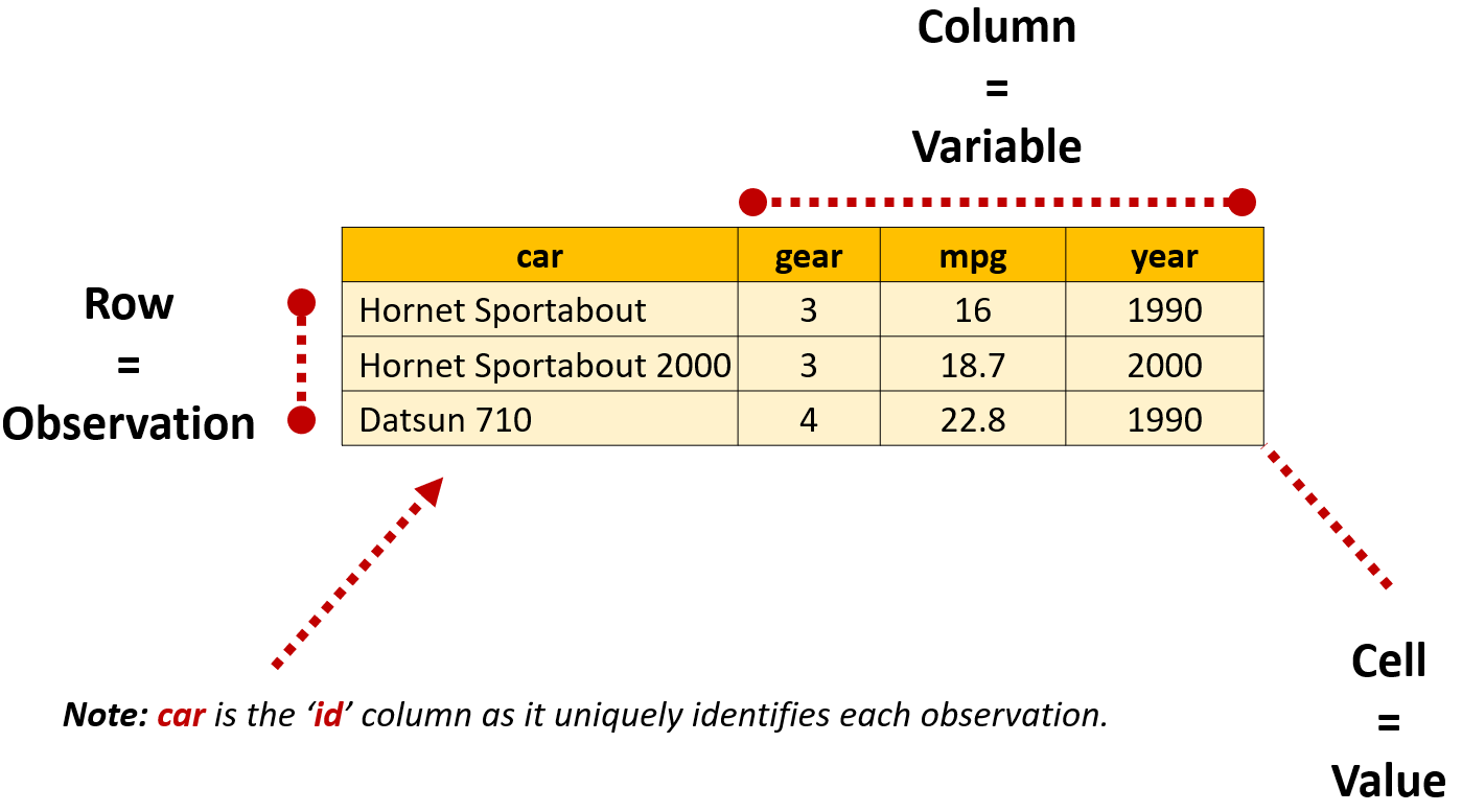
In this example, the car variable also serves another purpose: it acts as an ID variable that uniquely identifies which car each row (and value) describes. Although some datasets won’t need an id variable it can be important when reshaping data so R knows how to properly reorganize values.
The code below loads the data and calculates the number of cells used to store the twelve values. Notice that variable names aren’t counted by nrow() making the total number of cells (and values) 12.
#load libraries
library(tidyr)
library(dplyr)

#import tidy data example (based on mtcars)
dta_tidy_data_mini<-read.csv("./Data/tidy-data-simple.csv")

#return the number of observations
nrow(dta_tidy_data_mini)
[1] 3#return the number of columns
ncol(dta_tidy_data_mini)[1] 4#calculate the number of cells
nrow(dta_tidy_data_mini)*ncol(dta_tidy_data_mini)[1] 12Data organized in a ‘long’ format records values, variables and observations vertically across rows. In the example below, notice values for three variables are stored in a single column value, resulting in a separate row being created for gear, mpg and year, which makes the table longer than the data when organized in a tidy format.
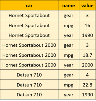
In the code below pivot_longer() has been used to create the long version of the dataframe. The cols parameter let’s pivot_longer() know that all columns other than car should be made longer.
#create long version of data:
dta_tidy_data_mini_lng<-pivot_longer(dta_tidy_data_mini,
                                     cols= -car )
Because storing values in this format requires repeating the name of the and variable for each observation, the table is requires more cells than the tidy format to store the same twelve values:
#report the number of rows
nrow(dta_tidy_data_mini_lng)
[1] 9#report the number of columns
ncol(dta_tidy_data_mini_lng)[1] 3#calculate the number of cells
nrow(dta_tidy_data_mini_lng)*ncol(dta_tidy_data_mini_lng) [1] 27‘Wide’ format data records values for the same variable across multiple columns. In the example below values for gear and mpg are organized in a long format, while the year they correspond with are stored horizontally across columns:
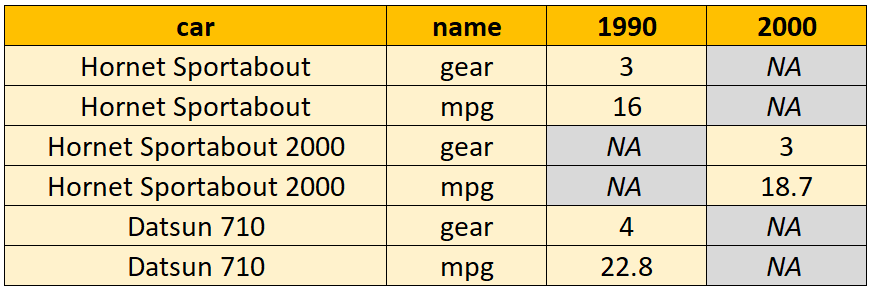
Because values are organized a both a long and wide format, pivot_longer() and pivot_wider() have been combined to create the dataframe. In the code below, notice that pivot_longer() has first been used to lengthen the gear and mpg columns before pivot_wider() is used to widen the data table so that each year is in a separate column:
  #create a wide version of the data:
dta_tidy_data_mini_wd_year<-pivot_longer(dta_tidy_data_mini,                                          cols= -c(car,year)) |>
  pivot_wider(names_from = year)
Once again, notice that data stored in this way requires more cells to store the same twelve values than the tidy data table:
#report the number of rows
nrow(dta_tidy_data_mini_wd_year)
[1] 6#report the number of columns
ncol(dta_tidy_data_mini_wd_year)[1] 4#calculate the number of cells
nrow(dta_tidy_data_mini_wd_year)*ncol(dta_tidy_data_mini_wd_year) [1] 24Tidying Data
When cleaning and wrangling messy data it’s a good idea to sit down and sketch out what a tidy version of your data will look like before writing any code. Doing this will make it clearer what needs to be done, the functions you need and how to apply them to your data. Tidying the dataframe then becomes a matter of combining pivot_longer() and pivot_wider() in the right order to whip the data into shape.
From Long to Tidy
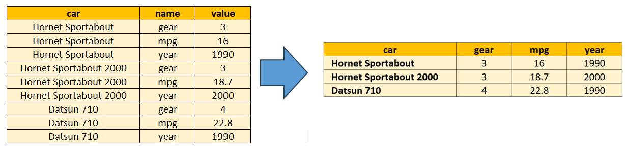
To reshape the long data table into a tidy format, we each variable to be stored in its own column. This is achieved in the code below using pivot_wider(), with values_from specifying the name of the column where values are stored. names_from is then used to let pivot_wider() know where to get the variables names from:
#creating a tidy data table (explicitly specifying arguments)
dta_tidy_from_lng<- pivot_wider(dta_tidy_data_mini_lng,
                                id_cols=car,
                                names_from=name,
                                values_from=value)
Because pivot_wider() assumes that variable names and values are stored in the names and values columns, these don’t need to be directly specified as we have in the code above. id_cols can also be omitted as pivot_wider() assumes that any columns not included in values_from or names_from are ids.
The code below demonstrates this by peforming the same transformation without needing to explicitly set the value for any of the three arguments:
#creating a tidy data table (relying on the default behaviour)
dta_tidy_from_lng<- pivot_wider(dta_tidy_data_mini_lng)
From Wide to Tidy
Because the example data table below organizes some values as wide and others as long, we’ll reshape the data into a tidy format in two steps.
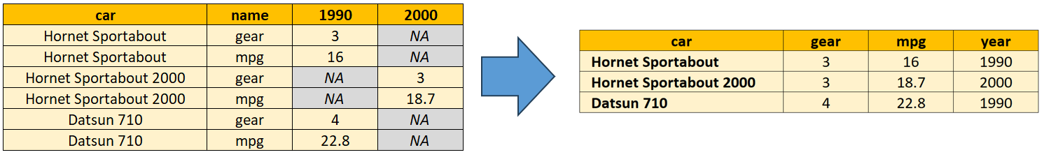
In the first step, we reshape the variables stored in a wide format so they are stored in a single variable called ‘year’. The variables mpg and gear will then be reshaped from long to wide so that each variable has its own column and values are stored in individual rows (making it tidy):
#reshape the data into a tidy format in two steps:
dta_tidy_from_wd<- pivot_longer(dta_tidy_data_mini_wd_year,
                                                  cols= c('1990','2000'),
                                                  names_to= 'year') |>
  pivot_wider(names_from=name,
              values_from=value)
Combining and Splitting Values
Although reshaping will take you a long way when you’re trying to put your data into a tidy format, sometimes its the format of the variables that are the problem. Such as when there are more than one observation or measure stored in a single cell or when cells need to be combined to be useful.
The tidyr package has functions that can help with this too, including unite() for combining cells from more than one column, separate_wider_delim() for splitting cells into more than one column and separate_longer_delim() for splitting cells into more than one row.
The sample data provides a demonstration of this using a set of hypothetical environmental data. Notice that the dataframe is almost in a tidy format except that:
site_codes: has more than one observation per cell;
measurements: includes information about more than one variable; and
day, month and year: need to be combined into a single variable to be useful for our analysis.
# Load required packages
library(tidyr)
library(dplyr)
library(kableExtra)

# Create example dataset
dta_environment <- tibble(
 day = c(1, 2, 3, 4, 5),
 month = c(5, 5, 5, 5, 5),
 year = c(2023, 2023, 2023, 2023, 2023),
 measurements = c(
   "41,20,25",
   "36,18,22",
   "12,12,18",
   "18,15,19",
   "28,23,27"
 ),
 site_codes = c("A01;A02", "A01", "A02;A03", "A01;A02;A03", "A02")
)| day | month | year | measurements | site_codes |
|---|---|---|---|---|
| 1 | 5 | 2023 | 41,20,25 | A01;A02 |
| 2 | 5 | 2023 | 36,18,22 | A01 |
| 3 | 5 | 2023 | 12,12,18 | A02;A03 |
| 4 | 5 | 2023 | 18,15,19 | A01;A02;A03 |
| 5 | 5 | 2023 | 28,23,27 | A02 |
Splitting cells
Separate Longer
When a single cell contains multiple observations separated by a delimiter, separate_longer_delim() creates a new row for each value. This is useful when you have multiple values stored in one cell that should each be their own observation. This is exactly what the code below does for the site_codes variable. The argument delim= ";" lets separate_longer_delim() know where to split values in a cell into rows:
# separate_longer_delim() - Split site codes into rows
dta_environment_long <- dta_environment |>
 separate_longer_delim(
   site_codes,
   delim = ";"
 )

#display the table
dta_environment_long |> kable()| day | month | year | measurements | site_codes |
|---|---|---|---|---|
| 1 | 5 | 2023 | 41,20,25 | A01 |
| 1 | 5 | 2023 | 41,20,25 | A02 |
| 2 | 5 | 2023 | 36,18,22 | A01 |
| 3 | 5 | 2023 | 12,12,18 | A02 |
| 3 | 5 | 2023 | 12,12,18 | A03 |
| 4 | 5 | 2023 | 18,15,19 | A01 |
| 4 | 5 | 2023 | 18,15,19 | A02 |
| 4 | 5 | 2023 | 18,15,19 | A03 |
| 5 | 5 | 2023 | 28,23,27 | A02 |
Separate Wider
The separate_wider_delim() function can be used to split cells into more than one variable. In the example below the function is used to split cells in the measurements column into three different variable: ozone, no2 and so2. The argument delim="," specifies how values in a cell should be split, while names = c("ozone", "no2", "so2") specifies the variable names the values should be assigned to (in the same order the values appear).
# separate_wider_delim() - Split measurements into columns
dta_environment_wide <- dta_environment_long |>
 separate_wider_delim(
   measurements,
   delim = ",",
   names = c("ozone", "no2", "so2")
 ) |>
 mutate(across(ozone:so2, as.numeric))

#display the table
dta_environment_wide |> kable()| day | month | year | ozone | no2 | so2 | site_codes |
|---|---|---|---|---|---|---|
| 1 | 5 | 2023 | 41 | 20 | 25 | A01 |
| 1 | 5 | 2023 | 41 | 20 | 25 | A02 |
| 2 | 5 | 2023 | 36 | 18 | 22 | A01 |
| 3 | 5 | 2023 | 12 | 12 | 18 | A02 |
| 3 | 5 | 2023 | 12 | 12 | 18 | A03 |
| 4 | 5 | 2023 | 18 | 15 | 19 | A01 |
| 4 | 5 | 2023 | 18 | 15 | 19 | A02 |
| 4 | 5 | 2023 | 18 | 15 | 19 | A03 |
| 5 | 5 | 2023 | 28 | 23 | 27 | A02 |
Combining Cells
In the final step, unite() is used to combine values from more than one column into a single variable. In this example, we’ve told unite() to combine values from the day, month and year columns into a single variable called date. The argument sep="-" let’s the function know to add a hyphen between each value so values take the format DD-MM-YYYY. By default, unite() drops the united variables, but we’ve chosen to retain the source columns by setting remove=FALSE:
# unite() - Combine date components into single column
dta_environment_tidy <- dta_environment_wide |>
 unite(
   "date",
   day,month,year,
   sep = "-",
   remove=FALSE
 )

#display the table
dta_environment_tidy |> kable()| date | day | month | year | ozone | no2 | so2 | site_codes |
|---|---|---|---|---|---|---|---|
| 1-5-2023 | 1 | 5 | 2023 | 41 | 20 | 25 | A01 |
| 1-5-2023 | 1 | 5 | 2023 | 41 | 20 | 25 | A02 |
| 2-5-2023 | 2 | 5 | 2023 | 36 | 18 | 22 | A01 |
| 3-5-2023 | 3 | 5 | 2023 | 12 | 12 | 18 | A02 |
| 3-5-2023 | 3 | 5 | 2023 | 12 | 12 | 18 | A03 |
| 4-5-2023 | 4 | 5 | 2023 | 18 | 15 | 19 | A01 |
| 4-5-2023 | 4 | 5 | 2023 | 18 | 15 | 19 | A02 |
| 4-5-2023 | 4 | 5 | 2023 | 18 | 15 | 19 | A03 |
| 5-5-2023 | 5 | 5 | 2023 | 28 | 23 | 27 | A02 |
#drop the example datasets
rm(dta_environment_tidy, dta_environment_wide, dta_environment_long,dta_environment)
Analysis
Dependent and independent variables
If you haven’t studied statistics before you might not have come across the idea of ‘independent’ and ‘dependent’ variables. In this course we will mainly use the term to differentiate between our focus outcome(s) (the dependent variable) and factors we think are related to it (the independent variables). Although we’ll steer away from assessing causality in this guide, it can be helpful to conceptualize independent variable(s) as the cause and the dependent variable as the effect. For instance, somebody’s income might be said to depend or relate to factors such as their education, sex and where they’re located. You can read more about the idea here.
When presenting analysis dependent variables are generally presented on the y axis and independent variables on the x axis. For tables, dependent variables are typically presented in columns and independent variables in rows.
Chaining Operations with Pipes
In traditional R coding, when we want to perform a sequence of operations on data, we have two main options:
- Save our intermediate results so they can be provided to another function; or
- Nesting functions inside each other.
‘Pipes’ provide an alternative to both of these approaches, allowing us to directly pass the results of one function to another, which can make our code more concise and easier to read.
In the tidyverse, magrittr pipes take the form %>%. As of version 4.1, base R also has a pipe operator which looks like |>. Most of the time, the two pipe operators work in the same way.
A simple demonstration of how pipes work is presented in the code below. Notice that the pipes example is more concise and allows each step of analysis to be organized and read from left to right:
# Using nested brackets}
#(order of analysis read from inner bracket to outer bracket)
round(mean(1:10),1)
[1] 5.5# Saving each step #(order of analysis read from top to bottom)
dta_numbers<-1:10
rlt_mean<-mean(dta_numbers)
rlt_mean_rounded<-round(rlt_mean,1)
# With pipes
#(order of analysis read from left to right)
rlt_mean_rounded<- 1:10 |> mean() |> round(1)Note: The shortcut for inserting the pipe operator (|>) is Ctrl + Shift + M on Windows and Cmd + Shift + M on Mac.
Managing, manipulating and summarizing data
| Function | Purpose | Example |
|---|---|---|
group_by() |
Assign a group to a data to allow grouped manipulation or analysis | group_by(data, group_1, group_2) |
summarise() |
Summarize values to a single statistic | summarise(data, avg_age= mean(age)) |
Statistical summaries
dplyr’s summarise() function allows a user to transform a series of values into a single statistic, such as when we want to calculate the mean values from a vector, such as in the code below. Because we can make more than one calculation at a time and assign each to its own variable, the function makes it easy to produce a set of summary statistics in a format that can be used elsewhere.
#calculate average value
rlt_affordable_housing_avg_no<-dta_dop_affordable_housing |>
  summarise(avg_no=mean(value, na.rm=TRUE))

#output results
rlt_affordable_housing_avg_no
# A tibble: 1 × 1
avg_no
<dbl>
1 1548.The summarize function is designed to return one result per group (more on this below), so will work with most vector-based summary functions, such as:
| Function | Purpose |
|---|---|
mean() |
Calculates the arithmetic mean (average) of values within a group. |
median() |
Determines the middle value of a dataset within a group. |
sd() |
Computes the standard deviation, a measure of the spread of values. |
min() |
Identifies the smallest value within a group. |
max() |
Identifies the largest value within a group. |
first() |
Retrieves the first value encountered within a group. |
last() |
Retrieves the last value encountered within a group. |
nth() |
Retrieves the value at a specific position (e.g., second) within a group. |
n() |
Counts the number of rows in each group. |
n_distinct() |
Counts the number of unique values within a group. |
Grouped summaries
One of the advantages of using dplyr’s summarize() rather than base R functions is that it is that it simplifies the process of creating grouped summary statistics when paired with group_by().
The group_by() function allows you to assign a set of ‘groups’ to a dataframe. This lets compatible functions, like summarize(), know that the dataframe should be divided into the defined groups before a calculation is made.
A demonstration of this is provided in the code below. Notice that we first use group_by() to specify year and name as the groups we’re interested in before passing it to summarize(). The summarize() functions then understands that it should first split the data into groups before calculating the mean. This results in us being provided with the average value of housing by type (name) and year:
#calculate average value by year
rlt_affordable_housing_avg_no_by_type_and_year<-dta_dop_affordable_housing |>
  group_by(year, name) |>
  summarise(avg_no=mean(value, na.rm=TRUE))

#output results
rlt_affordable_housing_avg_no_by_type_and_year
# A tibble: 91 × 3
# Groups: year [13]
year name avg_no
<dbl> <chr> <dbl>
1 2011 Census Units 8804.
2 2011 Deed Restricted Units 32.4
3 2011 Government Assisted 510.
4 2011 Percent Affordable 5.71
5 2011 Single Family CHFA/ USDA Mortgages 155.
6 2011 Tenant Rental Assistance 246.
7 2011 Total Assisted Units 944.
8 2012 Census Units 8804.
9 2012 Deed Restricted Units 33.7
10 2012 Government Assisted 510.
# ℹ 81 more rows#check remaining groups
groups(rlt_affordable_housing_avg_no_by_type_and_year)[[1]]
yearNote: by default results from the summarise() of a grouped dataframe will be sorted according to the order in which the groups are specified in group_by(). summarize() also drops the last grouping variable defined in group_by() each time it’s applied, for instance in the example above notice that the name group has been dropped from rlt_affordable_housing_avg_no_by_type_and_year after summarise() was applied.
Stocks vs. Flows
Whether you realize it, or not, you’ve already come across the idea of stocks and flows. Although the terms are most frequently used in the field of economics and finance, they describe the properties of a measurement that you’ll already be familiar with:
- Stock variables: are those that describe the quantity of something at a specific point in time. For instance, the total length of paved roads in France as of the end of 2011.
- Flow variables: are values that describe a quantity over an interval of time. Such as the length of new roads built between 2011 and 2012.
In additional to this being a great conversation starter at parties, the concept has important practical applications for data analysis as it determines what questions we can ask of a dataset. For instance, to measure the size of a country it makes more sense to use a total population (a stock variable) than population growth (a flow variable).
Levels vs. Differences:
Another reason this framework is useful to keep in mind, is that it fits in nicely with the statistical idea of ‘levels’ and ‘first differences’. Simiar to stock variables, levels represents the total value of a variable at a given point in time. Whereas differences measure the net change in a variable’s levels across observations. This doesn’t mean that stocks and levels, or flows and first-differences, are always the same thing, only that they’re conceptually similar.
The table below illustrates these ideas. The variable schools_no is a stock variable as it measures the total number of schools at a given point in time. On the other hand, schools_built and schools_closed are flow variables as they measure changes in the number of schools over time. However, notice that the school_diff_no variable, which is the first-difference of schools_no, captures only the net change in schools over time, but doesn’t reveal the size or nature of the flows.
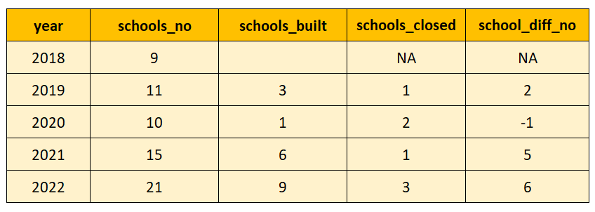
Time series analysis with lag()
By now, you have probably noticed that analysis in R often involves a combination of vertical and horizontal operations. Functions, such as mean(), sum() and length() process and aggregate numbers vertically across rows in a variable (or vector). Whereas operations to manipulate or create variables process data horizontally by row, such as when we create or manipulate variables.
However, time-series analysis requires that we process data in both directions. For instance, in the table below to calculate the yearly change schools_no requires vertically comparing values. Where saving the year-to-year difference (school_diff_no) is a horizontal operation. Luckily, if our dataframe is well-organized, dplyr’s lag() function makes this a relatively simple problem to solve.
The lag() function works by returning values from previous rows for a variable, with n specifying the number of rows prior that a value should be returned from. In the table below, schools_no_lag1 has been created using lag(school_no,order_by=year,n=1). With lag() returning values from schools_no from one row prior (n=1) when the variable is ordered by year. The school_diff_no variable is then created by calculating the difference between schools_no and schools_no_lag1.
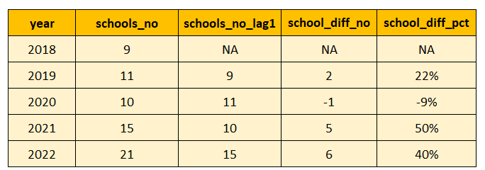
lag() also works with grouped data where it might not be appropriate to simply take data from the previous row. In the example below time series data is available for two municipalities from 2021 to 2023. Notice that lag() has returned 54 for Ansonia in 2022, despite this being from another town. Notice also that a value from 2023 has been returned in 2021 for Ansonia due to the way the dataframe is sorted.
library(dplyr)
library(tidyr)
library(readr)

#import, reshape and clean a sample of the housing data
dta_dop_affordable_housing_wd<-read_csv("./Data/Affordable_Housing_by_Town.csv") |>
  pivot_wider(id_cols=c(year, town_code, town)) |>
  janitor::clean_names() |>
  filter(town_code <=2,
         year>=2021) |>
  select(year, town, total_assisted_units) |>
  arrange(total_assisted_units)

#apply lag on ungrouped data
dta_dop_affordable_housing_wd<-dta_dop_affordable_housing_wd |>
  mutate(tot_assist_u_lag_1_ungrouped=lag(total_assisted_units))

#view the data
head(dta_dop_affordable_housing_wd)
# A tibble: 6 × 4
year town total_assisted_units tot_assist_u_lag_1_ungrouped
<dbl> <chr> <dbl> <dbl>
1 2023 Andover 51 NA
2 2022 Andover 52 51
3 2021 Andover 54 52
4 2022 Ansonia 1178 54
5 2023 Ansonia 1187 1178
6 2021 Ansonia 1303 1187Notice that after grouping the dataset in the example below that lag() recognizes that it shouldn’t draw values from different towns. However, because the dataframe isn’t ordered by year and we haven’t specified a value for order_by, Ansonia is still provided a value from 2023 in 2023. Notice also that we haven’t specified a value for n as lag() assumes n=1 by default.
#apply lag when grouped

#group dataframe by town
dta_dop_affordable_housing_wd<-dta_dop_affordable_housing_wd |>
  group_by(town)

#apply lag on grouped data
dta_dop_affordable_housing_wd<-dta_dop_affordable_housing_wd |>
  mutate(tot_assist_u_lag_1_grouped=lag(total_assisted_units))

#view the data
head(dta_dop_affordable_housing_wd)
# A tibble: 6 × 5
# Groups: town [2]
year town total_assisted_units tot_assist_u_lag_1_u…¹ tot_assist_u_lag_1_g…²
<dbl> <chr> <dbl> <dbl> <dbl>
1 2023 Ando… 51 NA NA
2 2022 Ando… 52 51 51
3 2021 Ando… 54 52 52
4 2022 Anso… 1178 54 NA
5 2023 Anso… 1187 1178 1178
6 2021 Anso… 1303 1187 1187
# ℹ abbreviated names: ¹tot_assist_u_lag_1_ungrouped,
# ²tot_assist_u_lag_1_groupedTo fix this, the code below specifies year in the order_by argument. Because the dataframe is already grouped we don’t need to apply group_by() again. Notice also that the data is arranged before viewing to make it easier to spot potential issues. Looking at the data it looks like applying lag() to grouped data and specifying a value for order_by did the trick:
#apply lag on grouped data while specifying year in order_by
dta_dop_affordable_housing_wd<-dta_dop_affordable_housing_wd |>
  mutate(tot_assist_u_lag_1_grouped=lag(total_assisted_units,n=1, order_by=year))

#sort the dataframe to make it easier to spot issues
dta_dop_affordable_housing_wd<-dta_dop_affordable_housing_wd |>
  arrange(town,year)

#view the data
head(dta_dop_affordable_housing_wd)
# A tibble: 6 × 5
# Groups: town [2]
year town total_assisted_units tot_assist_u_lag_1_u…¹ tot_assist_u_lag_1_g…²
<dbl> <chr> <dbl> <dbl> <dbl>
1 2021 Ando… 54 52 NA
2 2022 Ando… 52 51 54
3 2023 Ando… 51 NA 52
4 2021 Anso… 1303 1187 NA
5 2022 Anso… 1178 54 1303
6 2023 Anso… 1187 1178 1178
# ℹ abbreviated names: ¹tot_assist_u_lag_1_ungrouped,
# ²tot_assist_u_lag_1_groupedNote: The lag() function returns values from previous observations (or rows), not time periods. This is an important distinction when data has missing observations as the previous row might not always be the previous period. For instance, in the example above if data for 2022 was unavailable lag() would return a value from 2021 instead.
Spurious Correlation
In statistics, a correlation refers to there being an association or relationship between two variables. Such as shoe size and height being positivly associated with one another, such that taller individuals tend to have bigger feet.
In applied policy analysis correlations like these feel surprisingly common. Maybe you notice that fertility rates are higher in countries where couples do a similar amount of household work. Or that wealthier areas in a country receive larger shares of the social security budget.
Both relationships make sense, have an intuitive story behind them and point to potential policy interventions: to increase fertility encourage better sharing of domestic responsibilities and to drive economic growth we should invest more into social security.
The problem is that while the story and policy solution might seem reasonable for both of these examples, the causal relationship isn’t so clear. In the case of the fertility rate, the relationship might reverse if we expand the coverage of our dataset. Not only that, but it’s plausible that something else has caused both changes in fertility and the sharing of domestic work, such as shifting gender norms.
In the case of the social security example, it might be that wealthier areas of a country are also more populated and urbanized. Making it likely that the higher volume of social security claims has more to do with a larger population, while the higher incomes have more to with greater urbanization.
In short, while the correlations might be real, the stories we tell about them often aren’t. The correlations are spurious:
“We all know the truism ‘Correlation doesn’t imply causation,’ but when we see lines sloping together, bars rising together, or points on a scatterplot clustering, the data practically begs us to assign a reason. We want to believe one exists…”
Source: Harvard Business Review, June 2015, Beware Spurious Correlations, link
In a non-technical sense, spurious correlationsrefer to instances where there is a statistical association between variables, but they are not causally related.
Trending Variables, Spurious Correlations and First-Differences
Misleading correlations can feel common in policy analysis as we’ll frequently encounter observational data where the causal links are multidimensional, hard to measure and ambiguous. However, time series data can present an additional risk as correlations can appear when unrelated variables have similar trends over time.
The code below provides an extreme example of this by generating two random variables, variable_x and variable_y that are statistically random, but both trend in a similar general direction over time:
library(dplyr)
library(ggplot2)
library(tidyr)

#set the seed to allow reproducibility
set.seed(123)
#generate two random series with a similar trend
#(cumsum() simply calculates the cumulative sum of random values over time)

dta_time_series<-data.frame(year=1981:2030,
                           variable_x=cumsum(rnorm(n=50,mean=5, sd=8)),
                           variable_y=cumsum(rnorm(n=50, mean=2,sd=11)))

#plot the two series over time
ggplot(data=dta_time_series |>
         pivot_longer(cols=-year),
       aes(x=year, y=value, col=name))+
  geom_line()+
  theme_minimal()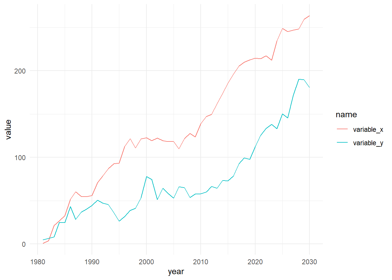
The result is two variables that have nothing to do with each other, but look suspiciously related to one another. If variable_x and variable_y were renamed to income and education we might even have a compelling story to tell about why the relationship makes sense.
#plot the two series against one another
ggplot(data=dta_time_series  ,
       aes(x=variable_x, y=variable_y))+
  geom_point()+
  theme_minimal()+
  labs(x="Years of Education",
       y="Income")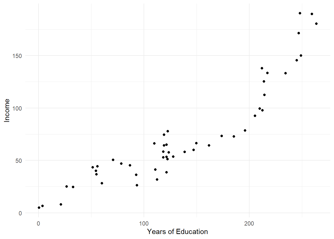
Of course, being able to see how the data was generated provides you with an edge: you know the relationship is statistically significant, but has no significance from a policy perspective. Unfortunately, it’s rare to have a behind-the-scenes look at the data generation behind what we’re working with.
First-differences are one practical approach for teasing out whether a correlation might be spurious for trending variables. This is calculated by taking the difference between values in consecutive periods (Δyt = yt - yt-1), which can be achieved via dplyr’s lag() function:
#calculate the first difference
dta_time_series<-dta_time_series |>
  mutate(variable_x_lag1=lag(variable_x, order_by = year),
         variable_y_lag1=lag(variable_y,order_by = year),
         variable_x_diff=variable_x-variable_x_lag1,
         variable_y_diff=variable_y-variable_y_lag1) |>
    select(variable_x, variable_y,
         variable_x_diff,
         variable_y_diff)

#plot the two series against one another
ggplot(data=dta_time_series  ,
       aes(x=variable_x_diff, y=variable_y_diff))+
  geom_point()+
  theme_minimal()+
  labs(x="Change in variable_x",
       y="Change in variable_y")

As is clear from the the scatter plot, the relationship between x and y disappears when comparing period-to-period changes. This can also be observed when looking at the relationships more formally via correlation statistics. In the example below, notice that the both variables are highly correlated at their levels, but not when the first difference is taken:
#pairwise correlations for levels and differences
dta_time_series |>
cor(use="pairwise.complete.obs") |>
  round(1)
variable_x variable_y variable_x_diff variable_y_diff
variable_x 1.0 0.9 0.0 0.2
variable_y 0.9 1.0 -0.1 0.3
variable_x_diff 0.0 -0.1 1.0 0.0
variable_y_diff 0.2 0.3 0.0 1.0Conceptually, it can be helpful to think of first differences as asking how do variables move together? For instance, instead of asking “Is infrastructure spending associated with the number of roads” we might ask “Are changes in infrastructure spending associated with changes in the number of roads.”
Unfortunately, while this is a useful technique to keep in mind, it’s not a silver bullet. As while the strategy can provide a helpful filter for identifying genuine statistical relationships, it doesn’t answer whether the associations are casually related or meaningful from a policy perspective. Not only that, it’s also possible that a statistical relationship exists, but not in the same period. For instance, new roads might not be built until several periods after spending has been allocated in the budget.
Note: a TLDR on spurious correlations is that they’re easy to find, hard to detect and difficult to deal with. They lurk in trending data, emerge from omitted variables, and can persist even after applying sophisticated statistical techniques.
The best defense is to carefully examine why relationships might exist, what might be done about them and retain a healthy sense of skepticism about correlations that seem too good to be true.
Also see:
Visualization
Why we viz
Take a look at the table below, which lists the number of roll calls in the UN General Assembly by decade, and ask yourself has the number of roll calls has increased over time?
library(kableExtra)
library(tidyverse)
library(unvotes)

sum_un_votes_nobs <- un_roll_calls |>
  mutate(year = year(date),
         decade = round(year/10)*10) |>
  group_by(decade) |>
  summarise(roll_call_no = n_distinct(rcid))

kable(sum_un_votes_nobs, caption = "Number of UN Votes by Decade")| decade | roll_call_no |
|---|---|
| 1950 | 433 |
| 1960 | 525 |
| 1970 | 677 |
| 1980 | 1364 |
| 1990 | 921 |
| 2000 | 968 |
| 2010 | 808 |
| 2020 | 506 |
Now, take a look at the plot below and try to answer the same question:
# Create the plot
ggplot(sum_un_votes_nobs, aes(x = decade, y = roll_call_no)) +
  geom_col(fill = "steelblue") +
  labs(
    title = "Number of UN Roll Call Votes by Decade",
    x = "Decade",
    y = "Number of Roll Calls"
  ) +
  theme_minimal()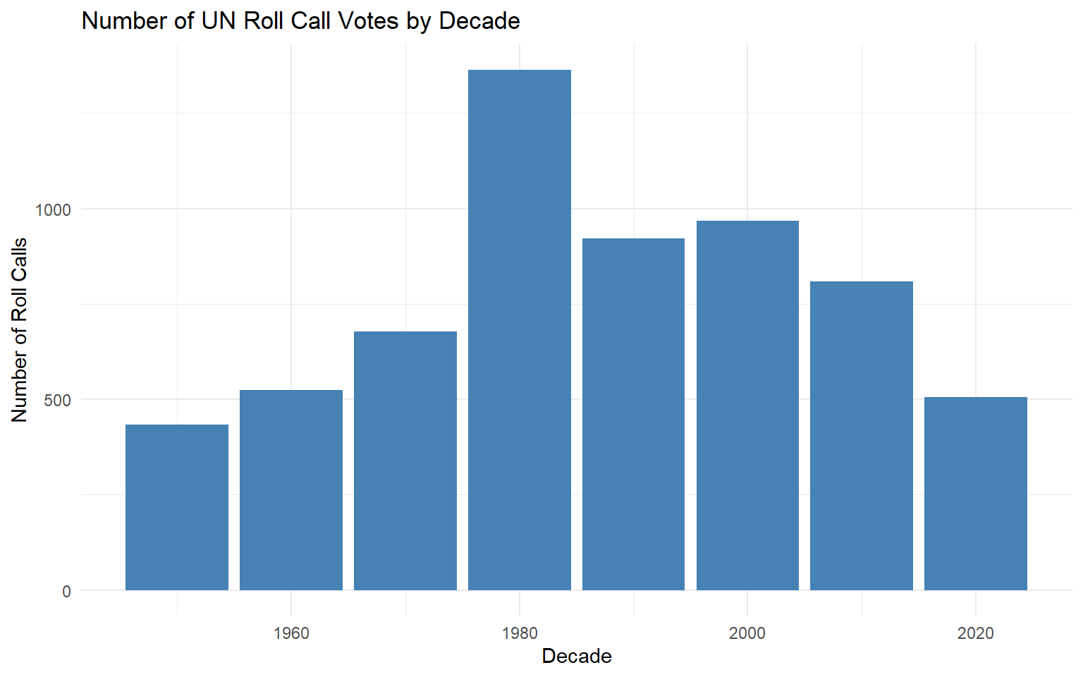
Easier, right?
As a general rule, a good visualization is a better than a good table as it leverages our natural ability to rapidly process visual information: accelerating comprehension, reducing cognitive load and ultimately leading to better decision making. Data visualization has another advantage aside from reducing cognitive load. A good plot can help us reveal patterns and relationships that might not be obvious by looking at summary statistics alone.
The code below provides an illustration of this idea by calculating a set of summary statistics for thirteen different datasets:
library(tidyverse)
library(kableExtra)

dta_some_data<-read_csv("./Data/dino.csv")

dta_some_data<-dta_some_data |>
  pivot_longer(cols=-dataset)

sum_dataset_stats<-dta_some_data |>
  group_by(dataset,name) |>
  summarize(sd= sd(value),
            mean=mean(value),
            variance=var(value)) |>
  pivot_wider(values_from=c(sd,mean,variance))

sum_dataset_stats$dataset<-1:13

kable(sum_dataset_stats, caption= "Summary statistics by dataset", digits = 1)| dataset | sd_x | sd_y | mean_x | mean_y | variance_x | variance_y |
|---|---|---|---|---|---|---|
| 1 | 16.8 | 26.9 | 54.3 | 47.8 | 281.2 | 725.7 |
| 2 | 16.8 | 26.9 | 54.3 | 47.8 | 281.2 | 725.5 |
| 3 | 16.8 | 26.9 | 54.3 | 47.8 | 280.9 | 725.2 |
| 4 | 16.8 | 26.9 | 54.3 | 47.8 | 281.1 | 725.5 |
| 5 | 16.8 | 26.9 | 54.3 | 47.8 | 281.2 | 725.2 |
| 6 | 16.8 | 26.9 | 54.3 | 47.8 | 281.1 | 725.8 |
| 7 | 16.8 | 26.9 | 54.3 | 47.8 | 281.1 | 725.8 |
| 8 | 16.8 | 26.9 | 54.3 | 47.8 | 281.1 | 725.6 |
| 9 | 16.8 | 26.9 | 54.3 | 47.8 | 281.2 | 725.7 |
| 10 | 16.8 | 26.9 | 54.3 | 47.8 | 281.2 | 725.2 |
| 11 | 16.8 | 26.9 | 54.3 | 47.8 | 281.2 | 725.6 |
| 12 | 16.8 | 26.9 | 54.3 | 47.8 | 281.2 | 725.7 |
| 13 | 16.8 | 26.9 | 54.3 | 47.8 | 281.2 | 725.2 |
Notice that the mean, standard deviation, and variance are nearly identical across all datasets, which might suggest the datasets have a similar source or focus. But, as you can see from the low-effort plots below, this is clearly not the case:
dta_some_data<-read_csv("./Data/dino.csv")  |>
  arrange(dataset)

tmp_unique_values <- sort(unique(dta_some_data$dataset),decreasing =TRUE )
tmp_replacement <- setNames(as.character(13:1), tmp_unique_values)

# Apply the replacement
dta_some_data <- dta_some_data |>
  mutate(dataset = str_replace_all(dataset, tmp_replacement) |>
           as.integer())

ggplot(data=dta_some_data,
       aes(x=x, y=y))+
  geom_point()+
  facet_wrap(dataset~.)+
  theme_classic()
Which is a striking demonstration of what makes visualization so important: relying solely on summary statistics might obscure crucial insights about our data, such dinosaurs lurking in our dataset.
Note: this data was sourced from the datasauRus package.
Exploratory and explanatory data visualization
Throughout this course we’ve described analysis as being either exploratory or explanatory. Exploratory analysis describes the steps we take to understand and explore datasets as we attempt to answer a question. On the other hand, explanatory analysis describes the steps we take to produce results that are intended to be shared with an outside audience.
Exploratory and explanatory visualizations are more or less the same:
Exploratory plots and data visualizations: are those that we produce for ourselves. They tend to be produced quickly in an unpolished format not meant for an outside audience. R’s base plotting functions are often ideal for unpolished exploratory plots as they can be quickly produced and iterated on.
Explanatory plots and data visualizations: are designed for an outside audience. They will look more professional, include labels and be specifically designed for the target audience as part of a wider analysis story. The ggplot2 package will often be better suited for producing polished explanatory plots and visualizations.
Rules of Thumb for Data Visualization
A key principle guiding our approach is Tufte’s data-ink principle - a concept that emphasizes maximizing the proportion of visual elements that directly represent data. However, throughout the course (and beyond) it’s a good idea to keep the following principles in mind:
Relevance and Focus: decide the central message you want your plot to tell and make this the priority. Remove any elements that don’t contribute to your message and don’t include plots that don’t contribute to your wider story.
Simplicity and Clarity: keep your plots as simple and easy to interpret. Use straightforward layouts, clear labels, and intuitive visual elements that your audience can quickly understand.
Accessibility: make your plots accessible to as wide an audience as possible. Consider color blindness, screen readers, and varying levels of data literacy. Use high-contrast colors, clear typography, and include alternative text descriptions when possible.
Consistency and Style: use a similar style across your visualizations. Changes in visual elements should reflect meaningful differences in data, not arbitrary design choices.
Accuracy: Ensure data is represented accurately without distorting or misinterpreting the information. This might mean: using scales appropriate to the data; using proper labels; including the source of the data; and acknowledging any limitations or uncertainties.
Base graphics
If you’re already familiar with the tidyverse, you might wonder why we’d cover R’s base plotting functions at all. After all, the ggplot2 package can produce a wide variety of professional-looking graphics with ease.
However, base R plotting offers several distinct advantages. From a practical standpoint, base plots are fast to generate and straightforward to use, making them ideal for rapid data exploration. Since they’re built into every R installation, you can be confident your code will run without dependency issues on any R setup. The long history of base plots also means you’re likely to frequently encounter twerrorhem in documentation, code and academic papers.
Unlike ggplot2, base plots:
Use separate functions for creating different plots instead of ‘geoms’).
Aren’t built by adding ‘layers on a canvas’. Instead, plots are built by setting values for arguments in each function.
Using different functions can sometimes mean that the data format required for each type of plot can be different (where all plot types i ggplot2 are designed to work with tidy data).
Base R Plotting Functions by Visualization Purpose
The plots below can be useful when we want to compare a variable across groups or over time.
| Function | Description | Example Question | Example Code |
|---|---|---|---|
| barplot() | Creates a bar chart for comparing categories. | How do health outcomes compare across regions? | barplot(table(mtcars$cyl), main="No. of cars by cyl", col="navy") |
| plot() | Create a line plot for a variable over time. | How has the unemployment rate changed over time? | plot(EuStockMarkets) |
| dotchart() | Dot plot for comparisons. | How do average grades in a school district compare by sex across grades? | dotchart(VADeaths, main = "Death Rates in Virginia - 1940") |
Histograms and boxplots are handy for seeing how values are distributed for a specific variable. This can be done overall, or by a particularly group (such as male vs. female).
| Function | Description | Example Question | Example Code |
|---|---|---|---|
| hist | Histogram for visualizing data distribution. | What is the income distribution for a specific area? | hist(ChickWeight$weight, breaks=12, main="Distribution of Chicken Weights", col="wheat") |
| boxplot | Boxplot for summary statistics and outliers. | What are the range of times taken to process imports? | boxplot(formula= Sepal.Length ~Species, data=iris, main="Distribution of Sepal Length by Species", col="orange") |
Plots that show composition can be helpful for understanding the contribution of individual groups to a whole, such as the % of the national budget that is allocated to each Ministry for a particular fiscal year.
Note: pie graphs are generally not recommended as people tend to be good at judging linear measures, but bad at judging relative areas (see pie()’s help for more).
| Function | Description | Example Question | Example Code |
|---|---|---|---|
| pie | Pie chart to show part-to-whole relationships. | What percentage of the national budget is allocated to education, healthcare, and defense? | pie(table(chickwts$feed), main="No. of chickens by allocated diet") |
Useful plots for exploring how variables are associated with one another are provided below. These can be useful for understanding how two variables relate to each other for understanding relationships, modelling and validating the accuracy of data.
| Function | Description | Example Question | Example Code |
|---|---|---|---|
| plot | Scatter plot for two continuous variables. | Is there a correlation between educational attainment and crime rates? | plot(mtcars$mpg, mtcars$hp, main="MPG vs HP") |
| pairs | Matrix of scatter plots for multiple variables. | How are poverty, unemployment, and crime rates associated with average county policy spending? | pairs(iris[1:4], main="Iris Data Pairs") |
ggplot2 essentials
When we want to vizualise data in base R, the function we use will largely be determined by the type of plot we want to create. Anything we’d like to customize also needs to be explicitly specified within the function itself, such as by setting the value of the ‘main’ parameter for a title.
#Load required packages
library(HistData) #for the Playfair Wheat and Wage data

#create a dataframe containing the wheat and wage data
dta_playfair<-Wheat

#create a barplot in base R
#(notice all options are specified within the barplot function)
barplot(dta_playfair$Wages,
        names.arg = dta_playfair$Year,
        main = "Weekly Wages of Skilled Craftsperson (1565-1821)")
Building plots using the ggplot2 package works a little differently. Based on ‘The Grammar of Graphics’, ggplot2 provides a consistent and organized system for translating data into visualizations by combining a series of discrete layers, or composable parts, that provide a specific set of instructions for visualizing data.

Source: tidyverse.org, Introduction to ggplot2.
In a sense, this makes producing visualizations like adding layers to a canvas. First, we use the ggplot() function to define our canvas before adding layers to customize the plot. In its simplest form, creating a plot will require specifying the source dataframe, aesthetics and desired geometry of the plot. An illustration of this is provided in the code below.
Note: it’s not possible to substitute ‘+’ for pipes (e.g. |>) when combining layers in ggplot2. Hadley Wickham provides an explanation of why this is here.
Define the canvas
The first step is to set the source dataframe and specify how variables should be visualized using the ggplot() function. In the example below, we’ve set dta_playfair as our dataframe and specified how variables relate to the plot’s aesthetics. Notice that the dimensions of the canvas are based on the maximum and minimum value of variables assigned to the x and y axes in aes():
#Load required packages
library(HistData) #for the Playfair Wheat and Wage data

#create a dataframe containing the wheat and wage data
dta_playfair <- Wheat

#load the ggplot2 package
library(ggplot2)

# set up the ggplot 'canvas' and add a line geometry
plt_playfair_wages <- ggplot(data = dta_playfair,
                            aes(x = Year, y = Wages))

#display the plot
plt_playfair_wages
Specify the geometry:
Once we’ve set the source dataframe and assigned variables to visual aesthetics in aes() we can use a geom layer to visualize the data. Notice that adding the geom_col() layer using ‘+’ resulted in a simple column graph as this was the final ingredient required produce a basic plot in ggplot:
A dataframe;
A set of properly specified aesthetics; and
A geom layer to specify the type of plot to produce.
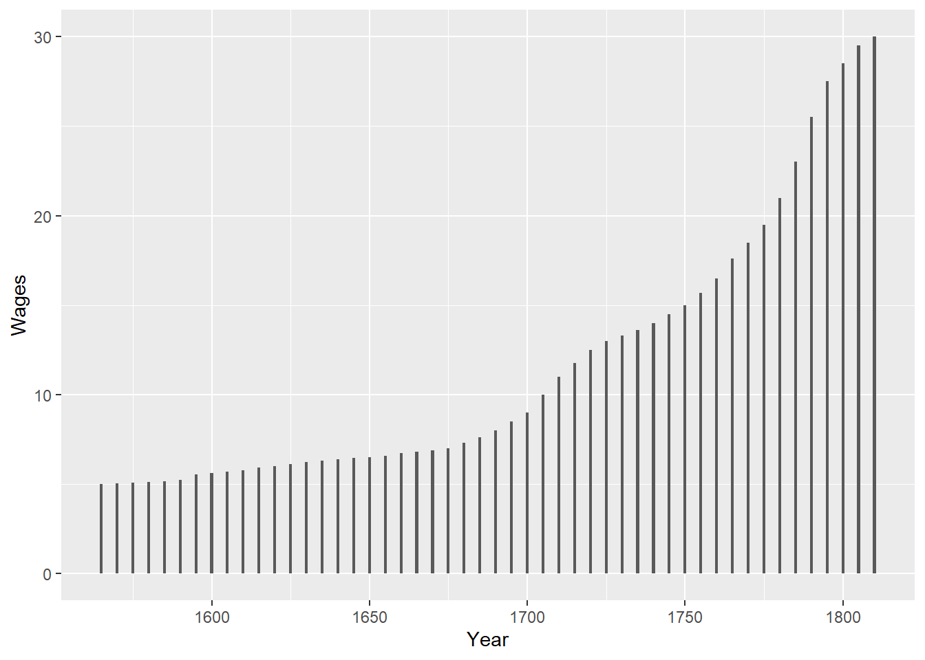
Add layers to customize its look and feel:
Once we’ve set up the basics for a plot we can add additional layers to further customize the format of the plot. In the code below we’ve kept it simple by applying a theme and adding a title, but further examples are provided in the sections below for customizing the function and form of a plot.
# add labels to the plot
plt_playfair_wages<-plt_playfair_wages +
  #add a layer that applies a theme
  theme_minimal()+
  #add a layer that adds a title
  labs(title="Weekly Wages of Skilled Craftsperson (1565-1821)")

#output the final plot
plt_playfair_wages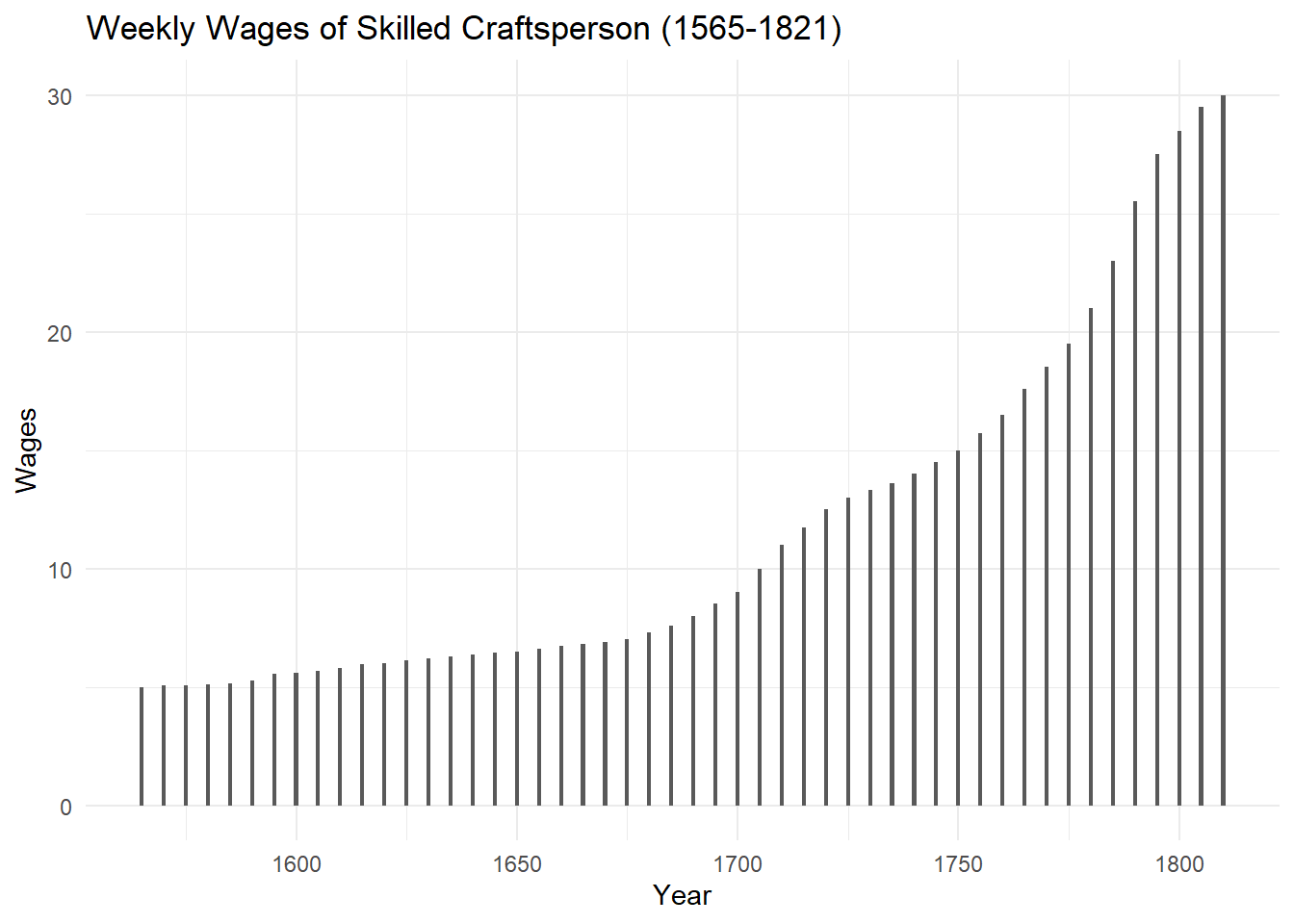
ggplot2: key layers
Visualizations are created in ggplot2 by combining a series of composable parts that describe how to draw a chart. As you get comfortable with the package it will be worth becoming familar with the ggplot2 cheat sheets and R-Graph-Gallery.com to get a sense of what’s possible, but when you’re starting out most of the legwork can be done by combining the layers below:
The canvas: When you first create a ggplot() object, you need to define the data to use and how this should be mapped to visual properties of the plot (the aesthetics). Properly specifying the data and aesthetic mapping is important as it sets the basic assumptions for a plot that other layers rely on.
geoms: The ‘geom’ layer specifies how the data and aesthetics should be visualized. For instance, geom_histogram() can be used to produce a histogram, geom_point() for a scatter plot and geom_col() fr a column plot. Because the geom layer relies on the data and variables specified in the ggplot() function, choose geoms that appropriately match your data structure. For instance, to use geom_point() requires that you have mapped numeric variables to both x and y.
labs: the labs() layer allows you to add labels to a plot, such as a title, subtitle, caption and x an y xis labels.
themes: themes allow you to make general adjustments to the look and feel of a plot. For instance, adding theme_minimal() will apply a more minimal styling to a graph. See here for examples of what the default themes look like and here for some of the options available in the ggthemes package.
facets: the facets layer provides a way to produce individual plots across a set of discrete categories or groups. For instance, to create individual plots comparing the survival rate of men and women on the titanic we could add facets_grid(sex ~ . ) as a layer.
Basic Structure
The code below illustrates how the ingredients outlined above can be combined to produce a plot. Notice that once we’ve specified the dataframe and variables we’d like to visualize, we’ve added layers to customize specific qualities of the plot.
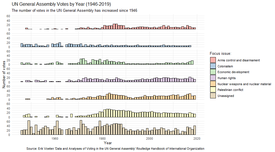
#Load required packages
library(tidyverse)
library(unvotes) # for un roll call and issues data

#create a summary of the number of unvotes with a designated issue
sum_roll_calls_and_issues<-left_join(un_roll_calls, un_roll_call_issues,
                                               multiple = "first") |>
  mutate(year= year(date)) |>
  group_by(year,issue) |>
  summarize(rcids_n_distinct=n_distinct(rcid)) |>
  mutate(issue= if_else(is.na(issue),"Unassigned", issue))

# set up the ggplot 'canvas'
plt_roll_calls_and_issues<-ggplot(data= sum_roll_calls_and_issues,
                                  aes(x=year, y=rcids_n_distinct))+
#specify the geometry for visualizing data
  geom_col(aes(fill=issue), color="black")+
#add labels
  labs(y="Number of votes",
       x="Year",
       fill="Focus issue:",
       title="UN General Assembly Votes by Year (1946-2019)",
       subtitle = "The number of votes in the UN General Assembly has increased since 1946",
       caption = "Source: Erik Voeten 'Data and Analyses of Voting in the UN General Assembly' Routledge Handbook of International Organization")+
#apply a theme
  theme_minimal()+
#customize visual aspects the plot, such as removing individual facet labels
  theme(strip.text = element_blank())+
#specify the colors to use for fill
  scale_fill_brewer(palette = "Pastel1")+
#create individual plots by groups defined in the dataframe. Note that facets are specified as rows ~ columns in facet_grid()
  facet_grid(issue ~.)

#output the plot
plt_roll_calls_and_issues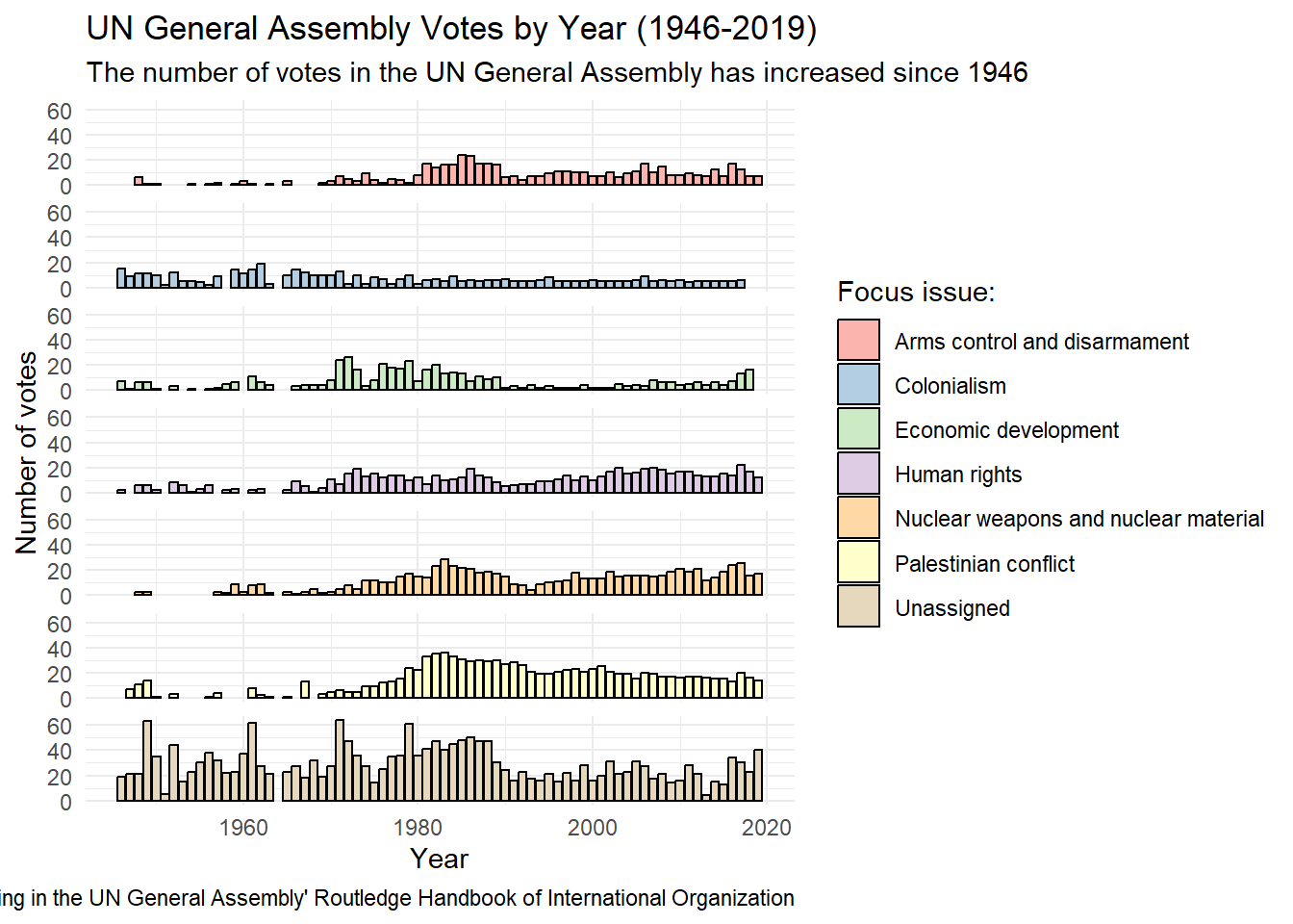
Setting up the canvas: ggplot
The architecture of ggplot2 operates much like adding layers on a canvas, allowing for incremental complexity and customization. Once you’ve loaded the ggplot2 library, you can create a ggplot object using ggplot(dta_my_data,aes(x=var_x, y=var_y,…)). In addition to letting ggplot know what data to use and how it should relate to visual elements of your plot, the values specified are used as the default (or ‘global’ value) that subsequent layers will use (unless otherwise specified).
# set up the ggplot 'canvas'
plt_roll_calls_and_issues<-ggplot(data= sum_roll_calls_and_issues,                                   aes(x=year, y=rcids_n_distinct))
In this code:
data = sum_roll_calls_and_issuesspecifies the dataset you’re visualizingaes()stands for “aesthetics” and maps variables in your data to visual propertiesx = yearmaps the “year” column to the x-axis positiony = rcids_n_distinctmaps the “rcids_n_distinct” column (which appears to count distinct roll call votes) to the y-axis positionThe
+at the end allows you to add more layers to this canvas
When providing a dataset to ggplot2, make sure it already includes any calculated statistics or results you intend to visualize in a ‘tidy’ format. For example, if you’re interested in plotting the average age of passengers from the titanic data by sex, you could use dplyr’s group_by() and summarize() to calculate this. These results can then be used as your ‘data’ object in the ggplot() function.
Aesthetics
Arguments specified in the aes() or ‘aesthetics’ function let ggplot know how different visual elements are connected with the provided data. Such as basing the colors used in a plot on whether a vehicle has an automatic or manual transmission.
Different layers in ggplot have different aesthetic parameters available. For instance, it’s possible to assign a variable to x and y in geom_point(), but not geom_histogram(). ggplot2 will usually give you a warning if you’ve specified something that is inappropriate to your plot and/or source data. Some of the more common aesthetics include:
x and y: these specify which variables to visually map from the dataset.
color and fill: Generally, color is used for setting the outline color of a geom, whereas fill is used to specify its fill.
shape: Governs the shape of points in scatter plots.
size: Determines the size of geometrical shapes like points or lines.
linetype: Sets the style of lines to use.
linewidth: Specifies the width of lines.
alpha: Sets the transparency of an element.
Mapping Data to Geometry: geoms
Geometric layers, or ‘geoms’ specify how values will be presented e.g. as a line plot, scatter diagram, histogram etc. Geoms are usually the first layer added to a plot after data and aesthetic mappings are specified by the ggplot() function and rely heavily on the global data and aesthetic mappings defined in the ggplot() function.
For instance, in the code below geom_col() let’s ggplot know that we’d like to present the data in a column plot, with year on the x axis and the number of votes on the y axis. aes(fill = issue) maps the “issue” variable to different fill colors for each bar color = “black” sets the outline color of all bars to black. The fill is inside aes() because it varies based on our source data, while color can be set outside of aes() as it is applied consistently.
#specify the geometry for visualizing data
  geom_col(aes(fill=issue), color="black")+
The right plot (or geom) will primarily be determined by its purpose and the data available to you. In a simple sense, different plots can be thought of as belonging to one of four groups based on the question being asked and/or the message you’re hoping to communicate:
- Comparison: Shows hows how things vary by groups or over time.
- Distribution: Shows how something is organized or distributed.
- Composition: Describes the parts that make up a whole.
- Relationship: Shows how things are connected, related, or associated with one another.
ggplot2 Plotting Functions by Visualization Purpose
The plots below can be useful when we want to compare a variable across groups or over time.
| Function | Description | Example Question | Example Code |
|---|---|---|---|
| geom_bar() | Creates a bar chart for comparing categories. | How do health outcomes compare across regions? | ggplot(mtcars, aes(x = factor(cyl))) + geom_bar(fill = "navy") + labs(title = "No. of cars by cyl", x = "Cylinders") |
| geom_line() | Create a line plot for a variable over time. | How has the unemployment rate changed over time? | ggplot(economics, aes(x = date, y = unemploy)) + geom_line() + labs(title = "Unemployment Over Time") |
| geom_point() | Dot plot for comparisons. | How do average grades in a school district compare by sex across grades? | ggplot(mtcars, aes(x = mpg, y = reorder(rownames(mtcars), mpg))) + geom_point() + labs(title = "MPG by Car Model", y = "Car Model") |
Histograms and boxplots are handy for seeing how values are distributed for a specific variable. This can be done overall, or by a particularly group (such as male vs. female).
| Function | Description | Example Question | Example Code |
|---|---|---|---|
| geom_histogram() | Histogram for visualizing data distribution. | What is the income distribution for a specific area? | ggplot(ChickWeight, aes(x = weight)) + geom_histogram(bins = 12, fill = "wheat", color = "black") + labs(title = "Distribution of Chicken Weights") |
| geom_boxplot() | Boxplot for summary statistics and outliers. | What are the range of times taken to process imports? | ggplot(iris, aes(x = Species, y = Sepal.Length)) + geom_boxplot(fill = "orange") + labs(title = "Distribution of Sepal Length by Species") |
| geom_density() | Density plot for continuous distributions. | How are employee salaries distributed in a company? | ggplot(diamonds, aes(x = price)) + geom_density(fill = "skyblue", alpha = 0.7) + labs(title = "Diamond Price Distribution") |
| geom_violin() | Violin plot combining boxplot and density. | How do test scores compare across different schools? | ggplot(iris, aes(x = Species, y = Sepal.Width)) + geom_violin(fill = "lightgreen") + labs(title = "Sepal Width Distribution by Species") |
Plots that show composition can be helpful for understanding the contribution of individual groups to a whole, such as the % of the national budget that is allocated to each Ministry for a particular fiscal year.
| Function | Description | Example Question | Example Code |
|---|---|---|---|
| geom_bar(position = “fill”) | Stacked bar chart normalized to 100%. | What percentage of the national budget is allocated to education, healthcare, and defense? | ggplot(mpg, aes(x = class, fill = drv)) + geom_bar(position = "fill") + labs(title = "Proportion of Drive Types by Vehicle Class", y = "Proportion") |
| geom_col() | Bar chart with values provided directly. | How is market share distributed among top companies? | ggplot(data.frame(category = c("A", "B", "C"), value = c(30, 45, 25)), aes(x = category, y = value)) + geom_col(fill = "steelblue") + labs(title = "Values by Category") |
| geom_area() | Area plot for showing composition over time. | How has the energy mix changed over the past decade? | ggplot(economics_long, aes(x = date, y = value, fill = variable)) + geom_area() + labs(title = "Economic Indicators Over Time") |
Useful plots for exploring how variables are associated with one another are provided below. These can be useful for understanding how two variables relate to each other for understanding relationships, modelling and validating the accuracy of data.
| Function | Description | Example Question | Example Code |
|---|---|---|---|
| geom_point() | Scatter plot for two continuous variables. | Is there a correlation between educational attainment and crime rates? | ggplot(mtcars, aes(x = mpg, y = hp)) + geom_point() + labs(title = "MPG vs HP") |
| geom_smooth() | Add a smoothed conditional mean. | What is the trend relationship between GDP per capita and life expectancy? | ggplot(mtcars, aes(x = wt, y = mpg)) + geom_point() + geom_smooth(method = "lm") + labs(title = "Weight vs MPG with Linear Trend") |
| geom_text() | Scatter plot of two continuous variables with text labels for points. | How are customers distributed by age and income in our database? |
|
Giving Your Data a Voice: labs
When used well, labels can greatly enhance the accessibility and accuracy of a plot by providing context to visual elements and helping the audience understand its message. Well-crafted labels can transform a confusing graphic into an informative visualization.
Key arguments in the labs() function include:
- title: Specifies the main title of the plot.
- subtitle: Adds a subtitle below the main title.
- caption: Inserts a caption at the bottom, often used for notes or data sources.
- tag: Adds a tag, useful for identifying plots within a collection.
- x: Sets the label for the x-axis.
- y: Sets the label for the y-axis.
  labs(y="Number of votes",
       x="Year",
       fill="Focus issue:",
       title="UN General Assembly Votes by Year (1946-2019)",
       subtitle = "The number of votes in the UN General Assembly has increased since 1946",
       caption = "Source: Erik Voeten 'Data and Analyses of Voting in the UN General Assembly' Routledge Handbook of International Organization")+
Ensuring Visual Consistency and Style: Themes
Themes control the non-data elements like background, gridlines, and text formatting. ggplot2 includes a range of in-built themes that can provide a useful starting point for customizing the look and feel of a plot that can be added as a layer:
theme_bw(): A clean black-and-white theme featuring both axes and gridlines. Useful for more audiences that might benefit from reference lines and scales.theme_classic(): A traditional theme with axes but no gridlines. Works well for general audiences and creates a clean, uncluttered appearance reminiscent of base R’s graphics.theme_minimal(): A minimalist design that retains gridlines, but removes axis lines. This theme has less clutter than thantheme_bw()while keeping gridlines that help readers gauge precise values and scales.theme_void(): A completely blank canvas with no axes, gridlines, or borders. A useful theme to start with when data layers alone can communicate your message effectively (like maps or network diagrams) or when you need complete control over visual elements.
To see the full range of themes and how they look see here. The ggthemes package also has additional options for changing the look and feel of your plots.
Finer-grained customization via themes()
The theme() function can also be used to exert fine-grained control of how a plot looks. As always, you can find out more via the in-built documentation and the online reference here.
Although it’s easy to be feel overwhelmed by the number of parameters that can be tweaked (I counted 130+), there’s no need to memorize every one or apply them all when using the function. The naming of parameters has also been designed to follow a general to specific hierarchy that makes it easier to find the parameter to tweak. For instance, axis.text would set options for all axis text, where axis.text.x would apply only to text on the x axis. General parameters include:
axis.*: Controls coordinate axes including labels, tick marks, gridlines, and axis lines.legend.*: Manages the legend’s appearance, position, and layout.panel.*: Defines the actual plotting area where your data appears, such as the background, borders, and gridlines.plot.*: Styles the entire plot container including titles, subtitles, captions, margins, and overall background.strip.*: Formats facet labels when usingfacet_wrap()orfacet_grid().
The parameters line, rect, text, title and aspect.ratio can also be used to to set the characteristics of line, rectangular, text and title elements in a plot.
Personal Favourites
If you’re still feeling overwhelmed the good news is that most plots only need to combine a handful of parameters to look polished. Not only that, but once you’ve applied a good theme most of the parameters you’ll need to tweak will be the same, such as:
Typography & Text
text: Sets base text properties that cascade to all text elements. A great way to set typography across the entire plot.axis.text: Formats the tick labels on both axes e.g. size, color, angle etc.axis.title: Set axis label text for both x and y axes.plot.title: Customizes the style of the main plot title e.g. size, color, alignment, font.
Layout & Positioning
legend.position: Controls where the legend appears e.g., “top”, “bottom”, “right”, “left”, “gary”.plot.margin: Adjusts space around the plot. Can be useful to tweak to avoid text being cutoff.
Visual Style
panel.background: Controls the plot area background color, fill, borders etc. Useful for removing those horrible gray backgrounds in the default theme.panel.grid.major and panel.grid.minor: Modifies major and minor gridlines properties, such as the color, size and linetype. Great for reducing uncessary clutter for plots that benefit from gridlines, but dont need to be prominent to be useful.
Applied Example
The code below demonstrates theme() in practice. The order matters: we first apply theme_classic() as our foundation, then layer our custom theme() modifications on top. Any attributes we don’t explicitly specify in our theme() call will inherit the defaults from theme_classic(). This layering approach lets you start with a cohesive base style so we can focus on customizing what matters for our message.
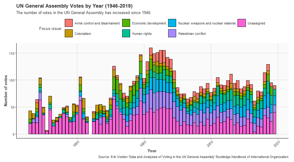
#Load required packages
library(tidyverse)
library(unvotes) # for un roll call and issues data

#create a summary of the number of unvotes with a designated issue
sum_roll_calls_and_issues<-left_join(un_roll_calls, un_roll_call_issues,
                                               multiple = "first") |>
  mutate(year= year(date)) |>
  group_by(year,issue) |>
  summarize(rcids_n_distinct=n_distinct(rcid)) |>
  mutate(issue= if_else(is.na(issue),"Unassigned", issue))

# set up the ggplot 'canvas'
plt_roll_calls_and_issues<-ggplot(data= sum_roll_calls_and_issues,
                                  aes(x=year, y=rcids_n_distinct))+
#specify the geometry for visualizing data
  geom_col(aes(fill=issue), color="black")+
#add labels
  labs(y="Number of votes",
       x="Year",
       fill="Focus issue:",
       title="UN General Assembly Votes by Year (1946-2019)",
       subtitle = "The number of votes in the UN General Assembly has increased since 1946",
       caption = "Source: Erik Voeten 'Data and Analyses of Voting in the UN General Assembly' Routledge Handbook of International Organization")+
  theme_classic()+
#apply a theme
   theme(
    # Move legend to top for better use of horizontal space
    legend.position = "top",
    # make all axis text the same size
    axis.text = element_text(size = 9),
        # Rotate x-axis text for better readability of years
    axis.text.x = element_text(angle = 45, hjust = 1),
        # Make title bold and larger
    plot.title = element_text(size = 14, face = "bold", hjust = 0),
        # Add subtle background color
    panel.background = element_rect(fill = "grey98", color = NA),
    # Lighten gridlines to reduce visual clutter
    panel.grid.major = element_line(color = "grey85", size = 0.3),
      # Increase axis title size and add some styling
    axis.title = element_text(size = 11, face = "bold"),
        # Add margin space to prevent text being cutoff
    plot.margin = margin(10, 15, 10, 10),
        # Set consistent base text properties
    text = element_text(family = "sans", color = "grey20"),
      # Make legend keys smaller for compact display
    legend.key.size = unit(0.8, "cm")
  )


#output the plot
plt_roll_calls_and_issues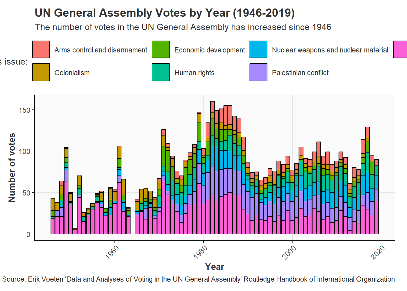
Comparing Groups and Categories: Facets
Facets split your visualization into multiple related sub-plots based on categorical variables provided. This can make it easier to visualize and compare the characteristics of groups and categories within a dataset. ggplot2 offers two main faceting functions:
facet_grid(row ~ column)arranges plots in a grid defined by row and column variables; andfacet_wrap()wraps a series of panels into a 2D arrangement and offers more flexibility.
#create individual plots by groups defined in the dataframe. Note that facets are specified as rows ~ columns in facet_grid()
  facet_grid(issue ~.)
Enhancing Impact and Meaning: Color and Aesthetics
The strategic use of color can help an audience quickly grasp the core message presented by a plot and enhance its impact. Perhaps you’re interested in communicating different levels of risk using green, orange and red. Maybe your categories belong to high-level groupings that you’d like to highlight through color. Or perhaps you have a third variable that you’d like to visualize in a scatter diagram, such as the regional grouping a country belongs to.
Understanding the psychology of color can also add an additional dimension to your visualizations. For instance, red is often associated with strong negative emotions, making it often useful for highlighting problematic data points that warrant the attention of the audience. Whereas greens might be more appropriate for highlighting more favorable data points.
The nature of the values you’re intending to assign colors also matters when selecting a color palette. For instance, basing colors on data that has no pattern or grouping that contributes to your core message is unlikely to be useful and will just add unecessary clutter. In general, the color palette appropriate for the data can be divided into three groups:
Sequential palettes use light-to-dark variations of a single color to represent a variable’s value. This is best used for values whose values or rank can be meaningfully compared, such as average household income by region.
Qualitative palettes have distinct hues and/or colors for each value. This is generally used for categorical and qualitative data, such as the sex of respondents to a survey.
Diverging palettes use diverging hues and/or color combinations to highlight extreme values on either end of a scale. For instance, a diverging palette might be useful for visualizing the average speed of traffic relative to the speed limit as large differences on either side might warrant further attention.
ggplot2’s Color Logic: Aesthetics + Scales
ggplot2 separates what gets colored (aesthetics) from how it gets colored (scales).
# Mapping data to aesthetics
ggplot(data, aes(x = var1, y = var2, color = category))

# Controlling how the colors appear
scale_color_manual(values = c("red", "blue", "green"))
Aesthetics
Different geometric elements require different types of coloring, and ggplot2 provides distinct aesthetic mappings for each. For beginners trying to specify colors for a plot confusion often stems from not realizing that different parts of the same geometric shape are controlled by distinct aesthetic parameters. For instance, a bar chart’s outline is set via color, while fill sets its interior. At the same time, how and where these parameters are set depends on whether the colors are meant to map to data or be fixed across a plot.
ggplot2 has three main color aesthetics, each serving different visual elements. In most cases you’ll set these within the aes() function if the colors depend on your data, but outside if the colors should apply across the entire plot:
color(orcolour) - Colors the outlines, points, lines, and textfill- Colors the interior areas of bars, polygons, violin plots, and area chartsalpha- Controls transparency (0 = invisible, 1 = fully opaque)
Scales
Once you’ve specified the aesthetics of your plot you can set how these are colored via adding scales layers, which are named using a general to specific format e.g. scale_[aesthetic]_[type]():
For discrete/categorical data:
scale_<aesthetic>_manual()can be used to manually specify which colors to use. Also scale_fill_manual()scale_<aesthetic>_brewer()which has a variety of predefined sequential, diverging and qualitative color palettes. See herefor more.scale_<aesthetic>_viridis()for the Viridis palette which can improve readability for those with color blindness and/or deficiencies (orscale_<aesthetic>_viridis_d()for the discrete alternative).
For continuous/numeric data:
scale_<aesthetic>_gradient()a simple two-color gradient from low to high valuesscale_<aesthetic>_viridis_c()to apply the Viridis palette to continuous data
Remember to match your aesthetic: if you mapped fill = variable in your aes(), use scale_fill_*() functions. If you mapped color = variable, use scale_color_*() functions.
Viewing Available Colors in R
R has a lot of options for specifying the color of your plot. So much so, it can feel a little overwhelming for a newcomer. But, luckily R (andthe R community) has your back.
The code below provides some examples of what you’ve got to work with, but there are a myriad of other options available for the brave. The important thing to notice from the code below is that it’s possible to specify colors with a high level of precision by using its name, RGB or HEX code, or number (link).
# View all named colors in R
colors()  # Returns vector of all color names
[1] "white" "aliceblue" "antiquewhite"
[4] "antiquewhite1" "antiquewhite2" "antiquewhite3"
[7] "antiquewhite4" "aquamarine" "aquamarine1"
[10] "aquamarine2" "aquamarine3" "aquamarine4"
[13] "azure" "azure1" "azure2"
[16] "azure3" "azure4" "beige"
[19] "bisque" "bisque1" "bisque2"
[22] "bisque3" "bisque4" "black"
[25] "blanchedalmond" "blue" "blue1"
[28] "blue2" "blue3" "blue4"
[31] "blueviolet" "brown" "brown1"
[34] "brown2" "brown3" "brown4"
[37] "burlywood" "burlywood1" "burlywood2"
[40] "burlywood3" "burlywood4" "cadetblue"
[43] "cadetblue1" "cadetblue2" "cadetblue3"
[46] "cadetblue4" "chartreuse" "chartreuse1"
[49] "chartreuse2" "chartreuse3" "chartreuse4"
[52] "chocolate" "chocolate1" "chocolate2"
[55] "chocolate3" "chocolate4" "coral"
[58] "coral1" "coral2" "coral3"
[61] "coral4" "cornflowerblue" "cornsilk"
[64] "cornsilk1" "cornsilk2" "cornsilk3"
[67] "cornsilk4" "cyan" "cyan1"
[70] "cyan2" "cyan3" "cyan4"
[73] "darkblue" "darkcyan" "darkgoldenrod"
[76] "darkgoldenrod1" "darkgoldenrod2" "darkgoldenrod3"
[79] "darkgoldenrod4" "darkgray" "darkgreen"
[82] "darkgrey" "darkkhaki" "darkmagenta"
[85] "darkolivegreen" "darkolivegreen1" "darkolivegreen2"
[88] "darkolivegreen3" "darkolivegreen4" "darkorange"
[91] "darkorange1" "darkorange2" "darkorange3"
[94] "darkorange4" "darkorchid" "darkorchid1"
[97] "darkorchid2" "darkorchid3" "darkorchid4"
[100] "darkred" "darksalmon" "darkseagreen"
[103] "darkseagreen1" "darkseagreen2" "darkseagreen3"
[106] "darkseagreen4" "darkslateblue" "darkslategray"
[109] "darkslategray1" "darkslategray2" "darkslategray3"
[112] "darkslategray4" "darkslategrey" "darkturquoise"
[115] "darkviolet" "deeppink" "deeppink1"
[118] "deeppink2" "deeppink3" "deeppink4"
[121] "deepskyblue" "deepskyblue1" "deepskyblue2"
[124] "deepskyblue3" "deepskyblue4" "dimgray"
[127] "dimgrey" "dodgerblue" "dodgerblue1"
[130] "dodgerblue2" "dodgerblue3" "dodgerblue4"
[133] "firebrick" "firebrick1" "firebrick2"
[136] "firebrick3" "firebrick4" "floralwhite"
[139] "forestgreen" "gainsboro" "ghostwhite"
[142] "gold" "gold1" "gold2"
[145] "gold3" "gold4" "goldenrod"
[148] "goldenrod1" "goldenrod2" "goldenrod3"
[151] "goldenrod4" "gray" "gray0"
[154] "gray1" "gray2" "gray3"
[157] "gray4" "gray5" "gray6"
[160] "gray7" "gray8" "gray9"
[163] "gray10" "gray11" "gray12"
[166] "gray13" "gray14" "gray15"
[169] "gray16" "gray17" "gray18"
[172] "gray19" "gray20" "gray21"
[175] "gray22" "gray23" "gray24"
[178] "gray25" "gray26" "gray27"
[181] "gray28" "gray29" "gray30"
[184] "gray31" "gray32" "gray33"
[187] "gray34" "gray35" "gray36"
[190] "gray37" "gray38" "gray39"
[193] "gray40" "gray41" "gray42"
[196] "gray43" "gray44" "gray45"
[199] "gray46" "gray47" "gray48"
[202] "gray49" "gray50" "gray51"
[205] "gray52" "gray53" "gray54"
[208] "gray55" "gray56" "gray57"
[211] "gray58" "gray59" "gray60"
[214] "gray61" "gray62" "gray63"
[217] "gray64" "gray65" "gray66"
[220] "gray67" "gray68" "gray69"
[223] "gray70" "gray71" "gray72"
[226] "gray73" "gray74" "gray75"
[229] "gray76" "gray77" "gray78"
[232] "gray79" "gray80" "gray81"
[235] "gray82" "gray83" "gray84"
[238] "gray85" "gray86" "gray87"
[241] "gray88" "gray89" "gray90"
[244] "gray91" "gray92" "gray93"
[247] "gray94" "gray95" "gray96"
[250] "gray97" "gray98" "gray99"
[253] "gray100" "green" "green1"
[256] "green2" "green3" "green4"
[259] "greenyellow" "grey" "grey0"
[262] "grey1" "grey2" "grey3"
[265] "grey4" "grey5" "grey6"
[268] "grey7" "grey8" "grey9"
[271] "grey10" "grey11" "grey12"
[274] "grey13" "grey14" "grey15"
[277] "grey16" "grey17" "grey18"
[280] "grey19" "grey20" "grey21"
[283] "grey22" "grey23" "grey24"
[286] "grey25" "grey26" "grey27"
[289] "grey28" "grey29" "grey30"
[292] "grey31" "grey32" "grey33"
[295] "grey34" "grey35" "grey36"
[298] "grey37" "grey38" "grey39"
[301] "grey40" "grey41" "grey42"
[304] "grey43" "grey44" "grey45"
[307] "grey46" "grey47" "grey48"
[310] "grey49" "grey50" "grey51"
[313] "grey52" "grey53" "grey54"
[316] "grey55" "grey56" "grey57"
[319] "grey58" "grey59" "grey60"
[322] "grey61" "grey62" "grey63"
[325] "grey64" "grey65" "grey66"
[328] "grey67" "grey68" "grey69"
[331] "grey70" "grey71" "grey72"
[334] "grey73" "grey74" "grey75"
[337] "grey76" "grey77" "grey78"
[340] "grey79" "grey80" "grey81"
[343] "grey82" "grey83" "grey84"
[346] "grey85" "grey86" "grey87"
[349] "grey88" "grey89" "grey90"
[352] "grey91" "grey92" "grey93"
[355] "grey94" "grey95" "grey96"
[358] "grey97" "grey98" "grey99"
[361] "grey100" "honeydew" "honeydew1"
[364] "honeydew2" "honeydew3" "honeydew4"
[367] "hotpink" "hotpink1" "hotpink2"
[370] "hotpink3" "hotpink4" "indianred"
[373] "indianred1" "indianred2" "indianred3"
[376] "indianred4" "ivory" "ivory1"
[379] "ivory2" "ivory3" "ivory4"
[382] "khaki" "khaki1" "khaki2"
[385] "khaki3" "khaki4" "lavender"
[388] "lavenderblush" "lavenderblush1" "lavenderblush2"
[391] "lavenderblush3" "lavenderblush4" "lawngreen"
[394] "lemonchiffon" "lemonchiffon1" "lemonchiffon2"
[397] "lemonchiffon3" "lemonchiffon4" "lightblue"
[400] "lightblue1" "lightblue2" "lightblue3"
[403] "lightblue4" "lightcoral" "lightcyan"
[406] "lightcyan1" "lightcyan2" "lightcyan3"
[409] "lightcyan4" "lightgoldenrod" "lightgoldenrod1"
[412] "lightgoldenrod2" "lightgoldenrod3" "lightgoldenrod4"
[415] "lightgoldenrodyellow" "lightgray" "lightgreen"
[418] "lightgrey" "lightpink" "lightpink1"
[421] "lightpink2" "lightpink3" "lightpink4"
[424] "lightsalmon" "lightsalmon1" "lightsalmon2"
[427] "lightsalmon3" "lightsalmon4" "lightseagreen"
[430] "lightskyblue" "lightskyblue1" "lightskyblue2"
[433] "lightskyblue3" "lightskyblue4" "lightslateblue"
[436] "lightslategray" "lightslategrey" "lightsteelblue"
[439] "lightsteelblue1" "lightsteelblue2" "lightsteelblue3"
[442] "lightsteelblue4" "lightyellow" "lightyellow1"
[445] "lightyellow2" "lightyellow3" "lightyellow4"
[448] "limegreen" "linen" "magenta"
[451] "magenta1" "magenta2" "magenta3"
[454] "magenta4" "maroon" "maroon1"
[457] "maroon2" "maroon3" "maroon4"
[460] "mediumaquamarine" "mediumblue" "mediumorchid"
[463] "mediumorchid1" "mediumorchid2" "mediumorchid3"
[466] "mediumorchid4" "mediumpurple" "mediumpurple1"
[469] "mediumpurple2" "mediumpurple3" "mediumpurple4"
[472] "mediumseagreen" "mediumslateblue" "mediumspringgreen"
[475] "mediumturquoise" "mediumvioletred" "midnightblue"
[478] "mintcream" "mistyrose" "mistyrose1"
[481] "mistyrose2" "mistyrose3" "mistyrose4"
[484] "moccasin" "navajowhite" "navajowhite1"
[487] "navajowhite2" "navajowhite3" "navajowhite4"
[490] "navy" "navyblue" "oldlace"
[493] "olivedrab" "olivedrab1" "olivedrab2"
[496] "olivedrab3" "olivedrab4" "orange"
[499] "orange1" "orange2" "orange3"
[502] "orange4" "orangered" "orangered1"
[505] "orangered2" "orangered3" "orangered4"
[508] "orchid" "orchid1" "orchid2"
[511] "orchid3" "orchid4" "palegoldenrod"
[514] "palegreen" "palegreen1" "palegreen2"
[517] "palegreen3" "palegreen4" "paleturquoise"
[520] "paleturquoise1" "paleturquoise2" "paleturquoise3"
[523] "paleturquoise4" "palevioletred" "palevioletred1"
[526] "palevioletred2" "palevioletred3" "palevioletred4"
[529] "papayawhip" "peachpuff" "peachpuff1"
[532] "peachpuff2" "peachpuff3" "peachpuff4"
[535] "peru" "pink" "pink1"
[538] "pink2" "pink3" "pink4"
[541] "plum" "plum1" "plum2"
[544] "plum3" "plum4" "powderblue"
[547] "purple" "purple1" "purple2"
[550] "purple3" "purple4" "red"
[553] "red1" "red2" "red3"
[556] "red4" "rosybrown" "rosybrown1"
[559] "rosybrown2" "rosybrown3" "rosybrown4"
[562] "royalblue" "royalblue1" "royalblue2"
[565] "royalblue3" "royalblue4" "saddlebrown"
[568] "salmon" "salmon1" "salmon2"
[571] "salmon3" "salmon4" "sandybrown"
[574] "seagreen" "seagreen1" "seagreen2"
[577] "seagreen3" "seagreen4" "seashell"
[580] "seashell1" "seashell2" "seashell3"
[583] "seashell4" "sienna" "sienna1"
[586] "sienna2" "sienna3" "sienna4"
[589] "skyblue" "skyblue1" "skyblue2"
[592] "skyblue3" "skyblue4" "slateblue"
[595] "slateblue1" "slateblue2" "slateblue3"
[598] "slateblue4" "slategray" "slategray1"
[601] "slategray2" "slategray3" "slategray4"
[604] "slategrey" "snow" "snow1"
[607] "snow2" "snow3" "snow4"
[610] "springgreen" "springgreen1" "springgreen2"
[613] "springgreen3" "springgreen4" "steelblue"
[616] "steelblue1" "steelblue2" "steelblue3"
[619] "steelblue4" "tan" "tan1"
[622] "tan2" "tan3" "tan4"
[625] "thistle" "thistle1" "thistle2"
[628] "thistle3" "thistle4" "tomato"
[631] "tomato1" "tomato2" "tomato3"
[634] "tomato4" "turquoise" "turquoise1"
[637] "turquoise2" "turquoise3" "turquoise4"
[640] "violet" "violetred" "violetred1"
[643] "violetred2" "violetred3" "violetred4"
[646] "wheat" "wheat1" "wheat2"
[649] "wheat3" "wheat4" "whitesmoke"
[652] "yellow" "yellow1" "yellow2"
[655] "yellow3" "yellow4" "yellowgreen" demo("colors") # Visual display of colors
    demo(colors)
    ---- ~~~~~~

> ### ----------- Show (almost) all named colors ---------------------
>
> ## 1) with traditional 'graphics' package:
> showCols1 <- function(bg = "gray", cex = 0.75, srt = 30) {
+     m <- ceiling(sqrt(n <- length(cl <- colors())))
+     length(cl) <- m*m; cm <- matrix(cl, m)
+     ##
+     require("graphics")
+     op <- par(mar=rep(0,4), ann=FALSE, bg = bg); on.exit(par(op))
+     plot(1:m,1:m, type="n", axes=FALSE)
+     text(col(cm), rev(row(cm)), cm,  col = cl, cex=cex, srt=srt)
+ }

> showCols1()
> ## 2) with 'grid' package:
> showCols2 <- function(bg = "grey", cex = 0.75, rot = 30) {
+     m <- ceiling(sqrt(n <- length(cl <- colors())))
+     length(cl) <- m*m; cm <- matrix(cl, m)
+     ##
+     require("grid")
+     grid.newpage(); vp <- viewport(width = .92, height = .92)
+     grid.rect(gp=gpar(fill=bg))
+     grid.text(cm, x = col(cm)/m, y = rev(row(cm))/m, rot = rot,
+               vp=vp, gp=gpar(cex = cex, col = cm))
+ }

> showCols2()
> showCols2(bg = "gray33")
> ###
>
> ##' @title Comparing Colors
> ##' @param col
> ##' @param nrow
> ##' @param ncol
> ##' @param txt.col
> ##' @return the grid layout, invisibly
> ##' @author Marius Hofert, originally
> plotCol <- function(col, nrow=1, ncol=ceiling(length(col) / nrow),
+                     txt.col="black") {
+     stopifnot(nrow >= 1, ncol >= 1)
+     if(length(col) > nrow*ncol)
+         warning("some colors will not be shown")
+     require(grid)
+     grid.newpage()
+     gl <- grid.layout(nrow, ncol)
+     pushViewport(viewport(layout=gl))
+     ic <- 1
+     for(i in 1:nrow) {
+         for(j in 1:ncol) {
+             pushViewport(viewport(layout.pos.row=i, layout.pos.col=j))
+             grid.rect(gp= gpar(fill=col[ic]))
+             grid.text(col[ic], gp=gpar(col=txt.col))
+             upViewport()
+             ic <- ic+1
+         }
+     }
+     upViewport()
+     invisible(gl)
+ }

> ## A Chocolate Bar of colors:
> plotCol(c("#CC8C3C", paste0("chocolate", 2:4),
+           paste0("darkorange", c("",1:2)), paste0("darkgoldenrod", 1:2),
+           "orange", "orange1", "sandybrown", "tan1", "tan2"),
+         nrow=2)
> ##' Find close R colors() to a given color {original by Marius Hofert)
> ##' using Euclidean norm in (HSV / RGB / ...) color space
> nearRcolor <- function(rgb, cSpace = c("hsv", "rgb255", "Luv", "Lab"),
+                        dist = switch(cSpace, "hsv" = 0.10, "rgb255" = 30,
+                        "Luv" = 15, "Lab" = 12))
+ {
+     if(is.character(rgb)) rgb <- col2rgb(rgb)
+     stopifnot(length(rgb <- as.vector(rgb)) == 3)
+     Rcol <- col2rgb(.cc <- colors())
+     uniqC <- !duplicated(t(Rcol)) # gray9 == grey9 (etc)
+     Rcol <- Rcol[, uniqC] ; .cc <- .cc[uniqC]
+     cSpace <- match.arg(cSpace)
+     convRGB2 <- function(Rgb, to)
+         t(convertColor(t(Rgb), from="sRGB", to=to, scale.in=255))
+     ## the transformation,  rgb{0..255} --> cSpace :
+     TransF <- switch(cSpace,
+                      "rgb255" = identity,
+                      "hsv" = rgb2hsv,
+                      "Luv" = function(RGB) convRGB2(RGB, "Luv"),
+                      "Lab" = function(RGB) convRGB2(RGB, "Lab"))
+     d <- sqrt(colSums((TransF(Rcol) - as.vector(TransF(rgb)))^2))
+     iS <- sort.list(d[near <- d <= dist])# sorted: closest first
+     setNames(.cc[near][iS], format(zapsmall(d[near][iS]), digits=3))
+ }

> nearRcolor(col2rgb("tan2"), "rgb")
         0.0         21.1         25.8         29.5
      "tan2"       "tan1" "sandybrown"    "sienna1"

> nearRcolor(col2rgb("tan2"), "hsv")
      0.0000       0.0410       0.0618       0.0638       0.0667       0.0766
      "tan2"    "sienna2"     "coral2"    "tomato2"       "tan1"      "coral"
      0.0778       0.0900       0.0912       0.0918
   "sienna1" "sandybrown"     "coral1"     "tomato"

> nearRcolor(col2rgb("tan2"), "Luv")
        0.00         7.42         7.48        12.41        13.69
      "tan2"       "tan1" "sandybrown"    "orange3"    "orange2"

> nearRcolor(col2rgb("tan2"), "Lab")
        0.00         5.56         8.08        11.31
      "tan2"       "tan1" "sandybrown"       "peru"

> nearRcolor("#334455")
         0.0867
"darkslategray"

> ## Now, consider choosing a color by looking in the
> ## neighborhood of one you know :
>
> plotCol(nearRcolor("deepskyblue", "rgb", dist=50))
> plotCol(nearRcolor("deepskyblue", dist=.1))
> plotCol(nearRcolor("tomato", "rgb", dist= 50), nrow=3)
> plotCol(nearRcolor("tomato", "hsv", dist=.12), nrow=3)
> plotCol(nearRcolor("tomato", "Luv", dist= 25), nrow=3)
> plotCol(nearRcolor("tomato", "Lab", dist= 18), nrow=3)
# View specific color palettes
library(RColorBrewer)
display.brewer.all()  # Show all ColorBrewer palettes
display.brewer.all(colorblindFriendly = TRUE) # Only colorblind-safe palettes
# View viridis palettes
library(viridis)
scales::show_col(viridis(10))  # Show 10 colors from viridis palette
Applying Colors Palettes Across a Plot
Colors can also be specified more generally in ggplot using a pre-defined palette. In the example below notice that scale_fill_brewer() is added as a layer to the plot to apply a qualitative color palette to our categorical ‘issue’ variable. Since we have distinct categories with no inherent ordering a qualitative palette makes the most sense:
#Load required packages
library(tidyverse)
library(unvotes) # for un roll call and issues data

#create a summary of the number of unvotes with a designated issue
sum_roll_calls_and_issues<-left_join(un_roll_calls, un_roll_call_issues,
                                               multiple = "first") |>
  mutate(year= year(date)) |>
  group_by(year,issue) |>
  summarize(rcids_n_distinct=n_distinct(rcid)) |>
  mutate(issue= if_else(is.na(issue),"Unassigned", issue))

# QUALITATIVE PALETTE - for categorical data like 'issue'
plt_qualitative <- ggplot(data= sum_roll_calls_and_issues,
                          aes(x=year, y=rcids_n_distinct))+
  geom_col(aes(fill=issue), color="black")+
  scale_fill_brewer(palette = "Set2") +  # Qualitative palette for distinct categories
  labs(y="Number of votes", x="Year", fill="Focus issue:",
       title="UN General Assembly Votes by Year (Qualitative Palette)")+
  theme_classic()

plt_qualitative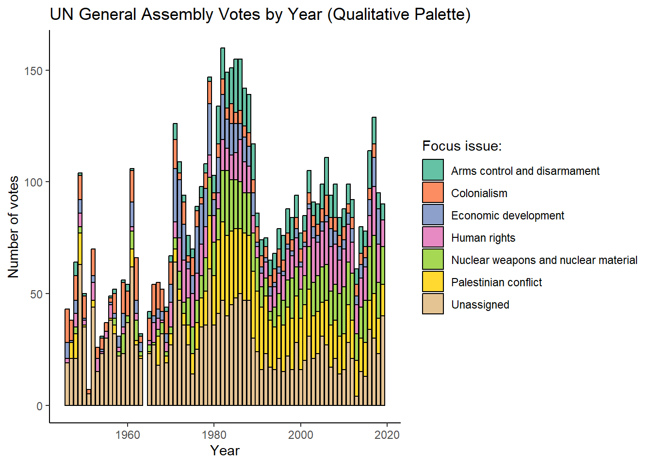
# Sequential example:
plt_sequential <- ggplot(data= sum_roll_calls_and_issues |>
                                   group_by(year) |>
                                   summarize(total_votes = sum(rcids_n_distinct)),
                                 aes(x=year, y=total_votes))+
  geom_col(aes(fill=total_votes))+
  scale_fill_gradient(low = "lightblue", high = "darkblue") +  # Sequential gradient
  labs(title="Sequential Palette Example")+
  theme_classic()

plt_sequential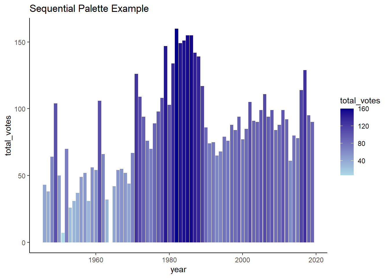
#drop the plots
rm(plt_qualitative,plt_sequential)Fine-Tuned Control: Inside vs. Outside aes()
Instead of applying color palettes globally, you can make targeted aesthetic adjustments directly within the geom layers and aes() mappings. This gives you finer control over how specific data points or categories appear in your visualization.
The code below provides an example of this, with the fill of the columns mapped to the issue and alpha (or transparency) being mapped to whether the issue was “Arms control and disarmament”. Notice that the borders and linewidth are specified within the geom layer, but outside of aes(). This is because these are constant values applied to all bars uniformly, rather than values that vary based on the underlying data. Properties inside aes() are mapped to variables in your data and can change for each observation, while properties outside aes() are fixed settings applied to all elements in that layer. The scale_alpha_identity() function tells ggplot to use the exact alpha values we specified (1 or 0.3) rather than mapping them to a different scale.
#Load required packages
library(tidyverse)
library(unvotes) # for un roll call and issues data
#create a summary of the number of unvotes with a designated issue
sum_roll_calls_and_issues<-left_join(un_roll_calls, un_roll_call_issues,
multiple = "first") |>
mutate(year= year(date)) |>
group_by(year,issue) |>
summarize(rcids_n_distinct=n_distinct(rcid)) |>
mutate(issue= if_else(is.na(issue),"Unassigned", issue))
# EXAMPLE 1: Highlighting specific issues through conditional aesthetics
plt_roll_calls_and_issues <- ggplot(data= sum_roll_calls_and_issues,
aes(x=year, y=rcids_n_distinct, fill=issue))+
geom_col(aes(alpha = if_else(issue== "Arms control and disarmament",1,0.3)),
color="black",
linewidth = 0.5) +
scale_alpha_identity() + # Use actual alpha values
labs(y="Number of votes", x="Year", fill="Focus issue:",
title="UN Votes: Highlighting Key Security Issues")+
theme_classic()
plt_roll_calls_and_issues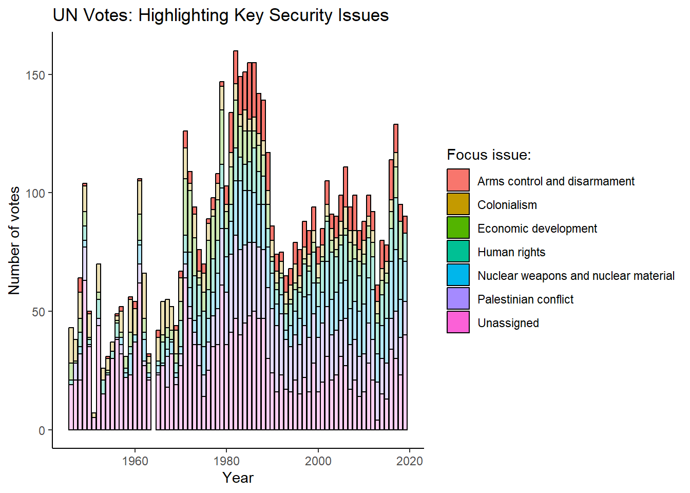
Key Considerations for Color Choices
As with most things in life, context matters. So before building a rainbow monstrosity it’s worth considering:
Appropriateness to data and message: Does your color scheme reinforce or distract from your key insight? Try to use colors sparingly in a way that fits your data and reinforces your message.
Organizational branding: Many organizations have style guides specifying exact colors for consistency across communications. Using brand colors can make your visualizations feel more professional and integrated. Doing this is also relatively simple in ggplot2 (link).
Audience color associations: Colors carry cultural and contextual meanings. Red might mean “stop” or “danger” in Western contexts but symbolizes luck and prosperity elsewhere. If you’re not sure how an audience might perceive your analysis a good idea can be to find somebody to test your ideas with first. You could also ask members of your target audience for examples of past presentations they have enjoyed.
Accessibility (color-blind friendly): It’s a good idea to use tools like
colorblindcheck::palette_check()to verify your palette is color-blind friendly or use a palette that is known to be suitable (link).
Note: There is a lot that can be done with colors in ggplot2. Fortunately, there are lots of great resources to help you along the way:
-
- In particular, the Color Palette Finder
Reference guides
Exporting Your Plot: ggsave
While plots can be saved through RStudio’s ‘Export’ viewer option, ggplot2’s ggsave() function provides direct control over export parameters. Like other tidyverse functions, ggsave() uses intelligent defaults, typically requiring only a filename specification.
Key parameters include:
filename: Output file name (with extension)plot: ggplot object to save (defaults to last displayed plot)path: Save directory (defaults to working directory)scale: Plot scaling factor (affects element sizes like titles)widthandheight: Plot dimensions (defaults to current device dimensions)units: Dimension units (“in”, “cm”, “mm”, “px”) - defaults to inchesdpi: Resolution for raster formats (jpeg, png, tiff)
If you’d like to save the last plot visualized, specifying just the filename is sufficient. For example:
#present the plot
plt_roll_calls_and_issues
#save the last plot as a png file in a directory called 'Plots'
ggsave(filename = "./Plots/my_plot.png")Reporting
Principles of Effective Data Visualization
Once you’ve learned the basics of ggplot2 It’s easy to get carried away as there are an almost unlimited array of options to choose from:
Interested in visualizing five variables in single plot?
Can do!
Want to spice up your scatterplot by using cats as points?
There’s a package for that!
Want to create a three-dimensional pie graph using a rainbow palette?
Please don’t.
Keep it simple: Balancing the Data-Ink Ratio
If you spend enough time learning about data visualization you’ll come across Edward Tufte’s principle of “data-ink” and “non-data-ink”.
Data-ink refers to elements of a visualization that represent the data, such as columns in a column plot, points in a scatter plot or slices of a pie chart. Non data-ink relates to elements of a visualization that don’t relate to the data, such as gridlines, colors and other embellishments that don’t help the reader understand the data (or your message). Tufte’s general guide is that a better visualizations are made up of a higher proportion of non-erasable data-ink:
Data-Ink Ratio
\[\text{Data-Ink Ratio} = \frac{\text{Data-ink}}{\text{Total ink used in the visualization}}\]
Where:
Data-ink = Elements representing actual data (columns, points, slices)
Non-data-ink = Elements not representing data (gridlines, decorative colors, embellishments)
Data-ink Ratio Extremism
To provide you a sense of what this means in practice, we’ll use the highly policy-relevant chicken weights dataset to communicate how different diets assigned to chickens influence their growth rate.
In the first example notice that the plot is composed almost entirely of data-ink. Although we know from the code that the height of column signifies the average weight of chickens and its position on the x axis the diet, there’s no way for the audience to know this. As we’ve cut out too much data-ink for it to be meaningfully interpreted.
We’ve clearly taken the data-ink principle too far.
Example 1: data-ink extremism

library(ggplot2)
library(dplyr)
#calculate teh average weigth of a chicken by feed
sum_chicken_weights<-chickwts |>
group_by(feed) |>
summarize(weight_avg=mean(weight, na.rm=TRUE))
#plot the average
ggplot(sum_chicken_weights, aes(x = feed, y = weight_avg)) +
geom_col() +
theme_void()
The second example presents another extreme. This time it’s clearer what data is being presented, but there is quite a bit of redundant, unnecessary and/or poorly structured information that doesn’t help our audience understand our core message:
Redundant: information about the diet has been presented three times in the plot - once on the x axis, once in the legend and once by the color.
Unnecessary: the title could be made more concise and probably doesn’t need to mention the sample size. The gray background and grid lines aid the audience interpreting the plot in a way that’s relevant to our message.
Poorly structured information: The axis labels could be made clearer and easier to interpret, such as by using Diet instead of feed and explaining what the weight_avg variable represents.
Example 2: a cluttered mess
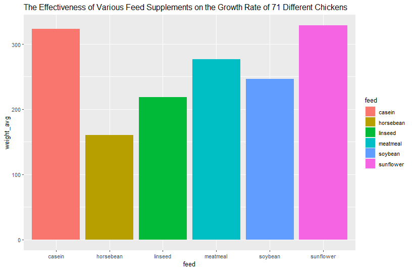
#plot the average
ggplot(sum_chicken_weights, aes(x = feed, y = weight_avg)) +
geom_col(aes(fill=feed))+
labs(title="The Effectiveness of Various Feed Supplements on the Growth Rate of 71 Different Chickens")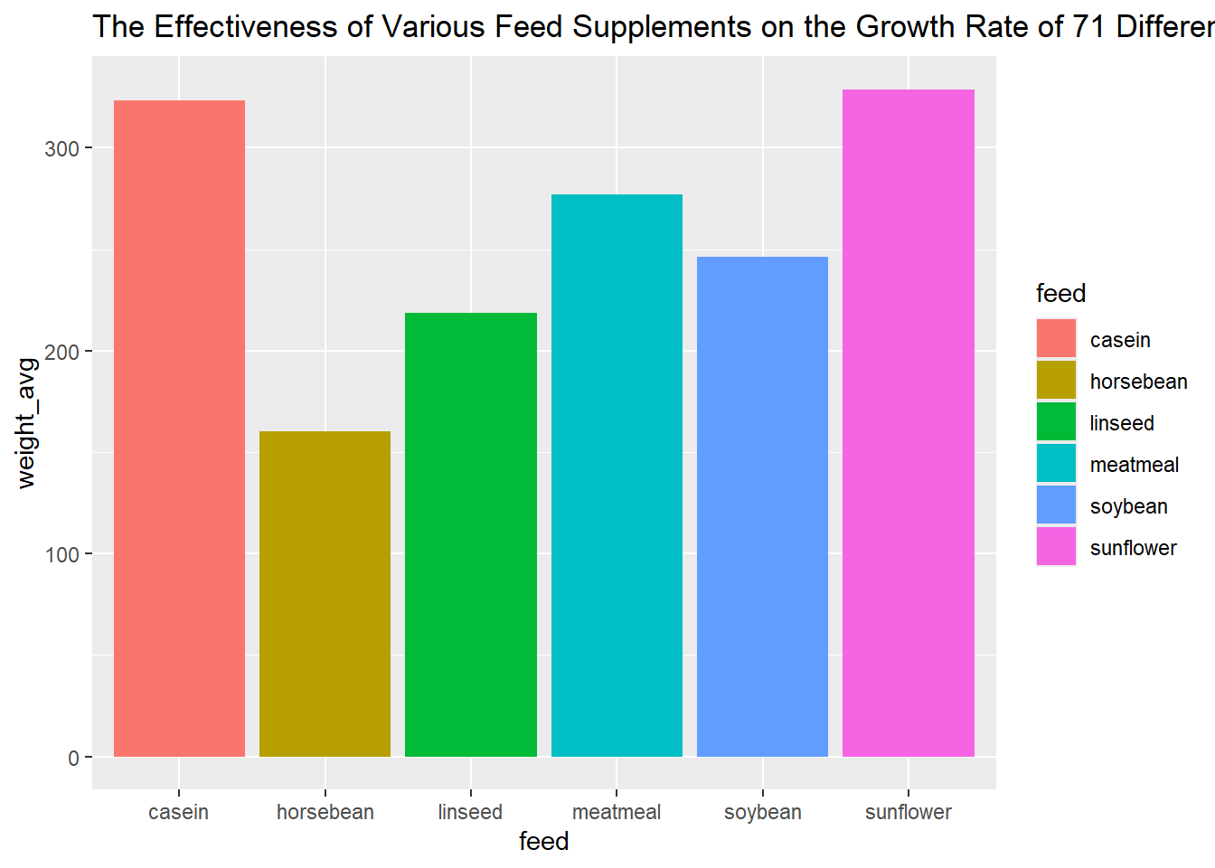
The final plot splits the difference by dropping a lot of the non-data-ink without making the point of the plot a mystery. In particular, notice that almost all of the visual elements directly stem from the data or are designed to help with its interpretation. In particular:
The title and subtitle directly communicates the point of the plot.
The y axis specifies the units being measured and the x axis the nature of the groups.
Columns are ordered and colored to highlight the diets with the highest weights.
The gridlines and background have been removed.
The name of the diet is only presented once on the x axis.
Example 3: balancing simplicity and style
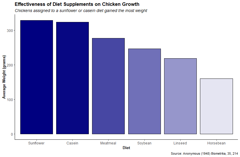
library(stringr)
#change the feed to sentence case
sum_chicken_weights<-sum_chicken_weights |>
mutate(feed=str_to_title(feed))
#plot the average
ggplot(sum_chicken_weights, aes(x = reorder(feed, -weight_avg), y = weight_avg)) +
geom_col(aes(alpha=weight_avg ), col="black", fill="navy")+
theme_classic()+
labs(title="Effectiveness of Diet Supplements on Chicken Growth",
subtitle="Chickens assigned to a sunflower or casein diet gained the most weight",
caption="Source: Anonymous (1948) Biometrika, 35, 214" ,
x="Diet",
y="Average Weight (grams)")+
theme(legend.position = "none",
plot.title = element_text(size = 14, face = "bold"),
plot.subtitle = element_text(size=12, face="italic"),
axis.text= element_text(size=10),
axis.title = element_text(size = 11, face = "bold")) 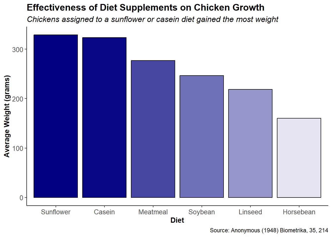
Finding the Right Balance: Context Matters
This isn’t to say that more couldn’t be done to improve the plot further, but just to demonstrate that maximizing the data-ink ratio isn’t a hard and fast rule. It’s a general guide for producing better plots. After all, gridlines might make sense if your audience is interested in knowing exactly how fat chickens were in each group. Colors might be appropriate so your plot properly aligns with the company’s brand. Or maybe the plot is exploratory in nature and will be presented to an audience that knows what the weight_avg variable is.
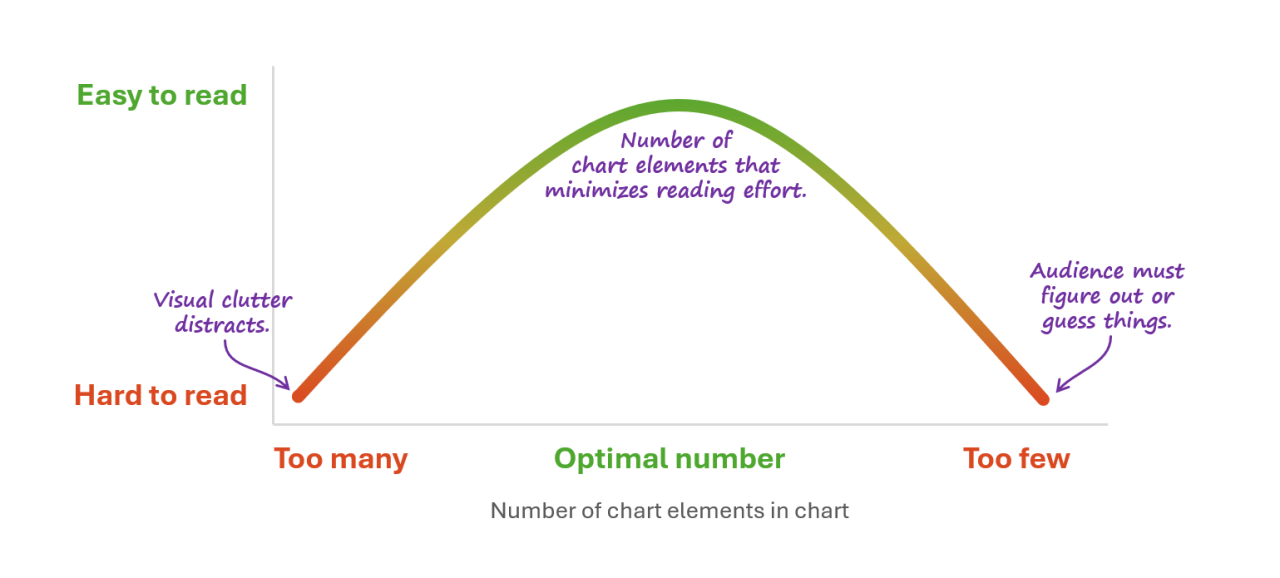
Source: Nick Deskbarats
Data visualization is both an art and a science. While the data-ink principle is a good general guide, there’s no universal formula for creating the perfect visualization. But, if I had to pick some rules of thumb for producing strong visuals I’d point to the following:
Relevance and focus: one of the reasons for obnoxiously stating your message in the plot is to keep yourself focused on why it exists in the first place. This makes it easier to emphasize what matters, drop visual elements that don’t have a purpose and decide whether a plot even makes sense for communicating your message.
Simplicity and clarity: although minimalism can be taken too far, my advice is to strive for simplicity without taking the data-ink ratio principle too far. In R, this might just mean starting with
theme_classic()and selectively adding elements until you’ve achieved the right balance.Accessibility: Design visualizations so they can be understood by a wide audience. Use colorblind-friendly palettes, ensure sufficient contrast between text and backgrounds and add descriptive labels that make your plot easy to understand. Remember that what seems obvious to you may be unclear to others. After all, many in your audience won’t be as comfortable with numbers or reading plots as somebody learning how to code.
Consistency and style: Try to maintain visual coherence and consistency both within individual plots and across your entire analysis or presentation. Aside from making your plots look more professional, visual coherence can reduce cognitive load and accelerates comprehension by the audience by reducing the time needed to familiarize themselves with the visual layout of each new chart.
Accuracy: Never let aesthetic choices compromise the integrity of your data. Start bar charts at zero to avoid exaggerating differences, use appropriate scales for the data and transparently indicate when data has been transformed or aggregated. Beautiful visualizations that mislead are worse than ugly ones that tell the truth.
Note: For an in-depth critique of data-ink ratio extremism (complete with hate mail), see Frank Elavsky’s great blog post on the topic here.
Data Storytelling
What is data storytelling?
Data storytelling is about weaving a narrative around your data, analysis and visualizations. Instead of just presenting a plot with your results, a data story explains its implication by combining data visualization with a narrative that explains what your analysis means, why the audience should care and what can be done about it.
The phrase “data storytelling” has been associated with many things—data visualizations, infographics, dashboards, data presentations, and so on. Too often data storytelling is interpreted as just visualizing data effectively, however, it is much more than just creating visually-appealing data charts. Data storytelling is a structured approach for communicating data insights, and it involves a combination of three key elements: data, visuals, and narrative.
-Steven Few
Rather than overwhelming audiences with spreadsheets and technical findings, it combines three elements to make research compelling and actionable:
Data: Your quantitative evidence, such as statistical analysis, metrics and research findings about a policy issue. This element can make your analysis credible, but is unlikely to be interesting or informative by itself.
Visuals: Charts, graphs and infographics can make complex ideas more accessible to an audience by highlighting what’s important, dropping what’s not and taking advantage of humanity’s talent for processing visual information.
Narrative: The explanatory story that connects your findings to your audience’s priorities and shows why they should change their view about an issue and/or act upon your findings.
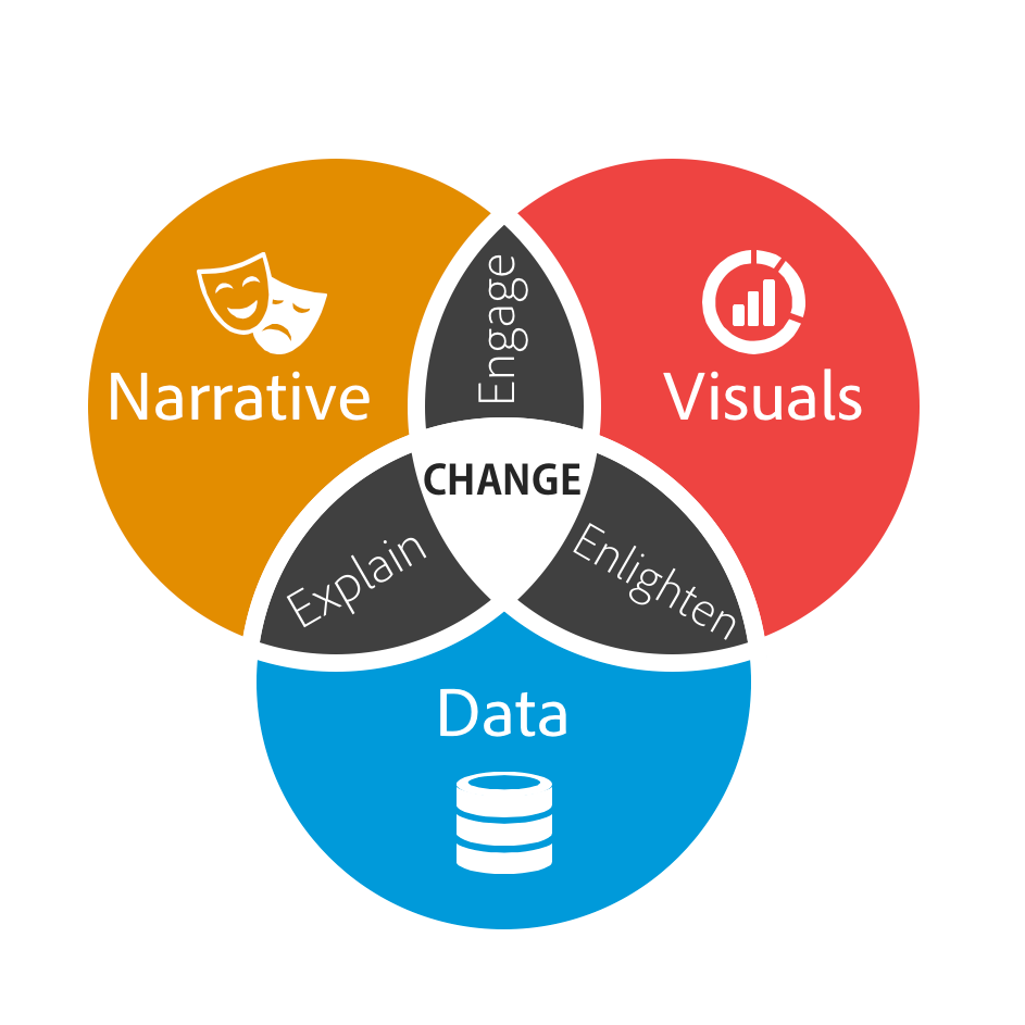
Source: Dykes, B., 31/3/2016, Data Storytelling: The Essential Data Science Skill Everyone Needs, Forbes.com
Crafting a Data Story
If you’re interested in learning R, you might find many of the principles of data visualization and storytelling confusing. After all, when learning R the principles tend to be logical, well structured and predictable, unlike the principles of good data visualization and storytelling:
A table of statistics might not be suitable for the general public, but be ideal for an academic audience.
A column graph might be the best way to show a set of data, but your manager might prefer pie graphs.
And although your colleagues might be interested in the thought process behind your analysis, the Finance Minister probably isn’t.
What works and why isn’t static, easy to test or universal. Which is perhaps why data visualization and storytelling is a fertile ground for unhelpful advice and snake oil.
It’s a mix of art and science.
But, if I had to suggest a good place to start, it would be to chart your analysis journey chronologically and think through what the audience needs to know to understand, identify and care about the journey you took. Although it’s best to avoid being too formulaic, a reasonable structure to start with for a policy analysis journey might be:
Setting the scene: Why this issue matters now: Establish what the focus issue is and why it demands attention by quantifying its scale, urgency, impact on the public and the cost of inaction.
Present the challenge: What has been tried, reccomended or missed: Present the landscape of relevant evidence and research. What have other jurisdictions tried? What does research reveal about the issue? What are stakeholders saying? What unanswered questions did your analysis seek to answer?
Highlight your central insight(s): whatnew and surprisinginsights did your analysis reveal: Share how your analysis uncovered patterns others missed, challenged conventional assumptions or suggested an issue’s root causes. If your analysis supports previous research, mention this and new insights from your work. If it contradicts the existing evidence mention this too, but explain why you think they are valuable to the focus issue.
Enable and inspire action: what should happen next: Give decision-makers clear options based on your findings. Explain the trade-offs honestly and, if seeking input, provide an easy way for audiences to respond.
This structure is just a starting template, not a rigid formula. But, it has the added advantage of chronologically aligning with the public policy cycle and a traditional narrative arc. Meaning that once you’ve identified your basic ingredients, crafting your data story becomes a matter of figuring out how best to combine them to make your target audience care.
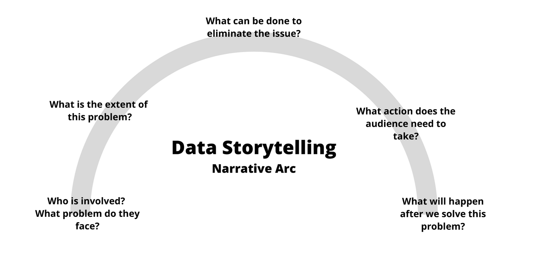
Source: Gates D.,1/10/2020, Transforming Data into a Story: Conflict, Characters, and Closure
The key question is: what impact do you want your presentation to have? Are your audience Ministers that you’d like to take action? Are you trying to convince executives to invest more resources into investigating a public policy issue? Or are you just interested in getting feedback from colleagues on a set of analysis?
Whatever the case, think carefully about what’s likely to be of interest to them, what will motivate them to act, contrbute and/or change their view about an issue. If they’re a Minister you might emphasize how the issue impacts their constituency. For executives, you might want to talk more about the risks of inaction. While a brainstorming session might be more effective if the questions are framed to align with their interest and expertise.
Policymakers also rarely have time for a second read. Your stunning visualization on slide 47? If it’s central to your argument, move it to slide 3. The methodological caveat that keeps you up at night? Unless it fundamentally changes your conclusions, it belongs in the appendix. And those 47 slides? Cut them to 10. Maybe 12 if you’re lucky.
Data storytelling demands ruthless editing. Every chart, every paragraph, every data point must earn its place by advancing your narrative. If it doesn’t help your audience understand the problem or believe in your solution, cut it. This isn’t about dumbing down your work, it’s about respecting your audience’s time and energy.
Finally, once you’ve drafted a narrative buy a colleague coffee and walk them through it. If they’re checking their phone by slide 5, you’ve lost them. If they’re asking clarifying questions about your main point, you haven’t made it clear enough. If they suddenly remember an urgent meeting when you mention there are 30 more slides to go, take the hint.
Note: to read more about data storytelling I highly recommend Cole Nussbaumer Knaflic’s book Storytelling with Data: A Data Visualization Guide for Business Professionals. Inforiver’s article on data storytellingalso provides one of the better explanations for how
Data Storytelling: Some Principles
While much of data storytelling is contextual and audience-dependent, several evidence-based principles are worth keeping in mind:
Stories are effective: If done well, designing vizualizations around a central message and/or narrative can enhance their impact. Stories help audiences remember key information by connecting data points to real-world consequences and human experiences. They also make complex policy trade-offs more relatable by showing how abstract numbers affect things the audience cares about.2
Keep it simple: when communicate to a general audience, it’s generally safe to assume the audience won’t have an instinct for numbers. In fact, several studies on statistical literacy suggest that, regardless of their educational background or intellectual capacity, audiences frequently struggle with interpreting plots, graphs, and statistics (e.g. see 1, 2 and 3). This doesn’t mean you need to dumb-down your analysis, just that it’s a good idea to think carefully about what to present and how to present it so it communicates your message.
Make it personal: studies on public statistical literacy suggest that people are more likely to understand issues and concepts that affect them personally.3 Suggesting data storytelling and visualization is likely to be more effective when framed in way that’s likely to be familiar to the audience.
Get to the point: in the data visualization section I suggested directly stating your message on your visualization. For instance, instead of writing Income and Tax Revenue you might say The highest income earners contribute 30 percent of tax revenue. This is sometimes called an action title and is meant to let the audience know the takeaway from a slide, plot or figure. Aside from this making it easier for somebody to follow your story4 it can also make it accessible to a wider audience.5
Direct the audience to what’s important: One of the reasons I recommend making a plot as simple as possible, is that it encourages you to only add elements that contribute to your core message. Aside from this making it easier on the audience6 you can then use strategic design choices to highlight elements in your plot that you’d like the audience to focus on.
Design for everyone: Around one in seven people have some form of colorblindness. Try to choose colors that have sufficient contrast and work for people who have difficulty distinguishing certain colors. This is relatively easy to do in R7 and has the benefit of making your plots accessible to a wider audience.
Reproducible Research with Quarto
Quarto is a publishing system that allows your R code to be directly integrated into articles, reports and presentations. Aside from this making it possible to never leave RStudio when writing a report, this makes it possible to develop reports and briefings that are dynamically linked to the analysis and data they depend on: enhancing reproducibility and making it possible to develop reports that will automatically update with your analysis.
Note: See here for a more detailed overview of working with Quarto.
Quarto basics
You can create a new Quarto document in RStudio via File > New File > Quarto Document. Rendering a Quarto document transforms it into into a format suitable for sharing, such as a pdf file, webpage or word document.
Quarto documents offer two editing modes in RStudio:
Visual: The default Visual mode provides a word processor-like interface for writing, editing and formatting text. It’s also possible to directly insert and edit executable code chunks that run when the document renders.
Source: The Source mode displays the raw contents of the Quarto document that defines how the document behaves, text is formatted and code is run.
A fully rendered Quarto document showing the final output with formatted text, executed code, and generated visualizations.
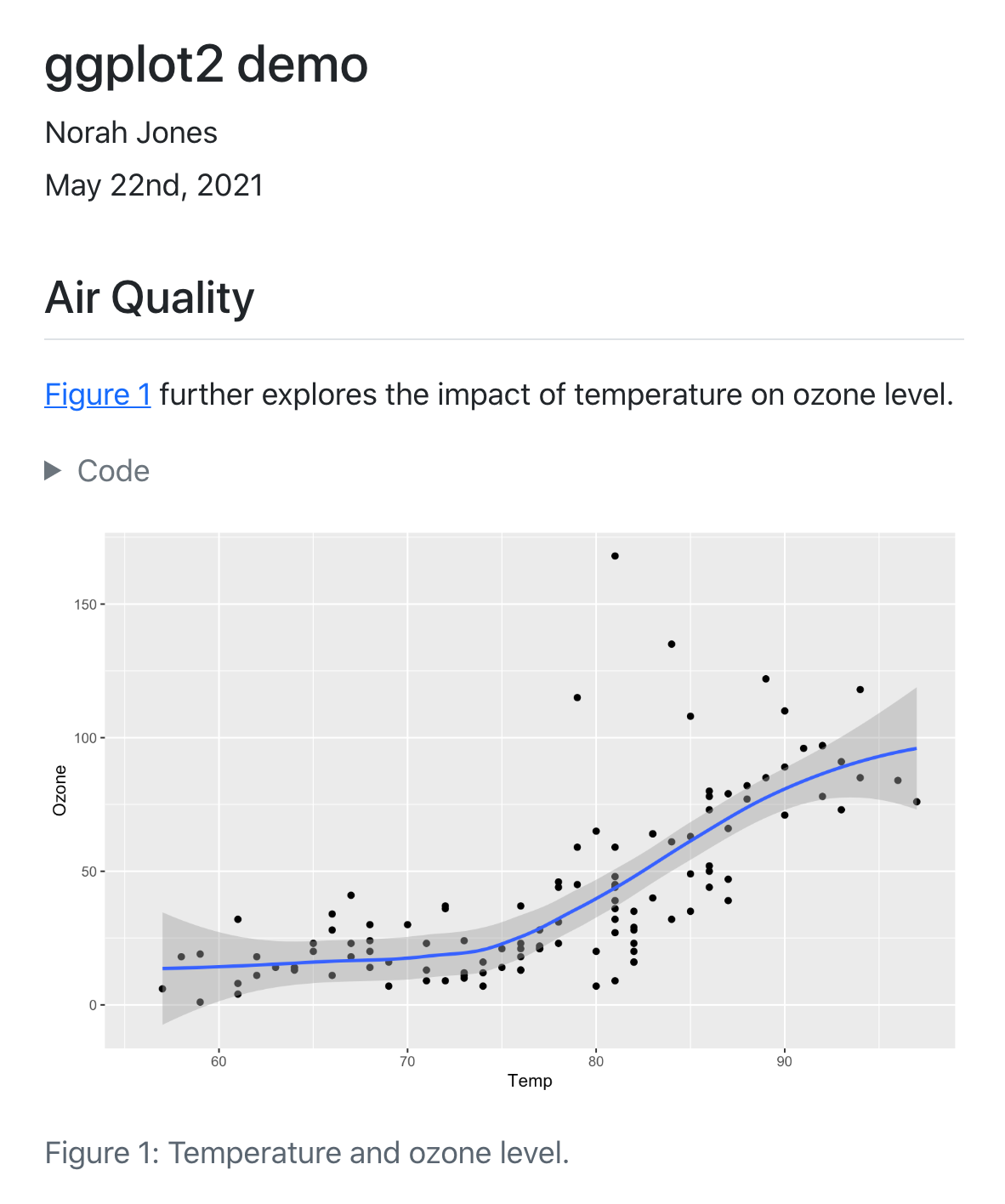
The Visual pane in RStudio allows you to directly edit the report. From here you can add text, change its formatting and insert code blocks that you’d like to run each time the document is rendered. Notice that the code block contains the R code required to produce the figure.
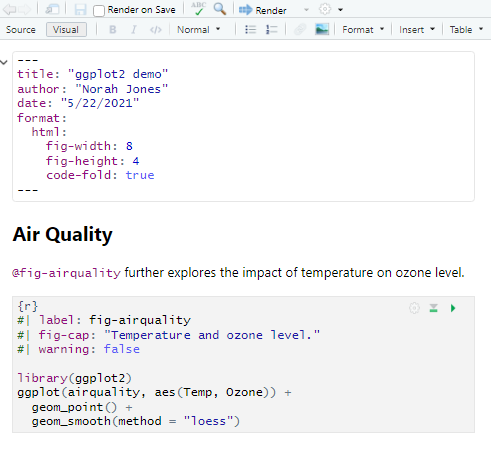
Behind the scenes of a Quarto document is the source text, which specifies the options for the YAML header, how text is formatted and the location and contents of individual code blocks.
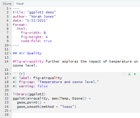
Source: https://quarto.org
At a basic level, a Quarto document is made up of three core ingredients:
A YAML header: which is placed at the beginning of a Quarto document between
---. This sets meta-information and the overall configuration of the document.Markdown: Is a simple markup language for specifying how to format text. For instance Render is
***Render***in markdown. To see the markdown behind formatted text select ‘Source’ when viewing a Quarto file in RStudio.Code blocks: are how code is embedded into a Quarto document, such as when we want to import a file, report some summary statistics or produce a graph.
Each ingredient serves a distinct purpose when constructing a Quarto report. The YAML header defines document configuration and metadata, markdown provides text structure and formatting, and code blocks embed executable analysis within the narrative. However, each component also has its own configuration options that control the style and behavior of your document: behavior and presentation.
YAML Header Options
The YAML header controls document-wide settings and metadata. These options determine how your document will be processed and rendered, from basic information like title and author to technical specifications for figure handling and code display.
| Option | Description |
|---|---|
title |
Specifies the title of the document |
author |
States the author’s name |
date |
Indicates the date the document was created or modified |
format |
Contains options related to the output format (html, docx, pdf) |
fig-align |
The horizontal alignment (default, left, right, or center) for figures |
fig-width / fig-height |
The default dimensions for generated figures |
code-fold |
Whether to collapse or ‘fold’ code blocks in the rendered HTML file |
Markdown Formatting
Markdown provides a lightweight syntax for formatting text without complex markup. These simple conventions translate into professionally formatted output when the document is rendered.
Some syntax:
- Header sizes: Set using
#,##,###, etc. in front of text - Emphasis: Create italics with
*text*and bold with**text** - Lists: Use asterisks
*or dashes-for bulleted lists - Web Links: Insert using
[text to display](URL)
Code Block Options
Code blocks can be fine-tuned using chunk options that control both execution behavior and output display. These settings allow you to customize which elements appear in your final document and how code is processed during rendering:
| Option | Description |
|---|---|
echo |
Sets whether the code should appear in the rendered report (TRUE) or be hidden (FALSE) |
results |
Specifies whether results of a code block are presented in the rendered document |
cache |
Specifies whether a code block should be re-run each time a document is rendered |
message |
Controls whether information messages are displayed in the final document |
warning |
Controls whether warning messages are shown in the final document |
The code below provides an illustration of how these options might be set in practice. Notice that each option is specified at the start of a code chunk with : setting the chosen value:
Beyond the Basics
Public Policy: Core Concepts
The Results Chains
A public policy and its constituent parts can be conceptualized as set of plans and interventions designed to encourage (or discourage) a set of activities that influence the target outcome(s). One useful methodology for conceptualizing this is the results chain, which outlines how resources are expected to influence the focus issue. The table below provides a simplified example of what a results chain might look like for a scholarship program:
| Inputs | Activities | Outputs | Outcomes | Impact | |
|---|---|---|---|---|---|
| Changes expected from the intervention: | The financial and staff resources required for the program. | New scholarships are made available and awarded to students from low-income families. | More students from low-income families pursue university education and graduate. | Scholarship recipients are more educated, better equipped with skills relevant to the workplace and less likely to face unemployment. | The socioeconomic outcomes of low-income communities improve. |
Although there’s more that can be said about conceptualizing policy interventions in this way, a results chain can be a useful place to start when designing and evaluating a public policy. Thinking about a public policy in this way can also be useful for estimating, monitoring and evaluating each stage of an intervention.
| Stage: | Inputs | Activities | Outputs | Outcomes | Impact |
|---|---|---|---|---|---|
| Measurement: | $ budget and hrs of staff time. | Number. of scholarships available and awarded. | Number of scholarship recipients that attend university, graduate and/or pursue further studies. | No. of graduates employed, average income of recipients and % of recipients pursuing further study (if not employed). | Life expectancy, unemployment rate, number under the poverty line average years of education. |
Although developing a results chain prior to a policy being designed and implemented is generally a good idea, this is often not done in the real world. Despite this, even when a results chain hasn’t been developed (or doesn’t reflect reality) the framework can be a useful part of a policy analyst’s toolkit. As applying the approach can encourage us to think through how the program intends to drive activity; how this will achieve the desired results, what conditions might be needed for this to happen, the time frame required, and the types of data that might be available (and useful) for our analysis.
Policies, Programs and Impact
When we talk about public policy, we generally mean the plans, programs, guidelines and legislation used by government to address a specific challenge, or set of challenges on behalf of the public (link). For instance, a policy designed to improve the outcomes of low-income households might be comprised of:
A scholarship program covering university tuition costs for high-performing students from low-income families;
Change to the legal and/or statistical definition of what constitutes a low-income household;
Commitments for government to hire more staff from lower socioeconomic backgrounds; and
Changes to the tax code to make education expenses tax deductible.
A public policy can sometimes be merely a government commitment to address an issue, even without concrete actions. Therefore, something can be considered a public policy regardless of its effectiveness.
Policy alignment, efficiency and effectiveness
Program evaluation describes the assessment of a policy or program’s appropriateness, effectiveness, efficiency and/or sustainability. Although program evaluation is itself a specialized field, at a general level evaluations often ask similar questions about a program or policy, such as:
- Did (or is) the program achieving its goals?
- Is it reaching the right people, communities or audience?
- Does it represent ‘value for money’?
- Was it effective?
- Is the program sustainable?
Although most evaluations are conducted after a policy or program has been implemented (and often after it’s completed), their implications are often forward-looking. As by examining what worked, what didn’t and what might be done better, we are likely to be better equipped to design better policies in the future. Making the core principles of program evaluation directly relevant to applied policy analysis and evidence-based policy making.
For instance, in evaluating a public health campaign to reduce obesity, one might look at medical records to assess changes in community weight levels, survey participants to understand behavioral changes, and analyze budget records to calculate cost per successful case. The resulting insights are incredibly valuable for decision-makers. Helping in the design of new policies and programs, guide resource allocation and even provide evidence to support the continuation or cessation of ineffective programs.
Policy Alignment, Efficiency and Effectiveness:
Alignment: Does (or did) the program’s objectives align with public needs, government policies and the stated goals of the program?
Efficiency: Did the program represent ‘value for money’? At a basic level, an efficient program achieves its goals using minimal resources.
Effectiveness: Given the stated aims of the policy or program, did we do it well?
Guiding Questions For Applied Policy Analysis
I started my career in a team that used quantitative analysis and modelling to analyse tax policy. For the most part, I was in my element. I spent most of my time time working on high-profile policies using interesting economic models and. However, I can vividly remember how surprised I was at the reasoning given by team members for coming to an answer:
Once you work with this data enough, you can eyeball it to see the solution.
I tweaked the model to better reflect the realities described by a friend in the financial sector.
A good rule of thumb is to pick an approach that you could explain and justify in a public inquiry.
Not once did somebody mention Monte-Carlo simulation, linear programming model or calculating a confidence interval. This isn’t to say such techniques weren’t used, just that they were of secondary importance to simple rules of thumb, sense checks and meeting standards of public accountability.
When I first started developing resources to teach programming to policy professionals, I attempted to incorporate these principles, but found little existing research on the topic. To fill this gap, I spoke to practitioners across government, the private sector and academia about the day-to-day principles they use when conducting policy analysis. I then distilled these conversations into a set of three guiding questions that are designed to embody the common principles used by practitioners:
1. What matters and what might influence this?
What matters: What are the central outcome(s) or problem(s) that need to be explored in our analysis?
What might influence this: What factors are we expecting to influence the focus outcome and/or our answer and why?
2. What can we reliably measure and what’s practical?
What can we measure: What data do we have access to or can we acquire?
What’s practical: What types of analysis is practical given the data, resources and time available?
3. What do we know, what don’t we know and why might we be wrong?
What do we know: Are our results plausible, do they align with previous findings and what can we reasonably conclude?
What we don’t know: How much of what matters can’t be measured or understood from our analysis?
Why might we be wrong: How reliable are our assumptions and what unintended consequences might be possible?
What matters and what might influence this?
For the most part, the first step of policy analysis is deciding what the question is and what a useful answer might look like. Perhaps the intent of the request isn’t clear without referring to public announcements made by a Minister. Or maybe the question(s) needs to be refined to make it technically possible to provide an answer while still being useful to decision makers.
Whatever the case, the intention of this question is to identify the problem and conceptualize the system we’re intending to analyze that relates to it. If you’re familiar with statistics, this can sometimes be analogous to thinking through how the relevant dependent, independent and control variables relate to one another and what this means for your analysis:
- What matters: What are the central outcome(s) or problem(s) that need to be explored in our analysis?
For example, if the Minister for Transport asked as to determine whether or not women and children were really prioritized during the 1912 RMS titanic disaster, we might focus on the survival rate of passengers as our central outcome.
- What might influence this: What factors are we expecting to influence the focus outcome and/or our answer and why?
For the passenger survival problem, this might include passenger characteristics that we expect to be associated with the survival rate. Given the question, the most obvious of these might be a passenger’s sex and age, but we might also expect the location of their cabin and physical fitness might matter too.
What can we reliably measure and what’s practical?
Policy analysis rarely affords the luxury of perfect information or unlimited time. As a result, once we’ve established our conceptual framework, we’ll usually need to think through an analytical approach that balances methodological rigor with real-world constraints while still providing a useful answer in time. After all, a rigorous analysis delivered after the deadline will often serves no practical purpose.
- What can we measure: What data do we have access to or can we acquire?
Both the questions we can ask and answer we can provide rely heavily on the data available to us. In the Titanic passenger survival example, we might expect that healthier passengers were more likely to survive, so will want to control for this in our analysis. Unfortunately, because this data isn’t available we might have to use a variable expected to proxy a passenger’s fitness, such as their age.
- What’s practical: What types of analysis is practical given the data, resources and time available?
The practical approach balances analytical rigor with timelines and the resources available. For instance, while a randomized controlled trial might be ideal for evaluating a tutoring program, practical constraints often dictate what’s possible. If a decision needs to be made in the next 24 hours, we might need to come to an answer using imperfect data and a targeted review of the research literature. Whereas if we have a week, this might give us time to source better data and consult with experts in the field.
What do we know, what don’t we know and why might we be wrong?
Good policy analysis requires intellectual honesty about the boundaries of our knowledge and the limitations of our methods. No analysis can capture every relevant factor or predict every possible outcome with certainty.
This guiding question prompts us to critically examine the strength of our analysis, acknowledge any gaps, consider alternative interpretations of our results and think through unintended consequences of an intervention.
- What do we know: Are our results plausible, do they align with previous findings and what can we reasonably conclude?
Consider a state education department evaluating whether to expand a tutoring program for underperforming schools. The plausible impacts might range from significant improvement in standardized test scores to minimal or even negative effects if the program diverts resources from other essential activities.
The plausibility consideration can also be useful for sense checking our analysis and results. For instance, the plausible range for the cost of a scholarship program might be between zero and the number of scholarships multiplied the average cost of a scholarship. Similarly, estimated impacts should mirror those achieved by comparable interventions. When results fall outside the plausible range, it might signal a need to review our assumptions, data sources and calculations. These types of sense checks can also be useful at intermediate stages of analysis to check that our code is working as expected.
- What we don’t know: How much of what matters can’t be measured or understood from our analysis?
Sometimes the most important factors are the hardest to quantify—like the distributional impacts across different communities or the political sustainability of the policy. One example of this might be a policy to relax zoning restrictions to encourage housing construction. While our model model might be able to quantify the impact on rental prices, anticipating the impacts on social cohesion might be harder quantify. Even when it’s not possible to address gaps, by identifying them we’re better placed to know the limits of our results and how to present them accurately to stakeholders.
- Why might we be wrong: How reliable are our assumptions and what unintended consequences might be possible?
Stress-testing our analysis by testing its sensitivity to different assumptions and outcomes can help us validate our findings and any recommendations that stem from them. For an education program, it might be worth testing whether changes to class sizes drastically alter our results, in case enrolments increase in schools that have access to the program. At the same time, an unintended consequence might be that communities that don’t receive the support experience a decline in educational outcomes due to teachers being drawn to communities that were targeted by the policy.
The Elements of Style: Some Tips For Mindful Modeling
As an independent consultant the majority of my work is about solving novel problems within tight time frames. This variety keeps the work interesting, but it also frequently made my code a mess: Files scattered everywhere. Code that worked but was impossible to follow. Variable names like “df1” and “temp_final_v2” that meant nothing a week later.
Source: monkeyuser.com
While the novel problems I faced were lots of fun to tackle, the novel approach for organizing my analysis wasn’t. I had created what programmers call “spaghetti code”.
“Spaghetti
code[analysis] is the general term used for any sourcecode[analysis] that’s hard to understand because it has no defined structure.”
Adapted from: Orani Amroussi, “What Is Spaghetti Code and Why Is It a Problem?”, Vulcan.io
This is normal for new analysts, but nobody teaches you how to fix it, which is the point of this chapter: to provide a set of practical strategies for organizing your work so you don’t make the same mistakes I did.
But, designing a sensible workflow isn’t just about maintaining order, it’s also about reproducibility, which is a cornerstone of the scientific method. Reproducibility ensures that your colleagues can get the same results when they use your data and methods. Whereas replication tests whether findings hold true with new data in different settings. Think of it this way: reproducibility means your teammate in the next office can run your code and get the same results. Replication means a policy that worked in one area produces similar results in another.
Although it might be hard to control the replicability of our research, R is well-suited for designing reproducible workflows. Provided you practice good habits from the start.
Start from a clean slate
When you first exit R, you’re likely to be asked whether you’d like to save a copy of your workspace, which contains a copy of objects you were working with.
Don’t.
In fact, one of the first settings I recommend new users implement is to disable restoring and saving your workspace in RStudio via Tools > Global Options > General: Workspace
The idea behind this is to encourage us to outline every step of an analysis recipe in our scripts. Encouraging you to create logical and well-documented scripts that provide a reproducible record of the data used, how it was cleaned and how results were produced. In addition, to encouraging reproducibility in our work it also reduces the risk of carrying forward errors from previous sessions, such as actions that we forgot to save in our script. Ensuring not only that our recipe works the same way each time its run, but that fatal errors are spotted and dealt with more quickly.
Organizing Your Working Directory
When learning a new skill it’s generally a good idea to adopt good habits early, to avoid having to retrain yourself later. For R, a good place to start is to organize all your files for a project in a single working directory using a standardized folder structure, such as:
- ./Data/: For storing the original input data and processed versions of the data.
- ./Outputs/: Where results of analysis are stored, such as statistical summaries.
- ./Plots/: Which is used for saving any plots generated.
- ./Scripts/: For storing individual R scripts.
Once you’ve set up a basic structure to organize your working folder, it will become easier for you and anybody you’re working with to keep project files organized. Having a standardized structure will also make it easier to remember how everything fits together should somebody need to revisit the project in the future.
Documentation
For me, documentation is about reducing the number of times I’m likely to be confused when revising old code. It should remind me what I was thinking and why I’d approached a problem in a particular way. While when working in a team, it should minimize the confused exasperation of colleagues when they’re trying to apply my model to their work.
To achieve this aim, I’ve found that when writing comments in an R analysis script it’s helpful to be as conversational and explicit as possible. In practice this means explaining what is being done, why it’s necessary and how it connects with subsequent analysis. For instance, instead of writing “This calculates the average wage by group” I might say “This calculates the average wage level by group to determine families with the lowest incomes. The results have been reshaped to a wide format to improve presentation.”
Structuring scripts
My chosen IDE when using R is Rstudio, which allows you to insert notes into your analysis scripts using ‘#’ before the text. Four hyphens (‘—-’) can also be used to specify code sections. Although there are no hard rules for how to organize a script, I’ve found it handy to try and organize analysis across sections designed to correspond with the typical steps of an analysis project:
- Overview: briefly describing the project and approach taken.
- Set-up: where I load libraries and create objects for later use (such as color schemes etc).
- Data Import / Cleaning: where datasets are imported and cleaned.
- Analysis: for statistical tests, defining models and exploratory analysis etc.
- Visualization: for producing plots.
- Outputs and Results: for outputting results such as statistical summaries, simulations, datasets etc.
Depending on the complexity of your project it can also be a good idea to use separate scripts for individual steps. I typically find having separate scripts for data cleaning, analysis and visualization works well. I then have the data cleaning script output a cleaned data set that is directly used in the separate analysis and visualization scripts. This makes it easier to review specific aspects of the analysis and avoids me needing to re-run the data cleaning script unnecessarily.
Modularize Analysis
My friends in the world of Data Science noted that something that helped them produce better code was to keep projects ‘modular’. That way if a specific section of your code stopped working only that section would fail. Although this can often be hard to implement in a policy analysis environment – due to data analysis typically being structured in a sequential fashion – a happy medium I found was to group my analysis into ‘code chunks’ using Rstudio’s sections (as illustrated).
By grouping thematically similar parts of analysis together, scripts became easier to understand and unnecessary dependencies were reduced. Both because the use of code chunks encouraged better separation and ordering of individual analysis steps and as each ‘code chunk’ could be more naturally connected to the formal methodology presented to clients.
Naming Principles
Names should generally start with a letter and only contain letters, numbers, ‘_’ and ‘.’. When it comes to selecting good names for files, objects and variables in R, there’s one-size fits all approach, but, if I had to pick good rules to follow, they would be to pick names that:
Are short, easy to understand and unambiguously communicate a file, object or variable’s purpose;
Use a logical hierarchy that presents information from most important to least important; and
Stick to snake_case i.e. use lowercase letter with ‘_’ to separate words as this makes referencing objects and variables easier. Avoid using ‘.’ in names too, as it can cause conflicts with R’s internal systems.
Note: Remember that the important thing is to pick a naming system that works and you and your team and apply it consistently. There’s no point trying to follow a complicated approach if it’s impractical.
A good guide is to keep object and variable names below 48 characters, but it’s better to have long and meaningful names to short and confusing ones.
Controlled vocabulary and hierarchical naming
Starting variable names with the most important information can enhance readability and improve our workflow. Since files, objects and variables are typically presented in alphabetical order, prioritizing critical information early can make it easier to understand its purpose, contents and relationship to other project components. Additionally, defining and applying a standardized vocabulary that communicates an important characteristic can make our names easier to read, less ambiguous and provide us with more options for working efficiently with data.
Files
When naming files, try to follow the following principles:
- Machine readable: e.g. don’t rely on – capital letters for differentiation, spaces, and special characters and accents.
- Human readable: make sure the name is intelligible
- Play well with default ordering: such as starting a filename with yyyy-mm-dd ordering
Adapted from: Jenny Bryan (2015), ‘Naming Things’, Reproducible Science Workshop
Aside from being useful for version control, well named files can be useful for later analysis. For instance if we have 100 files with the name format ’2012-10-14-data_envelopment_analysis-ministry_of_industry.csv” we can use the file name as a source of metadata e.g. the date, project title and name of the ministry the data relates to.
Note: To avoid having to manually update the date when outputting files, a good strategy can be to create an object with the current date at the start of each script. This can then be directly appended to the file name specified in a function when saving files.
ref_date <- Sys.Date()}
Objects
For objects, my recommended approach is to use a naming convention that concisely summarizes the object’s purpose, source, subject and any relevant attributes. For instance, if I were to name a dataframe that contains responses from a survey of rural households I might use dta_survey_responses_households_rural. Aside from the focus of this object being relatively clear, by applying a standard prefix dta_ it’s clear the object is meant as a data source. While prioritizing the most information first makes it quicker to understand its purpose and relationship with other objects in a project.
Specify an object’s purpose
Because RStudio’s environment pane sorts objects alphabetically, we can leverage this behavior to organize objects in our workspace based on their purpose. As always, it’s best to choose your own standard for and stick to it, but I’ve found the following object naming prefixes to work well:
- For data:
dta_ - Temporary files:
tmp_ - Statistical summaries:
sum_ - Models (such as lm models):
mod_ - Custom functions:
fn_ - Plots and visualization:
plt_ - Reference and lookup tables:
ref_ - Results and Analysis:
rlt_ - Consistency and accuracy checks:
chk_
What this means in practice is that when I’m importing a dataset I might name it dta_household_income. Whereas an object with average incomes might be named sum_dta_household_income_avg. Making it clearer what the purpose of the object is and how it relates to other objects (when this is important).
Variables
Like object names, what constitutes a well-named variable is largely a matter of personal preference. However, my recommendation is to follow a similar strategy to naming objects: stick to lowercase and choose names that are short, meaningful and reflect the variable’s content (e.g., respondent_id rather than just id).
Try to prioritize a consistent structure that places the most important information first, such as the the subject, attribute, and measure type. For example, use “customer_active_count” rather than “count_of_active_customers”. This will make it easier to understand its purpose and group related variables with one another.8
Because RStudio presents the format of a variable when previewing variables I've retained my approach i.e. \<Subject\>\<Attribute\>\<Measure type\>.Consistency across your project is also crucial - similar variables should maintain identical names across different objects. For example, if country identifiers appear in multiple dataframes, pick a single naming convention, like iso3c_code and apply it across the project. This will make its purpose clearer and streamline the process of working across objects (such as when merging dataframes).
Finally, suffixes and prefixes can be useful for concisely indicating what a variable relates to or a transformation that has been applied, such as educ_ for an education variable or _pct to signify a variable is a percentage. Remember, there’s no single approach for selecting names, the important thing is to choose an approach that works for you and your team and apply it consistently.
Spurious Accuracy and Rounding
When sharing your results, try to choose a format that is accurate, meaningful and honest about any uncertainties of the analysis. For instance, although it might be true that the average population of councils in your dataframe is 29,291.361, presenting this result to three decimal places isn’t particularly meaningful given there’s no such thing as 0.361 of a person. At the same time, reporting the figure to the nearest person might imply levels of certainty and accuracy that are difficulty to justify given the source data.
This idea is sometimes referred to as ‘spurious accuracy’ and varies according to the data, nature of your estimates and your field. General rules of thumb that are worth considering to avoid this are:
Choose a format that is useful for your audience: Try to present your results in a format that is useful to your audience. If your analysis is being used to understand where revenue is collected from, presenting each source to the nearest cent will probably make it harder to interpret and have little utility for decision makers.
Choose a format that is honest about uncertainties: avoid presenting your figures in a way that exagerates the level of precision and/or accuracy of your analysis. For instance, if you were to present an economic growth forecast of 3.281 percent from a model with a ten percent margin of error, it risks your audience assuming a level of precision that is warranted. Instead, it might be more appropriate to report your growth forecast as 3 percent.
Choose an approach that’s appropriate to your domain: Remember that many fields have their own standards of what’s expected. In an academic setting it might be expected to present detailed results, while the Minister of Education might be interested in knowing high-level figures.
Choose an approach based on what counts as ‘significant’ for your analysis: What counts as significant might also depend on the implications of your results, after all a one percent reduction in mortality might have a very different scale and meaning to a one percent reduction in weekly sales. Your reporting of results should reflect this.
Workspace Management
In addition to this naming convention making it easier to understand the role of an objects and how it fits into a project’s workflow, using the ‘tmp_’ prefix makes it possible to delete temporary files at key stages of your analysis by running the code below:
rm(list = ls(pattern="tmp_"))I tend to add this line at the end of each code section so the workspace is cleared up at the end of key steps.
Version Control
As you become comfortable with R, implementing a system to back up your files and track changes is essential for project management. While professional data scientists typically use git-based version control, when you’re first learning how to code it can be difficult to learn and implement.
Because it’s also better to have an imperfect system than no system at all, my suggestion for newcomers to coding is to start by implementing a simple version control system that you find manageable. My approach was to use a ‘manual archiving’ system by creating copies of files whenever they are updated and place the previous versions in an ‘Archive’ folder. To make it clear what the project was and the period the file relates to, dates and a descriptive file name should be used:
./Scripts/
280214 - land tax policy analysis.R
./Archive/
280213 - land tax policy analysis.R
280210 - land tax policy analysis.R
While this approach lacks many of the advantages of git-based version control, it serves as an accessible starting point for beginners. When combined with documentation that records changes at each milestone, well-documented code and regular backups, manual archiving offers a rudimentary way to track changes and recover previous versions until you’re ready to transition to a more robust system.
Iteration and Automation
A Note on Automation
Programming languages provide a variety of opportunities for making applied policy analysis quicker, more accurate and less costly through automation of repetitive and complicated analysis tasks. But, just because we can automate something, doesn’t mean we should.
I’ve outlined how I approached this problem for a real world policy analysis pipeline here, but a good TLDR is that you should consider whether the characteristics of a task make it better suited to completion by a person or a computer:
| Better suited to computers… | Better suited to humans… |
|---|---|
| High volume and repetitive | Complex or nuanced judgment |
| Consistent and rule-based decisions | Irregular or infrequent tasks |
| Regularly occurring | High level of flexibility required |
| Defined by a stable process with few exceptions | Significant value from personal interaction |
| Well-structured inputs | Benefits from creative problem-solving |
| Minimal human judgment required | Unclear process with many exceptions |
Functions
Functions are reusable pieces of code that perform a task based on the ingredients provided to it. We’ve already used functions, but haven’t considered how they work or how to make one of our own. Creating custom functions can be useful when there’s a task that you’d like to repeat more than once. This way you can reuse the code by referencing the function name and adjusting the arguments to suit how it’s being applied.
The code below demonstrates creating a simple function called fnc_name. Notice that within function() two arguments are specified a_vector and n. Setting a value with ‘=’ sets the default value so R knows what to do if a value isn’t specified when applying the function.
The code within the braces then provide the {instructions} for the function to follow, given the value of a_vector and n. I like to think of the code within the braces ({} ) as being just like a normal R script, with the value of arguments we choose being substituted before it’s run.
# A simple function:
fnc_name <- function(a_vector, n = 4) {
sum(a_vector) / n
}
#create an example vector
dta_vector <- c(10, 20, 30, 40)
#apply the function
fnc_name(a_vector = dta_vector)[1] 25#the 'script' equivalent:
#(notice it's the same code with the value of the arguments directly specified)
sum(dta_vector) / 4[1] 25Notice that when applying fnc_name we have specified a value for a_vector, but not n, resulting in the default value being used (n=4). This results in fnc_name essentially calculating the mean. In fact, if we wanted to calculate the mean we could have n depend on the length of a_vector:
fnc_name <- function(a_vector, n = length(a_vector)) {
sum(a_vector) / n
}Obviously there’s little point creating a function for calculating the mean, given mean() already exists, but that’s not the point. The point is to demonstrate the basic anatomy of a function and how you can create one.
My most used example is presented below: a function to delete all items in the global environment with tmp_ at the start of their name. Although this isn’t rocket science, defining this function upfront provides a way for me to concisely delete temporary objects at the end of a code section (assuming they’re named correctly).
fnc_rm_temp_objects <- function() {
# List and remove objects in the global environment with the prefix tmp_
rm(list = ls(pattern = "tmp_", envir = .GlobalEnv), envir = .GlobalEnv)
}I also frequently use functions when I need to create the same plot more than once. This work well, but be warned that converting gglot2 code to a function requires some extra steps.
Loops
Loops repeat a specified task based on a condition (or set of conditions). This might mean repeating something for all values in a vector, while a condition is TRUE or until a condition is met. In the context of policy analysis, loops might be useful when producing simulations, applying the same function across different groups or producing a series of exploratory graphs.
There are three members of the loop family:
for loops process each item in a collection.
while loops continue doing something while a condition is met.
repeat loops repeat a task until a condition is met.
For loop:
In the example below, the for loop runs the recipe for each number in the sequence of numbers from one to ten. In the example below, ‘i’ is replaced for each number in the sequence, leading R to print each element in the object dta_n.
dta_n <- 1:10
for (i in dta_n) {
print(i)
}While loops
In the example below, R continues to run the block of code for as long as the object ref_n is greater or equal to 1. ref_n starts at 10 and the block of code subtracts 1 from ref_n each time it’s run. Resulting in R printing ‘10 seconds till lift off’, ‘9 seconds till lift off’…. (until 1 second until lift off).
ref_n <- 10
while (ref_n >= 1) {
print(paste(ref_n, "seconds till lift off"))
ref_n <- ref_n - 1
}Repeat loops
In a similar way to the While loop, ‘repeat’ continues to run the block of code until a condition is met. In this case, the code will run until ref_n is equal to eleven. Because ref_n starts at 1, R will print “Counting to ten: 1”, “Counting to ten: 2” … (until 10).
ref_n <- 1
repeat {
print(paste("Counting to ten:", ref_n))
ref_n <- ref_n + 1
if (ref_n > 10) {
break
}
}Note that while loops check whether a condition is true before executing the code block, while repeat loops perform the task first and then check if a condition has been met. This means:
While loops may never execute (if the condition is false initially)
Repeat loops always execute at least once (checking the exit condition after execution)
In general, it’s best to avoid loops when vectorized alternatives exist. Vectorized functions apply operations to entire collections of data simultaneously, rather than processing each element individually like a loop. Still, loops can be handy in for specific tasks, such as:
Sequential dependencies: When how a task is performed depends on the previous result.
Repetitive operations: Such as importing individual files stored in the same folder.
Independent simulations: Such as running a series of simulations that need to be repeated using different policy scenarios and/or assumptions.
Control Flow
The order and logic that dictates when instructions are executed is referred to as Control flow. In R, commands are executed in the order they’re received, and more complex control can be achieved through loops, logical operators and deciding what code to run based on logical conditions being met.
The code below provides a simple example of this idea using a for loop, with the behavior of the function depending on whether the name “Wally” exists in the dta_names:
dta_names<-c("Shazza","Wally","Bazza")
for (i in 1:5) {
#test condition
ifelse(dta_names[i] =="Wally", print("Wally found!"),
print("Wally not found:("))
}You can learn more Control flow in R here.
The apply family
Although the apply family of functions performs repeated operations like loops, they are designed to work across data structures rather than following a set of conditions we manually specify. Aside from being easier to use, apply functions are typically faster and result in more readable code than the equivalent loop.
The functions implement a split-apply-combine strategy:
Split: Divide data into meaningful groups or components.
Apply: Perform the same operation on each piece.
Combine: Merge results back into a coherent structure.
The code below provides a simple example of this using a traditional loop vs. lapply(). Notice that the intended outcome of both functions is to split the dataframe into columns, apply the mean function on each and combine the individual results at the end:
library(dplyr)
library(tidyr)
library(readr)
library(janitor)
#load the data
dta_dop_affordable_housing<-read_csv("./Data/Affordable_Housing_by_Town.csv")
#reshape to tidy and clean variable names via janitor
dta_dop_affordable_housing<-dta_dop_affordable_housing |>
pivot_wider() |>
clean_names()
# Traditional loop approach - calculate the mean for each column
rlt_col_mean <- list()
for(i in 1:ncol(dta_dop_affordable_housing)) {
rlt_col_mean[[i]] <- mean(dta_dop_affordable_housing[[i]], na.rm = TRUE)
}
#display the results
rlt_col_mean[[1]]
[1] 2017
[[2]]
[1] 85
[[3]]
[1] NA
[[4]]
[1] 8823.345
[[5]]
[1] 539.163
[[6]]
[1] 265.5567
[[7]]
[1] 164.7105
[[8]]
[1] 32.73737
[[9]]
[1] 1001.922
[[10]]
[1] 6.194725# Split-apply-combine with lapply
rlt_col_mean <- lapply(dta_dop_affordable_housing, mean, na.rm = TRUE) # Split by column, apply mean, combine as list
#display the results
rlt_col_mean$year
[1] 2017
$town_code
[1] 85
$town
[1] NA
$census_units
[1] 8823.345
$government_assisted
[1] 539.163
$tenant_rental_assistance
[1] 265.5567
$single_family_chfa_usda_mortgages
[1] 164.7105
$deed_restricted_units
[1] 32.73737
$total_assisted_units
[1] 1001.922
$percent_affordable
[1] 6.194725#a tidyverse approach
rlt_col_mean <- dta_dop_affordable_housing |>
summarise(across(everything(), ~ mean(.x, na.rm = TRUE)))
#display the results
#(note that it returns a more nicely formatted tibble)
rlt_col_mean# A tibble: 1 × 10
year town_code town census_units government_assisted tenant_rental_assista…¹
<dbl> <dbl> <dbl> <dbl> <dbl> <dbl>
1 2017 85 NA 8823. 539. 266.
# ℹ abbreviated name: ¹tenant_rental_assistance
# ℹ 4 more variables: single_family_chfa_usda_mortgages <dbl>,
# deed_restricted_units <dbl>, total_assisted_units <dbl>,
# percent_affordable <dbl>#drop the object
rm(rlt_col_mean)There are four main functions in the apply family each with their own use-case (and quirks):
lapply(): list apply ~ applies a function to each element and returns a list.
sapply(): simplified apply ~ like lapply() but simplifies the output when possible.
vapply(): verified apply ~ allows you to specify the expected output format
tapply(): table apply ~ applies a function to subsets of data grouped by factors / categorical groups.
The code below provides a demonstration of sapply(), vapply() and tapply() using the same affordable housing data:
# sapply() - similar to lapply(), but with a simplified output
# Calculate means for all numeric columns, returns a named vector
rlt_sapply <- sapply(dta_dop_affordable_housing, mean, na.rm = TRUE)
rlt_sapply year town_code
2017.000000 85.000000
town census_units
NA 8823.345016
government_assisted tenant_rental_assistance
539.163024 265.556668
single_family_chfa_usda_mortgages deed_restricted_units
164.710514 32.737369
total_assisted_units percent_affordable
1001.922167 6.194725 # vapply() - verified apply
# Same operation but we can specify expected output format:
rlt_vapply <- vapply(dta_dop_affordable_housing, mean, numeric(1), na.rm = TRUE)
# Display results
rlt_vapply year town_code
2017.000000 85.000000
town census_units
NA 8823.345016
government_assisted tenant_rental_assistance
539.163024 265.556668
single_family_chfa_usda_mortgages deed_restricted_units
164.710514 32.737369
total_assisted_units percent_affordable
1001.922167 6.194725 # tapply() - grouped operations
# Calcualte the average number of units by town:
rlt_tapply <- tapply(dta_dop_affordable_housing$census_units,
dta_dop_affordable_housing$town,
mean, na.rm = TRUE)
# Display results
rlt_tapply Andover Ansonia Ashford Avon
1317.5385 8144.6154 1904.5385 7413.9231
Barkhamsted Beacon Falls Berlin Bethany
1587.2308 2517.3846 8173.1538 2043.6154
Bethel Bethlehem Bloomfield Bolton
7361.5385 1577.3077 9072.6923 2017.3077
Bozrah Branford Bridgeport Bridgewater
1064.5385 13988.0000 57155.2308 879.6154
Bristol Brookfield Brooklyn Burlington
27029.4615 6604.6154 3243.2308 3407.3846
Canaan Canterbury Canton Chaplin
768.2308 2043.0769 4342.3846 985.4615
Cheshire Chester Clinton Colchester
10422.2308 1913.0000 6081.7692 6201.9231
Colebrook Columbia Cornwall Coventry
719.8462 2306.9231 1006.6154 5112.3846
Cromwell Danbury Darien Deep River
6013.3846 31339.2308 7088.6923 2097.2308
Derby Durham East Granby East Haddam
5842.0769 2704.3077 2154.3846 4505.6154
East Hampton East Hartford East Haven East Lyme
5496.6923 21330.5385 12522.3077 8505.8462
East Windsor Eastford Easton Ellington
5068.3077 794.0000 2718.1538 6694.9231
Enfield Essex Fairfield Farmington
17572.0769 3266.2308 21673.6923 11149.1538
Franklin Glastonbury Goshen Granby
772.4615 13719.4615 1667.3846 4366.7692
Greenwich Griswold Groton Guilford
25634.5385 5111.0000 17991.5385 9603.4615
Haddam Hamden Hampton Hartford
3506.7692 25180.9231 792.7692 51932.5385
Hartland Harwinton Hebron Kent
855.0000 2284.3846 3570.9231 1666.6923
Killingly Killingworth Lebanon Ledyard
7614.4615 2598.2308 3126.6923 5999.5385
Lisbon Litchfield Lyme Madison
1729.8462 3974.3077 1222.7692 8049.8462
Manchester Mansfield Marlborough Meriden
26030.5385 6089.2308 2388.9231 25913.9231
Middlebury Middlefield Middletown Milford
2903.9231 1864.4615 21257.4615 23125.9231
Monroe Montville Morris Naugatuck
6918.0000 7406.6154 1309.3077 13074.6923
New Britain New Canaan New Fairfield New Hartford
31247.8462 7547.2308 5596.2308 2926.4615
New Haven New London New Milford Newington
55163.7692 11861.4615 11746.1538 13027.0000
Newtown Norfolk North Branford North Canaan
10081.0769 964.3077 5629.3077 1586.6154
North Haven North Stonington Norwalk Norwich
9528.6923 2299.8462 35625.5385 18667.4615
Old Lyme Old Saybrook Orange Oxford
5018.4615 5622.6154 5355.3846 4767.2308
Plainfield Plainville Plymouth Pomfret
6231.6923 8061.6154 5112.2308 1684.1538
Portland Preston Prospect Putnam
4080.9231 2021.3077 3496.1538 4298.4615
Redding Ridgefield Rocky Hill Roxbury
3799.6923 9426.6154 8879.6154 1166.6923
Salem Salisbury Scotland Seymour
1641.4615 2587.3077 677.6923 6979.0769
Sharon Shelton Sherman Simsbury
1771.0769 16225.0769 1831.2308 9194.8462
Somers South Windsor Southbury Southington
3490.0000 10286.1538 9104.7692 17500.6923
Sprague Stafford Stamford Sterling
1249.5385 5132.6923 51063.7692 1508.5385
Stonington Stratford Suffield Thomaston
9465.4615 21133.4615 5500.5385 3280.9231
Thompson Tolland Torrington Trumbull
4168.8462 5464.7692 16782.4615 13157.1538
Union Vernon Voluntown Wallingford
387.1538 13962.5385 1127.6154 18944.4615
Warren Washington Waterbury Waterford
809.3846 2118.7692 48021.8462 8652.3846
Watertown West Hartford West Haven Westbrook
9099.1538 26460.9231 22468.2308 3940.0000
Weston Westport Wethersfield Willington
3673.7692 10411.9231 11687.1538 2640.6923
Wilton Winchester Windham Windsor
6482.0769 5597.0000 9577.1538 11787.8462
Windsor Locks Wolcott Woodbridge Woodbury
5458.6923 6286.1538 3477.8462 4565.5385
Woodstock
3588.6923 # the tidyverse approach
rlt_grouped <- dta_dop_affordable_housing |>
group_by(town) |>
summarise(mean_units = mean(census_units, na.rm = TRUE))
# show me the results
rlt_grouped# A tibble: 169 × 2
town mean_units
<chr> <dbl>
1 Andover 1318.
2 Ansonia 8145.
3 Ashford 1905.
4 Avon 7414.
5 Barkhamsted 1587.
6 Beacon Falls 2517.
7 Berlin 8173.
8 Bethany 2044.
9 Bethel 7362.
10 Bethlehem 1577.
# ℹ 159 more rows#drop the objects
rm(rlt_sapply, rlt_tapply,rlt_vapply,rlt_grouped)Tidyverse alternatives to loop and apply
Although there’s a lot that can be done with loops and the apply family of functions, they share the same basic goal: automating repetiative tasks. Perhaps your data is stored across 100 individual csv files that need to be combined. Maybe you’d like to convert multiple variables into a numeric class. Or you might want to calculate the average for several variables in a dataframe without manually applying the mean function one-by-one.
The tidyverse offers modern alternatives for automating repetitive tasks through the purrr package and dplyr’s iteration functions. While these tools accomplish the same goal of eliminating manual repetition, they provide more consistent syntax and seamless integration with data manipulation workflows.
Applying functions across variables
purrr’s map() and dpylr’s across() provide useful subtitutes to the apply functions. They follow the same split-apply-combine logic, but use an easier to understand grammar and integrate more naturally with groups and pipes.
As a start, let’s take a look how the tidyverse handles applying a function across multiple columns in a dataframe. Notice that lapply() splits the dataframe into columns, applies the mean function to each, and combines the results into a list. The tidyverse across() function accomplishes the same thing, but is easier to read and returns a nicely formatted dataframe that’s easier to read:
Note: One thing to notice in the example below is the use of across() and everything(). across() applies operations to multiple columns simultaneously, while everything() lets across() know to apply the mean function to all variables.
everything() is called a selection helper. To find out about others you can view the help via ?tidyr_tidy_select.
library(dplyr)
library(tidyr)
library(purrr)
library(readr)
library(janitor)
#load the data
dta_dop_affordable_housing<-read_csv("./Data/Affordable_Housing_by_Town.csv")
#reshape to tidy and clean variable names via janitor
dta_dop_affordable_housing<-dta_dop_affordable_housing |>
pivot_wider() |>
clean_names()
#apply function across variables:
# Split-apply-combine with lapply
#(# Split by column, apply mean, combine as list)
rlt_col_mean <- lapply(dta_dop_affordable_housing, mean, na.rm = TRUE)
#present results
rlt_col_mean$year
[1] 2017
$town_code
[1] 85
$town
[1] NA
$census_units
[1] 8823.345
$government_assisted
[1] 539.163
$tenant_rental_assistance
[1] 265.5567
$single_family_chfa_usda_mortgages
[1] 164.7105
$deed_restricted_units
[1] 32.73737
$total_assisted_units
[1] 1001.922
$percent_affordable
[1] 6.194725# Using across() within summarise for a tidy output
rlt_across <- dta_dop_affordable_housing |>
summarise(across(everything(), mean, na.rm = TRUE))
#present results
rlt_across# A tibble: 1 × 10
year town_code town census_units government_assisted tenant_rental_assista…¹
<dbl> <dbl> <dbl> <dbl> <dbl> <dbl>
1 2017 85 NA 8823. 539. 266.
# ℹ abbreviated name: ¹tenant_rental_assistance
# ℹ 4 more variables: single_family_chfa_usda_mortgages <dbl>,
# deed_restricted_units <dbl>, total_assisted_units <dbl>,
# percent_affordable <dbl>The map() family of functions applies a function to each element in a list or vector while providing more precise control over the format of what it returns.
map(): always returns a list (likelapply())map_dbl(): returns a numeric vectormap_chr(): returns a character vectormap_lgl(): returns a logical vectormap_dfr(): returns a data frame by row-binding resultsmap_dfc(): returns a data frame by column-binding results
For grouped operations, the tidyverse approach is also more intuitive. Instead of tapply()’s approach of separately specifying a grouping variable and function, map allows you to combine familiar functions like group_by() and summarise() to create a clearer analysis pipeline:
# map: apply function across all variables
rlt_map_list<- dta_dop_affordable_housing |>
map(mean, na.rm = TRUE)
# print the results
rlt_map_list$year
[1] 2017
$town_code
[1] 85
$town
[1] NA
$census_units
[1] 8823.345
$government_assisted
[1] 539.163
$tenant_rental_assistance
[1] 265.5567
$single_family_chfa_usda_mortgages
[1] 164.7105
$deed_restricted_units
[1] 32.73737
$total_assisted_units
[1] 1001.922
$percent_affordable
[1] 6.194725#(#map_dbl Returns named numeric vector like sapply)
rlt_map_dbl <- dta_dop_affordable_housing |>
map_dbl(mean, na.rm = TRUE)
#take a look
rlt_map_dbl year town_code
2017.000000 85.000000
town census_units
NA 8823.345016
government_assisted tenant_rental_assistance
539.163024 265.556668
single_family_chfa_usda_mortgages deed_restricted_units
164.710514 32.737369
total_assisted_units percent_affordable
1001.922167 6.194725 # Clean up
rm(rlt_across, rlt_col_mean, rlt_map_list, rlt_map_dbl)Applied Example: Bulk Data Importing and Processing
I mentioned that another use-case for map() was for completing repetitive tasks, such as importing and binding a large collection of data files at once. To prove I wasn’t lying, the example below demonstrates how to do exactly this, using EuStockMarkets data.
To save you needing to download a series of csv files, the code below creates a csv file for each row of the EU Stock Market data and saves it in “./Data/Unprocessed/” of your working directory:
# Load necessary libraries
library(readr) # for read_csv() and write_csv()
library(purrr) # for map_dfr()
# Convert EuStockMarkets to a dataframe
dta_eu_stocks <- as.data.frame(EuStockMarkets)
# Add a row identifier for file names
dta_eu_stocks$row_id <- 1:nrow(dta_eu_stocks)
# Create a directory for the CSV files
dir.create("./Data/Unprocessed", recursive = TRUE, showWarnings = TRUE)
# Use a for loop to export each row of the dataframe as an individual csv file:
for(i in 1:nrow(dta_eu_stocks)) {
write_csv(dta_eu_stocks[i, ],
file = paste0("./Data/Unprocessed/row_", i, ".csv"))
}Now let’s combine all these CSV files back into a single dataframe using a loop.
The loop starts by creating an empty dataframe as a container for all the data. It then processes each file path in ref_unprocessed_csv_files one by one. The syntax file in ref_unprocessed_csv_files tells R to iterate through the list, with file serving as a temporary variable that holds each file path during its turn. For each file, the loop reads the CSV data and uses rbind() to stack it undeneath the existing data:
#load the libraries
library(readr) # for read_csv() and write_csv()
library(purrr) # for map_dfr()
# Createa a list of CSV files
ref_unprocessed_csv_files <- list.files("./Data/Unprocessed/",
pattern = "*.csv",
full.names = TRUE)
# Initialize an empty dataframe to store results
dta_eu_stocks_combined <- data.frame()
# Loop through each file and combine
for(file in ref_unprocessed_csv_files) {
# Read the current CSV file
dta_current_csv <- read_csv(file, show_col_types = FALSE)
# Bind to the combined dataframe
dta_eu_stocks_combined <- rbind(dta_eu_stocks_combined, dta_current_csv)
}The tidyverse approach achieves the same result with map_dfr(). Since this function is specifically designed to row-bind results, there’s no need to manually specify the binding operation or initialize an empty dataframe. It also iterates through each element of ref_unprocessed_csv_files automatically:
#use map_dfr
dta_eu_stocks_combined <-ref_unprocessed_csv_files |>
map_dfr( read_csv, show_col_types = FALSE)Beyond being more concise, map_dfr() is typically faster than the loop approach. One reason for this is that the for loop repeatedly grows the dataframe by binding each new file’s data to the existing result. By contrast, map_dfr() reads all files first, then performs the row-binding at the end.
Note: Although it’s best to avoid loops when better alternatives exist, they remain valuable learning tools. Loops are relatively easy to understand and experiment with, which helps when you’re figuring out how to solve a problem.
For instance, because for loops explicitly define their range with i in n, you can easily test your code on a smaller subset before running it on all your data. The operations within the braces are also laid out step-by-step, making it clearer what’s happening at each iteration. Although this can make for verbose code, it can be helpful when debugging and understanding the logic before moving to more efficient approaches.
Finally, although loops are comparatively slow, the performance difference might not matter from a practical standpoint. For instance, if map takes one second less to run than your loop, it might not be worth your time rewriting the code.
References and Resources
In fact, in a study where more than 140 research teams were asked to analyze the same dataset, data cleaning had the largest influence on the variability of results across teams. See: Huntington-Klein, Nick et al. (2025), The Sources of Researcher Variation in Economics (February 24, 2025). Available at SSRN: https://ssrn.com/abstract=5152665 or http://dx.doi.org/10.2139/ssrn.5152665↩︎
Shao, H., Martinez-Maldonado, R., Echeverria, V., Yan, L. and Gasevic, D., 2024, May. Data storytelling in data visualisation: Does it enhance the efficiency and effectiveness of information retrieval and insights comprehension?. In Proceedings of the 2024 CHI Conference on Human Factors in Computing Systems (pp. 1-21).↩︎
Runge, J., & Hudson, N. (2020). Public Understanding of Economics and Economic Statistics.↩︎
Shao, H., Martinez-Maldonado, R., Echeverria, V., Yan, L. and Gasevic, D., 2024, May. Data storytelling in data visualisation: Does it enhance the efficiency and effectiveness of information retrieval and insights comprehension?. In Proceedings of the 2024 CHI Conference on Human Factors in Computing Systems (pp. 1-21).↩︎
Aung, T., Niyeha, D. and Heidkamp, R., 2019. Leveraging data visualization to improve the use of data for global health decision-making. Journal of global health, 9(2), p.020319.↩︎
Echeverria, V., Martinez-Maldonado, R., Granda, R., Chiluiza, K., Conati, C. and Buckingham Shum, S., 2018, March. Driving data storytelling from learning design. In Proceedings of the 8th international conference on learning analytics and knowledge (pp. 131-140).↩︎
Osiobe, E.U., 2024. Enhancing data visualization accessibility: a case for equity and inclusion. Engineering and Technology Quarterly Reviews.↩︎
Emily Riederer recommends a similar approach in her blog post ‘Column Names as Contracts’, except that she suggests using <Measure type> <Subject> <Additional details> when naming variables. You can read more about her approach here: https://www.emilyriederer.com/post/column-name-contracts/↩︎